Revitalize tired eyes: 10 tricks to change the way you see images
Ten simple things you can do to change your perspective and get a fresh take on familiar images
The longer we look at something, the harder it can be to see. The same is true for many things in life, but it's especially true for photography. Seeing an image for what it is becomes harder the longer we look at it on screen. What can we do to break out of this? What can we do to refresh our eyes and see our photography from a different perspective?
Sometimes a simple shift in perspective can lead to big changes in what we can see in an image. To help you do so, here are ten ideas worth trying.
Get away from an image
It's obvious, but it has to be mentioned. You can reset your eyes and see images anew by getting away from them. As soon as you feel your creative flow has subsided, take a break for as long as you can.
If you leave an edited image for an hour, a day, or a week or two, you might notice problems you weren't aware of before. Perhaps there is an undesirable color cast, a lack of contrast, too much vibrance, etc. There are problems that can only be seen by a fresh pair of eyes.
Flip an image upside down
Flipping images upside down while editing is another way to break out of the familiar. An upside-down image appears abstract, tricking the eye into seeing the whole image rather than its individual parts. Then it's easier to evaluate an image's overall balance, rhythm, weight, contrast, and brightness.
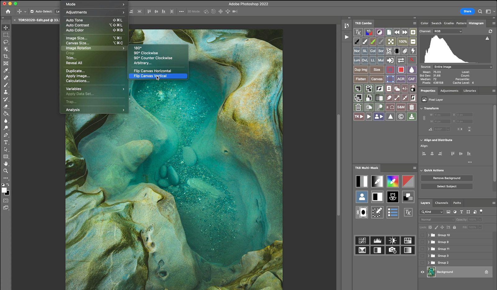
You can also apply edits to an upside-down image. When you revert the image back to its original orientation, all layers and adjustments will be flipped right-side up. I find this method most effective when dodging and burning, as it allows me to see the overall weight and distribution of light across the image without being distracted by my familiarity with the subject.
May feel strange at first, but give it a try!
Remove color from an image
When adjusting exposure, brightness, and contrast, the color saturation of an image can be affected. Brightening pixels will decrease color saturation, while darkening pixels will increase it. These color changes can potentially impact your creative judgement when adjusting tonality.
To focus only on tonal values, try temporarily editing color images in black and white. You may do this in Lightroom by enabling the Black & White mode at the top of the Lightroom Develop panel, or by adding a Black & White adjustment layer to the top of the Photoshop layer panel.
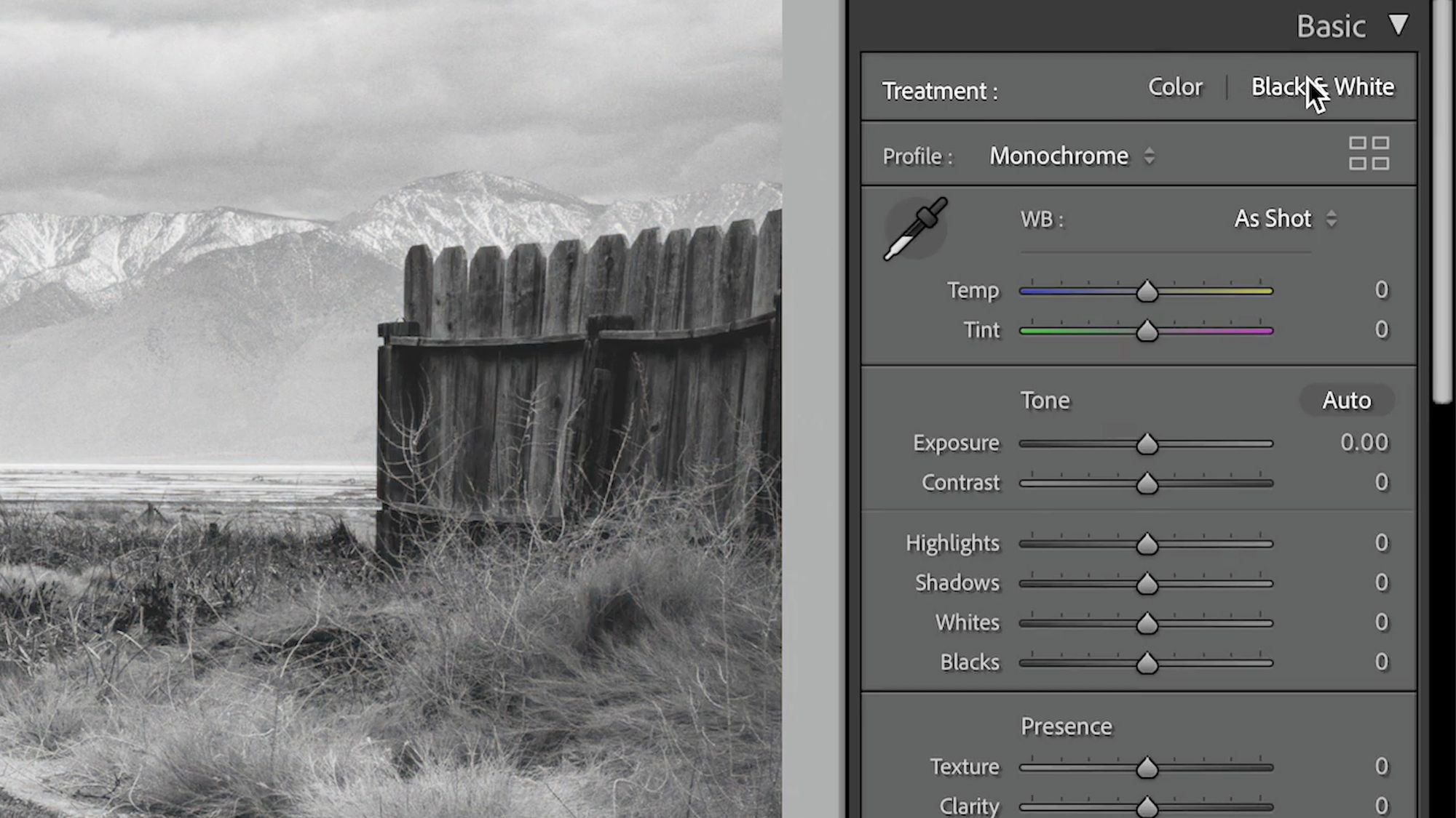
The goal is not to create black-and-white images, but rather to assist in assessing the lights and darks without the distraction of color. Once you have finished, switch the Lightroom editing mode back to color, or delete the adjustment layer in Photoshop, then concentrate on adjusting the colors.
Look at a neutral image
Have you ever edited an image, stepped away, then later noticed its color temperature or tint was off? This happens because our eyes become accustomed to the white point of an image and can no longer judge its accuracy correctly.
To fix this, I look at a solid, neutral color on my display for a few seconds. This helps recalibrate my eyes to a neutral baseline. Then when I switch back the image I'm editing, I'm able to better evaluate its color.
A quick way to do this on macOS is with Backdrop, a free app that covers everything on screen (except the top menu bar) with a solid color. It's primarily intended for covering windows and files when taking screenshots, but it's perfect for this too. I set Backdrop's background color to 83/83/83 RGB, and it works great. There's likely something similar out there for Windows as well.
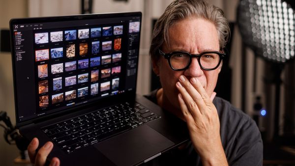
View image on a different display
Viewing an image out of context, on any screen other than the primary editing display, is another great way to see it from a different perspective. There's something about holding an image in my hand, using my iPhone or iPad Air, that switches my brain from "creator" mode to "viewer" mode. This helps me visualize how the image will appear to others.
To do this quickly, I typically export a JPG to Dropbox on my desktop, which then syncs the file to my laptop, phone and tablet. I can then view the image at a smaller size and with a "consumer" brightness level (which is typically brighter than a color managed display). This is a great opportunity to determine if my edit is too dark, too bright, too flat, or over-baked.
Next time you think you’re “done” with an image, try viewing it on a different display or device before finalizing your work.
Apply presets to an image
Lightroom presets are not only useful for quickly achieving a certain look, but they can also be used to discover new creative possibilities and treatments.
When I am uncertain about the creative direction I want to take with an image, I hover over all of my installed presets while observing how the image preview changes. The results are often mixed (mostly misses), but occasionally I will see a change in hue or tone I had not considered before.
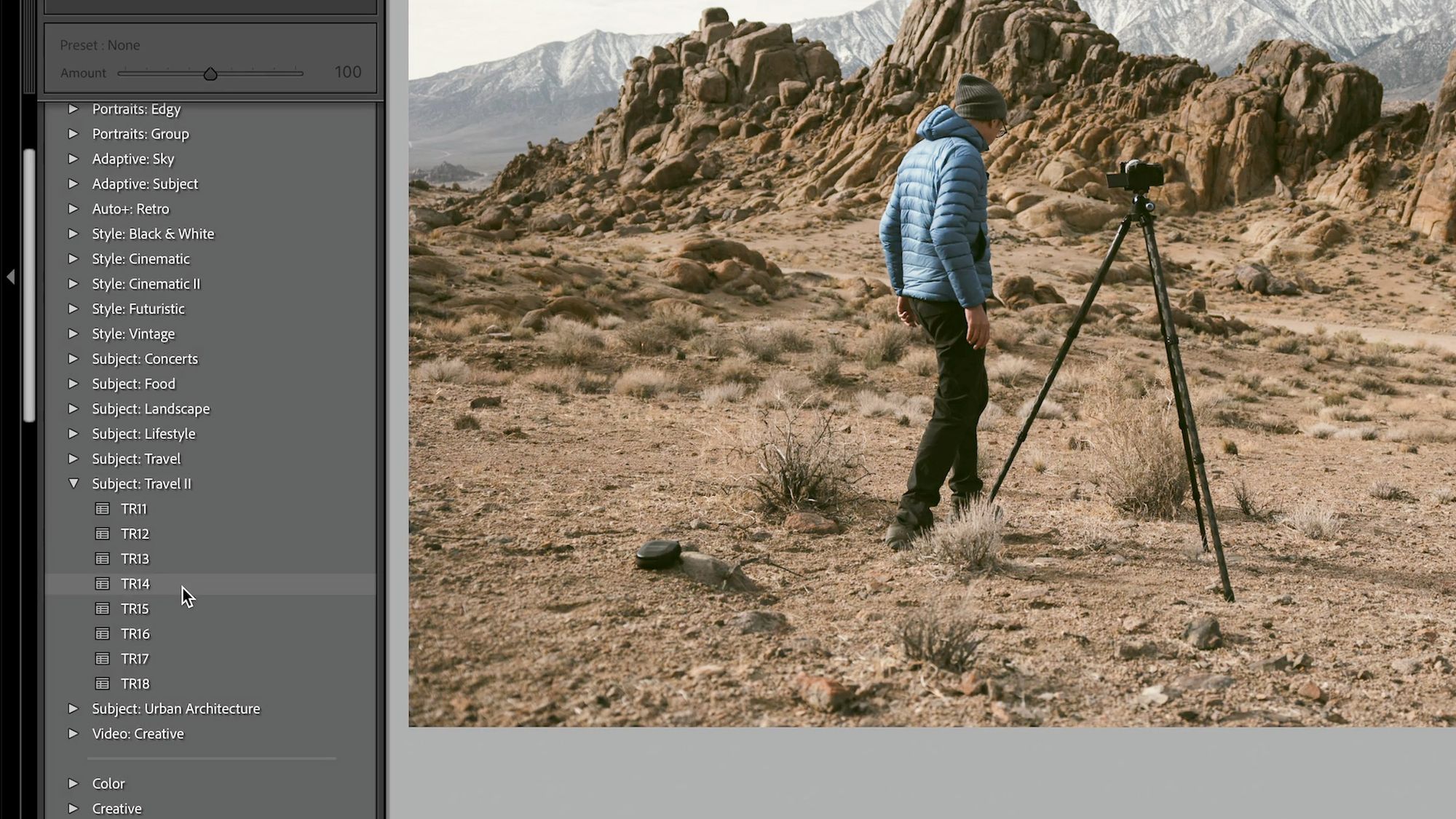
The goal isn’t finding a preset to actually use, but rather twisting and stretching the colors and tones in an image to see how it responds to different treatments. It's analogous to repeatedly pressing random when stylizing an avatar in a video game, just to see what the possibilities are. It may help generate new ideas and creative approaches you might otherwise miss.
Crop an image
The crop tool is obviously useful for changing aspect ratio and removing unwanted subjects, but it also does an amazing job of alerting perception.
Even if you have no intent of actually cropping the finished image, try cropping it to 1:1, 5:7, or 8:10 as a creative exercise. Watch how the rhythm, balance, and flow of the image changes as you move the subject within the crop. Also note whether the cropped subject appears stronger, clearer, and more focused, or now feels confined and cramped. Sometimes it's possible to create an entirely new, exciting image this way.
(By the way, if you have the budget, this can also be a compelling reason for investing in high-megapixel digital cameras. The more megapixels a camera has, the more flexibility you will have for cropping and resizing later on.)
Next time you come across an image that isn't working, try playing around with the crop tool to see if there's a better image inside the image.
Let Photoshop automatically "correct" an image
For this trick, we let Photoshop show us how contrast and color should be corrected. To do this, open an image in Photoshop, then add a Curves adjustment layer to the top of the Layers panel. Double-click on the newly added curves layer to edit its properties. Hold down Option (Mac) or Alt (Windows), then click the Auto button. You should now see the Auto Color Correction Options panel shown below.
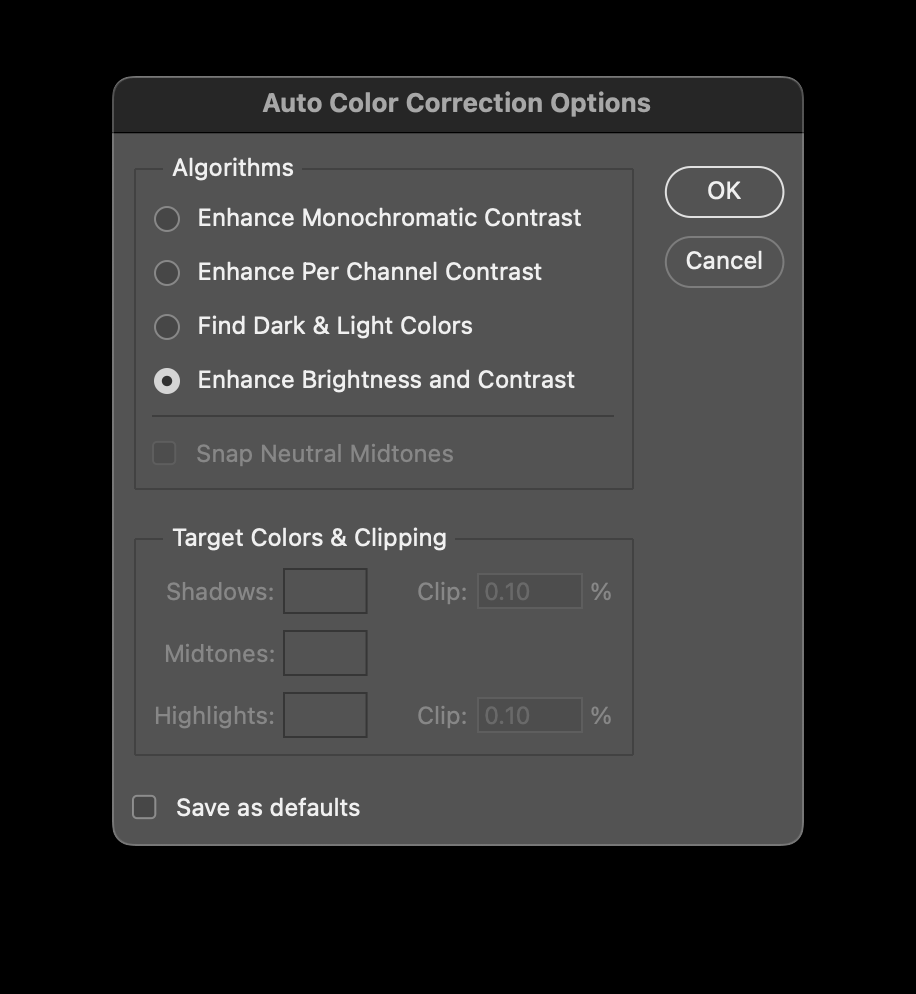
Click on each algorithm, and watch how Photoshop automatically adjusts the image. Some options also offer Snap Neutral Midtones to automatically fix white balance and color cast.
I enjoy using this tool as a final finishing step to gut check my edits, for I sometimes lift my shadows and blacks too high; resulting in images that are too soft and dim. But by adding this auto curves adjustment layer, I can see what Photoshop sees, and determine whether my image needs further adjustment.
My favorite algorithm is Enhance Monochromatic Contrast. This one stretches the darkest pixel to black and the brightest pixel to white, but without affecting color. I often apply this layer, then lower its opacity to taste.
Ask a friend for their opinion
Everyone sees the world differently, and the same goes with photography. Ask five people to edit an image and you'll get five completely different results.
Take advantage of other people's eyes by asking a friend to do a quick edit of one of your raw images. In return, offer to edit one of theirs! Share the results, and ask why they edited the image the way they did.
This can also be a great opportunity to edit raw images created by a different camera than the one you own and have grown accustomed to.
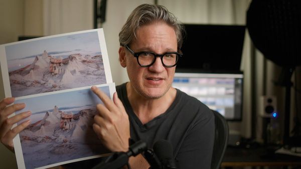
Print an image
Like my previous tip about using different screens, an image can appear entirely different when printed on paper. This is because images are displayed using ink instead of light, as they are on a screen.
I use a Canon PRO-300 to make prints. Sometimes when I'm working on an image, I'll make a quick test print at a small size (eg, 4x6) using economy photo paper. Then I'll place that print on a shelf or on my desk so I can live with the image for a while and see whether the edit holds up or should be revisited in the future.
Final thoughts
I believe that making judgement calls is one of the most challenging skills to learn in raw digital photography. When there are so many options available, how do you know when an edit is good or bad? It is ultimately up to us to decide, and the longer one looks at an image on a screen, the more difficult it becomes to see it objectively.
Next time you feel like you can't see the forest for the trees, and are focusing too much attention on details and small optimizations, try any of the tricks outlined in this article to help break you out of your comfort zone, reset your eyes, and see your image anew.
Video
Here's the video version of this post, albeit with fewer tips. I later updated this post with more tips, hence the difference.