Common signs of under and over-developed photos
Common signs of raw photos edited with too little or too much effort, plus how you check your progress for problem signs.
Photo editing is like any other creative craft. There's a beginning, a messy middle, then a sprint towards the finish. It's a journey full of ups, downs, challenges, frustrations, and (sometimes, if you're lucky) immense creative satisfaction.
I spend almost as much time thinking about photo editing as I do editing actual images, which means I do it a lot. The art of taking a flat, gray lump of raw sensor data and turning it into a finished, (hopefully) beautiful photograph is a mysterious process, to say the least.
How do photographers know when an image is "finished"? What is the difference between an edit pushed too far and one that hasn't been pushed far enough? The answers to these questions likely vary from photographer to photographer, but there are some commonalities I believe we can all agree on. And if we look deeper into signs of under and over-developed images, perhaps it will help define what "finished" means.
Signs of under development
Here are my telltale signs when an image of mine is under-developed and would benefit from additional time and effort.
Insufficient contrast
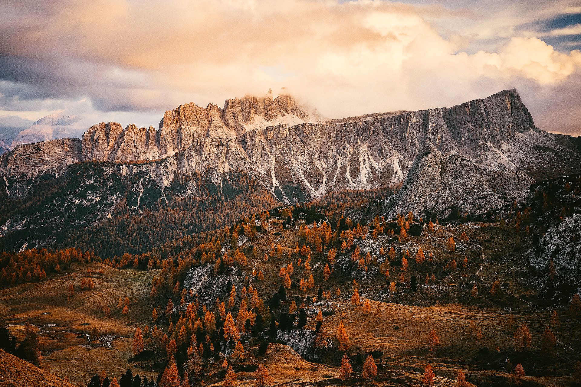
This is the most common mistake I make. Flat, gray images lacking contrast. I have a particularly bad habit of doing this because I stylistically prefer the softer blacks and mellower whites of analogue film. I can also get become cautious and overly concerned about my edits being too aggressive (over-developed). As a result, I often withhold contrast when the opposite is what an image actually needs to create depth and visual separation.
Dull colors
Second to too-soft contrast, the other classic sign of under-development I struggle with most is insufficient color saturation and vibrancy. I'm generally turned off by loud, flashy, richly saturated colors (both on-screen and off), so I have a tendency to push saturation too far into the negative. Some reduction in saturation is usually a good thing (to keep images from looking too digital), but when pushed too far, colors can appear thin and lifeless.
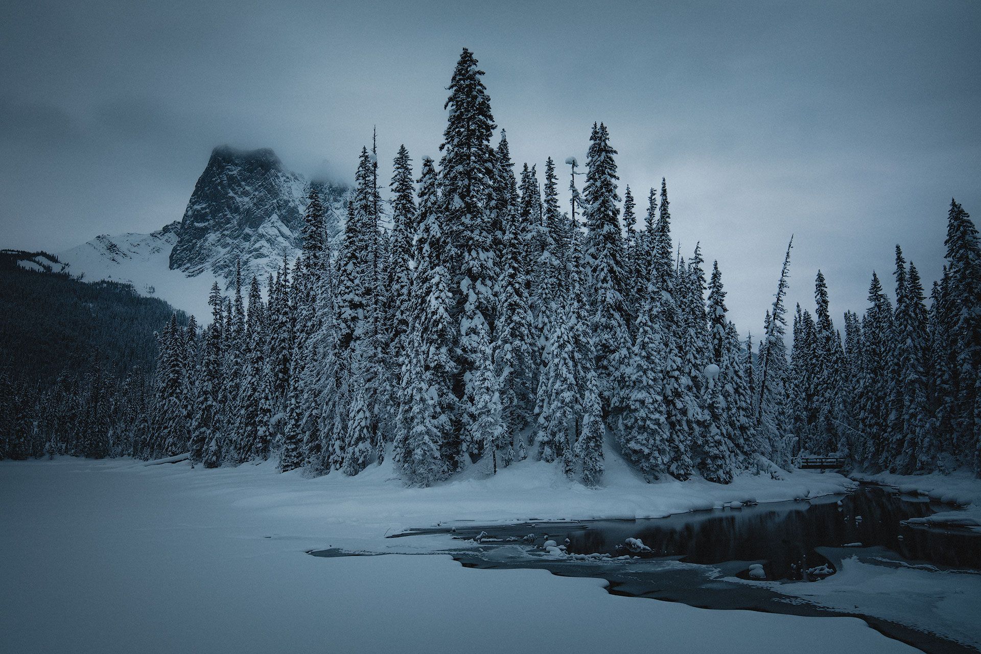
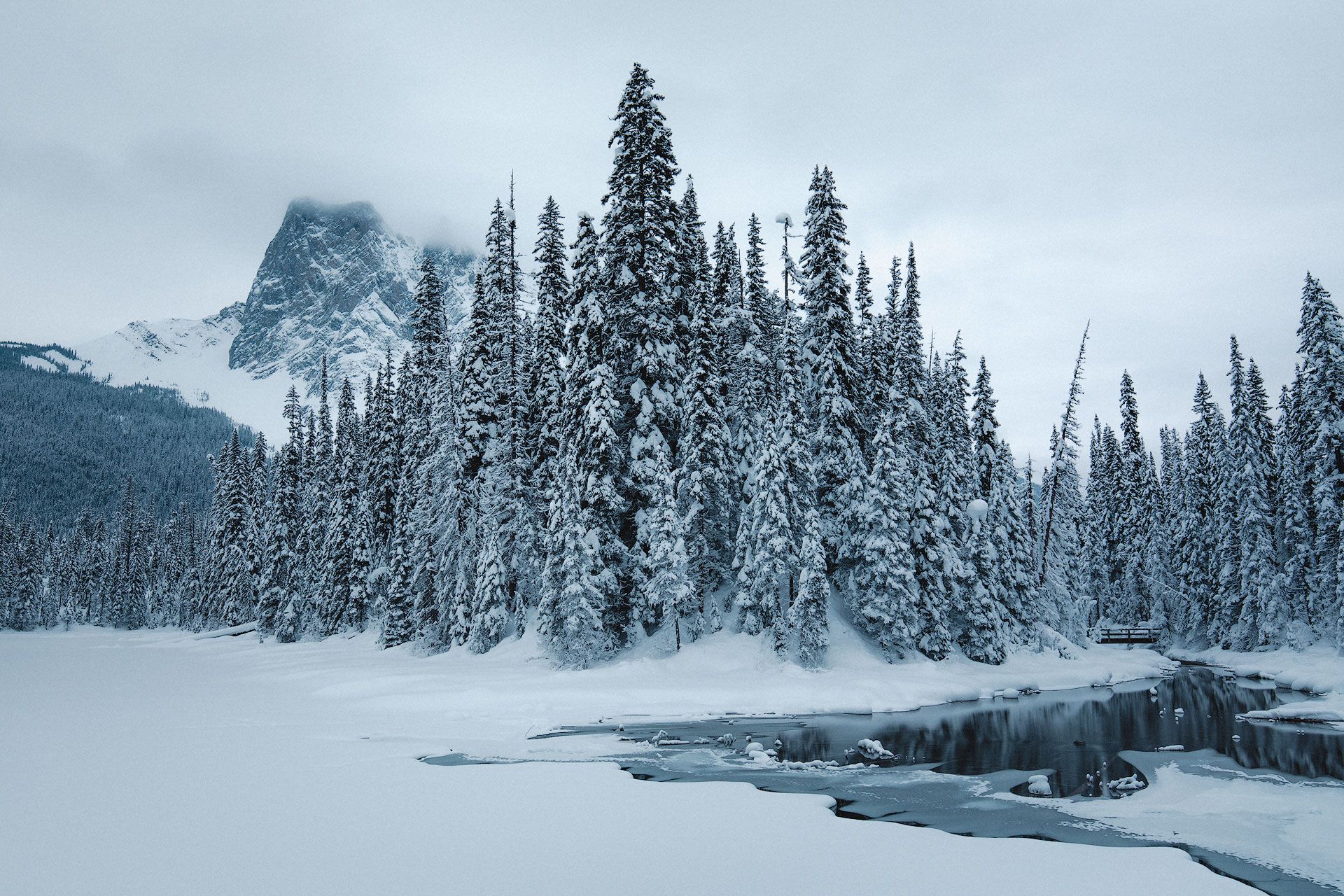
In the comparison image below, the left image was my first edit three years ago, the second a more recent re-edit. The new edit captures the vibrancy and intensity of the sky I saw when taking the photo. Ironically, less processing was done to this image; allowing the organic colors of the environment to shine through.
Muddy, dense shadows
I paid little attention to shadows when I first started editing raw images. I didn't think they were important (they're dark, who cares?). As a result, my shadows would often lose important texture and detail and appear darker and muddier than they could have been with more time and effort. Since then, I've grown to understand that shadows are truly the soul of an image. They're the bass and drum, grounding the melodic whites and highlights.
Underutilized crop
I sometimes get caught up in the romantic idea of nailing composition in camera and respecting an image's original aspect ratio. When executed perfectly, it feels like swishing a three-point basket (instead of first bouncing the ball against the backboard). But even with careful consideration in the field, a better, stronger image can often be found by taking the time to crop and experiment with different aspect ratios.
Dim whites
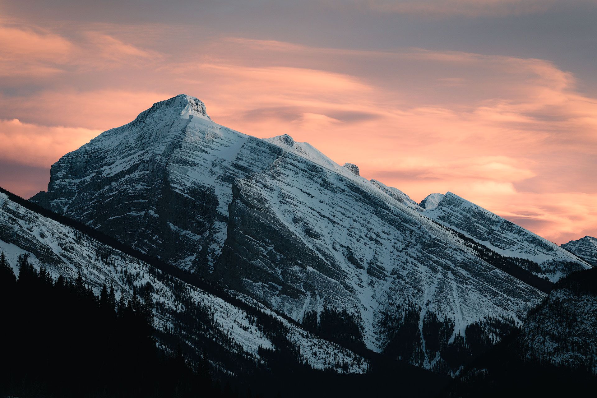
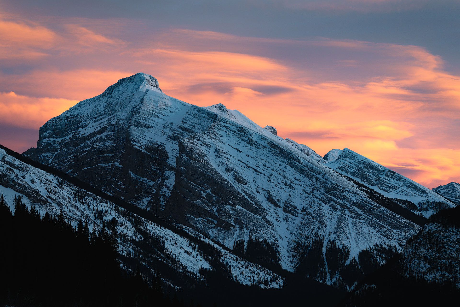
Crushed highlights can easily lead to dull whites. Instead of feeling like actual light, bright tones can often appear soft gray with overly aggressive negative highlights. I covered this topic in another article and video, but negative highlights do a good job of retaining detail and preventing clipping, but they can also flatten tonality and desaturate color.
In the comparison image below, my first edit of a snowy scene in the Canadian rockies was dark and dim (also caused by too much vignette). I then re-edited the image with brighter whites to make the snow look more natural, but without going overboard and creating a high-key image.
Insufficient local toning
Learning how to make local (not just global) adjustments is one of the most important skills to learn in photo editing. I used to avoid adding radial and linear gradients, thinking they should only be used to fix technical problems. Eventually I realized how important they (and other dodging and burning tools) were to help shape and direct light, create better balance and symmetry, and direct the viewer's eye. A little goes a long way.
Signs of over development
I typically don't notice over-development in my images until days or sometimes even months after an edit. It's the kind of thing that reveals itself after my eyes have been refreshed, and I then have to dial-back my edits, or mash the Reset button and start over from scratch.
Here are the most common things I do when over-developing images.
Monochromatic images
When an image is monochromatic, most colors (or perhaps even all) are part of a single hue. This happens when trying to tone down the busyness of an image and reduce visual complexity by bending neighboring hues closer together. For example, pushing yellow towards orange and orange towards yellow. Or, split-toning an image by injecting warm hues into cool shadows and cool hues into warm highlights.
Again, not a rule that applies to every image (Dune is a good example of monochromatic done well), but it's a technique that can also backfire when pushed too far; producing images that appear unnatural and washed out.
Too much clarity and sharpness
Modern digital sensors and professional quality lenses produce incredible sharpness and clarity. I've had a habit of forgetting this, and adding unnecessary clarity and micro-contrast to images that don't need it (or at least not a lot). This can produce images that look "crispy", digitized, and over-baked.
For example, I have no idea what I was thinking when I originally edited the image below, but I was punch drunk on clarity and sharpness. The whole image is over-developed in other ways as well (eg, weird vignette and tonal balance), but there is an absurd amount of detail enhancement that looks completely unnatural and manufactured.
Unrealistic shadows
Next to Highlights, the Shadows slider is one of the most intoxicating and alluring tools when editing raw images in Lightroom. Backlit subject? No problem. Just crank up the shadows. Well, in my experience, I often regret aggressively lifted shadows. The look doesn't age well, in my opinion. I'm at a point now where I only lift shadows if it truly benefits the image, and the effect looks natural, after all my exposure and contrast adjustments have been made.
General rule of thumb, if shadows have to be cranked way up, odds are the in-camera image wasn't exposed correctly.
Too much vignette
I know people who hate vignette. Never add it to anything. They see vignette as an optical defect that should be removed from digital images. Others — like me — appreciate some darkening around the corners and edges to subtly frame a subject and focus the viewer's attention. But it's super easy to go too far with vignette. I've applied vignette so heavy to some my older images it feels like the viewer is looking through a round tube (example below).
The best, most natural vignette is the kind that doesn't make its presence known. Subtle to the point of invisible. Or, none at all, if it doesn't contribute anything of value.
Too many local adjustments
Local adjustments using the brush tool, linear gradients, radial gradients, and luminosity masks are incredibly powerful tools. But as the old saying goes, with great power comes great responsibility. It's tempting to brighten this, darken that, and apply layers of tonal adjustments to craft the perfect image in the perfect light. But like everything else in this list, unless a photographer is super skilled, they can quickly cross the chasm of reality and produce images that look more like digital art than photographs. The goal then is applying the fewest number of local adjustments necessary to achieve a photographer's creative intent.

Tips for checking progress
When photo editing, it can be hard sometimes to see the forest from the trees. How can you tell when an image has under or over-developed? Here are a few techniques that work well for me.
Create snapshots, versions or groups
A great way to check gut-check edits is with Snapshots in Lightroom Classic and Versions in Lightroom CC. Both save progress, and allow you to roll back changes if so desired. While editing, try creating a snapshot or version every few minutes, or whenever you step away to take a break. Not only does this help visualize progress (which can be motivating and very satisfying), but also indicate whether an image has been over-developed and would benefit from being rolled-back further in time.
If using Photoshop, an effective trick is adding all edit layers to a group. Then create a new group when ready to add more layers. This allows you to toggle group visibility on/off and roll-back changes if needed.
Check for "dams" in the histogram
If the image histogram displays tall, vertical "dams" at far left and/or right, those spikes may contain important detail. This isn't a hard-and-fast rule, but the taller and more condensed those dams are, the flatter and more one-dimensional those tones will appear. Again, all depends on the type of image being created, but it's something to keep an eye on to ensure an image isn't losing important detail and texture.
Use auto adjustments
A great way to gut check an edit is to apply an "auto" correction. Asking the software to edit the image for you. For example, clicking the "Auto" button in Lightroom, selecting "Auto Tone" and/or "Auto Contrast" in Photoshop, or — my favorite approach — adding a curves adjustment layer in Photoshop, holding down the Option/Alt key, then clicking the "Auto" button in the curve's "Properties" panel. All will "correct" the image by adjusting exposure and contrast. I rarely keep auto adjustments, but they provide an effective way to get a second opinion.
Change canvas color
The human eye interprets tonal values through context. The eye gauges how bright or dark a tone is by comparing neighboring tones. Unfortunately, as illustrated by Adelson's illusion, our eyes are kind of lousy at it. Our perception of how bright or dark an image is can and will change depending on where the image is seen.
An effective way to gauge whether an image is under or over-developed through changing the color of the canvas. Right click on the empty area around an image in Photoshop, Lightroom or Capture One, and select different brightness values from the drop-down menu.
I find this especially helpful for not just gut checking exposure, but when working with high or low key images. Images of snow or bright sand dunes benefit from a white background, while darker images benefit from back or dark gray. Then it's easier to see whether the tonal values and contrast have been pushed too much or too little.
View images as thumbnails
Ever view an edited image on your phone, and think...this doesn't look right? I know I have. When an image is reduced in size, the contents of the frame get condensed. Then it's easier for the eye to gauge overall look and feel. This is typically where I discover problems with overly aggressive dodging and burning (or sometimes not enough).
My recommendation? Periodically during an edit, reduce image size to around 25%. This will give you a birds-eye-view of your edits. I often adjust the strength of local adjustments in this view.
Remove or disable edits
Another gut check is temporarily removing and/or disabling masks in Lightroom or layers in Photoshop to see if they contribute anything of value. If an image looks better without a mask or layer, delete it. The fewer effects and modifications used to achieve the look you want, the better.
Ask yourself why
Before touching a slider in Lightroom or adding an effect in Photoshop, ask yourself why. What problem will this adjustment solve? Will the image benefit from this change, or am I just adding things for the sake of adding them? For me, understanding when not to add something (eg, adding clarity, vignette or some other effect) is just as important as knowing when to use them.
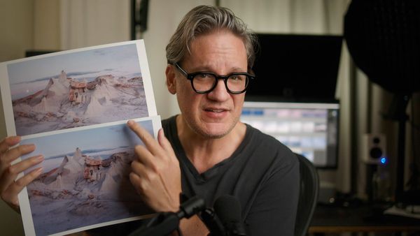
Video
Check out the video version of this article below.
Thanks to Skillshare for sponsoring this video! Whatever you’re into, Skillshare has classes taught by experienced instructors to help you improve your skills. You can checkout Skillshare absolutely free for 30 days by signing-up through this special link.