10 essential color editing techniques in Lightroom
Tools and tips to get the best possible color out of your digital raw files in Adobe Lightroom, Lightroom Classic and Camera Raw

Color in digital raw photography can be difficult and frustrating, for unlike film where colors are mostly baked-in, digital color is typically flat, desaturated, and accurate to a fault. To create a colorful image, a photographer must edit saturation, vibrance, luminance, and shift hues cooler or warmer to achieve the look they want.
Adobe Lightroom, Lightroom Classic and Camera Raw provide a variety of color editing tools and controls, but understanding how to practically use them is a different skill set. In this article, I'll share with you a number of color editing tips, techniques and recommendations using Lightroom Classic to help improve your digital editing processing.
Use camera matching profiles
"Adobe Color" is the default color profile for all newly imported raw files in Adobe Lightroom. This profile (and "Standard", which it extends) is intentionally designed to produce consistent results with all raw files, regardless of camera manufacturer.
It generally works fine, but you can often get better color rendition by selecting a "Camera Matching" profile. Click on the icon with four white squares at the far right of the "Profile" row (top of "Develop" panel), and there you will see a "Camera Matching" collection containing profiles that match the in-camera color styles used by the originating camera when shooting JPGs.
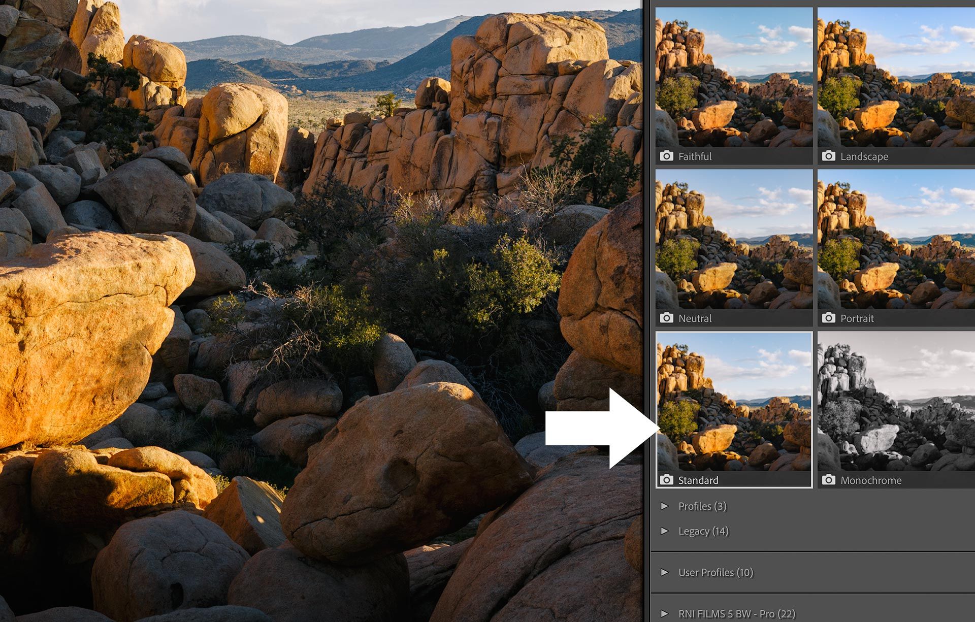
For example, when I import a Canon raw file, I see matching profiles for "Standard", "Portrait", "Neutral", etc. When I import a Fujifilm raw file, I see matching profiles for "Provia", "Astia", etc. These profiles are made by Adobe, not the camera manufacturers, but for me they almost always produce better colors than "Adobe Color", and provide a solid baseline for additional edits.
Speaking of camera matching profiles, if you get tired of applying these each and every time you edit an image, you may change Lightroom's raw default preferences to use color matching profiles on import.
Edit color separately from tonality
One of my favorite color editing tricks is switching "Treatment" (located at the top of Lightroom's Develop panel) from "Color" to "Black and White". This temporarily removes all color from an image and makes it easier to focus on tonal changes without being influenced by color.
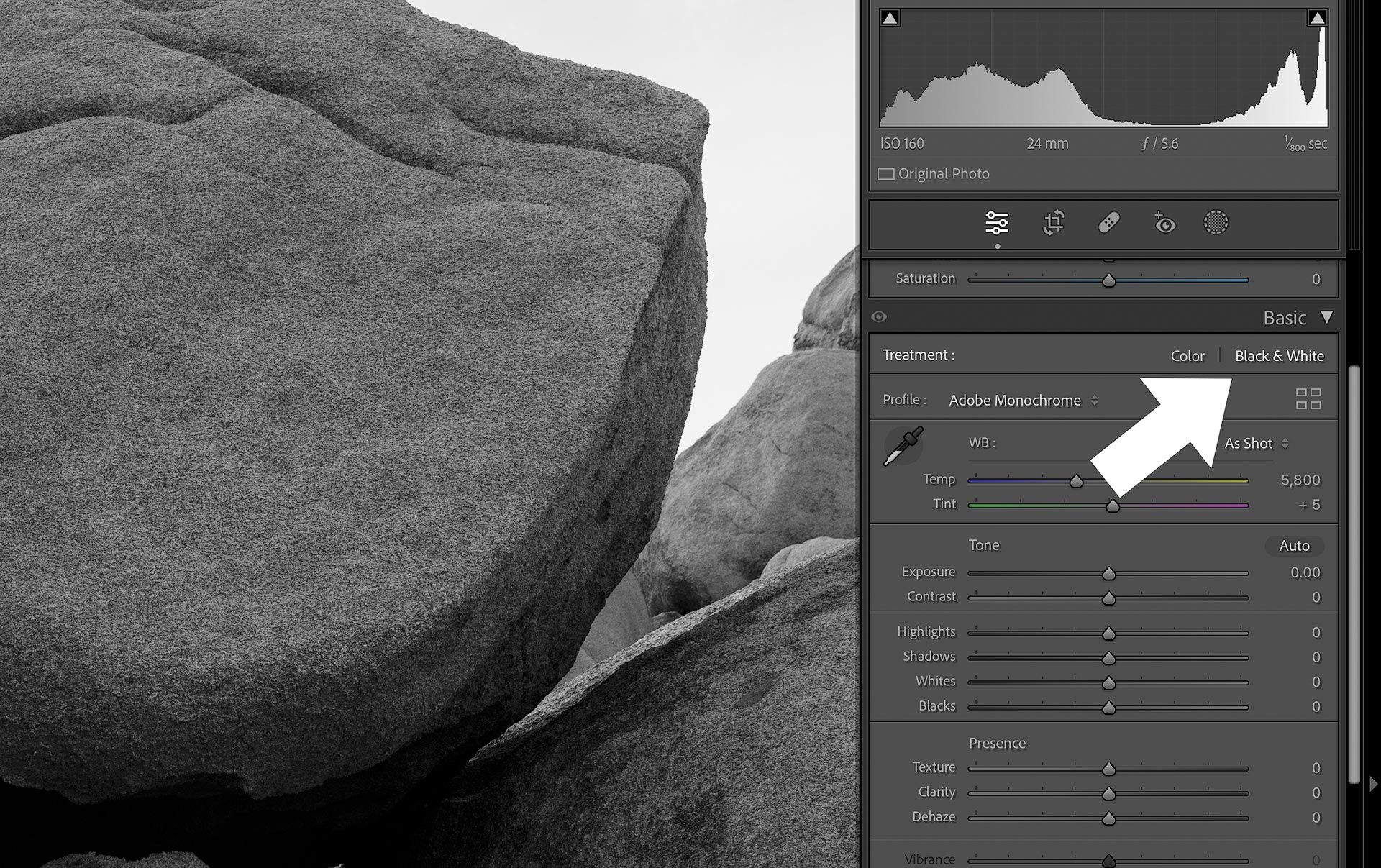
This is helpful because color saturation and luminosity change when exposure and contrast is edited. I notice this most with saturation, where colors can become muddy and dense (especially in the shadows) when darkening darker tonal regions. By temporarily disabling color, I can focus on getting my tonal values right, switch back to "Color", then make adjustments to color thereafter.
Edit white balance with intent
Early in my photo editing journey, I used the eyedropper tool in Adobe Lightroom to "fix" the white balance of every raw file I imported. I thought I was doing the right thing by removing color cast and converting colors to their true, authentic hue. I thought I was "optimizing" my images and fixing what my camera got wrong.
Eventually I learned that white balance is directly related to light, whether that light is coming from the sun, and studio LED, or anything else. And by "correcting" the white balance of an image to create spectrally neutral blacks, grays and whites, I was changing the light source. I was manipulating time of day and the natural environment in which an image was captured.
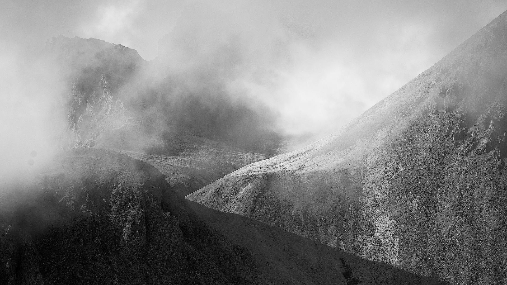
For example, check out the following image. This was shot in the highlands of Iceland, in summer, when the light was naturally dim and blue between midnight and 3am. The white balance is exactly as the camera captured it (eg, "As Shot"), and accurately reflects what the environment looked like when I was standing there.
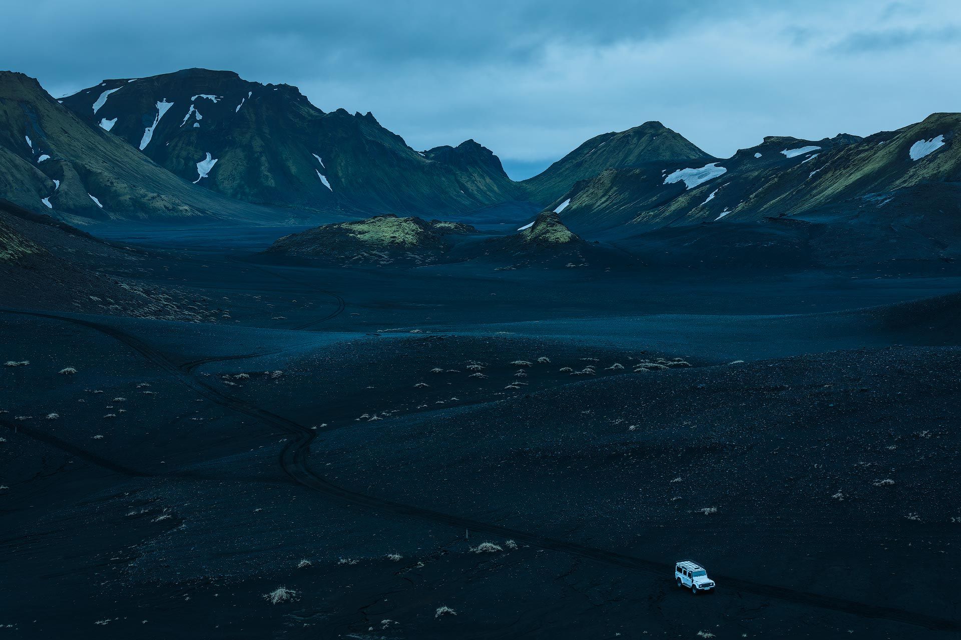
If we "fixed" the white balance by using Lightroom's eye dropper tool on the Land Rover parked in the foreground, its white paint turns pure white, and the snow and clouds shift in the same direction. This also changes the tint of the volcanic rock to be more neutral, and the moss on the hills now leans more towards their natural yellow/green hue.

You may prefer the hues of the second image, and that's totally fine if you do. Color is a subjective call. But for me, the second image has not been improved. The white balance may be "correct", but now the image appears to have been captured in the afternoon on a warm, overcast day. It no longer evokes the cold, blue atmosphere of Iceland's midnight sun, which for me is an important component of the image's story.
White balance is "correct" when it accurately reflects the intention of the image.
White balance is technically correct when neutrals are spectrally neutral. When there is no visible tint or color cast, and colors are displayed in their natural hue. This is most commonly used in product or studio photography, where color (especially brand color) can be critically important.
White balance is authentically correct when it aligns the the image with the color temperature and tint of the light source, whether that light is reflected, blue, atmospheric light like my Iceland image, or the golden hues of sunset. It authentically emulates the color cast of the original light source.
White balance is creatively correct when it aligns the image with the intended mood, atmosphere, or story a photographer is trying to convey. An extreme example of this is the "day to night" color grade seen in countless movies, where white balance is skewed towards deep blue and cyan so an audience believes a scene's time of day is blue hour, either before sunrise or after sunset.
In summary, when you first start editing an image and reach for the Color Temperature and Tint sliders, decide whether an image should be technically, authentically or creatively correct, to establish a proper baseline.
Use Calibration panel to explore creative color treatments
Every pixel on your screen is illuminated using a mix of red, green and blue. The same is true with digital camera sensors, which capture raw image data using combinations of all three colors. When Lightroom imports a raw file, it "de-mosaics" the data it contains by combining red, green and blue to form the images you see on screen.
Lightroom Classic (but not the cloud version of Lightroom, unfortunately) includes a "Calibration" panel that adjusts how Lightroom de-mosaics the red, green and blue channels. It was developed, initially, as a fallback in case Lightroom didn't interpret RGB information correctly, and for the custom calibration profiles for photographers who need a fully calibrated workflow.
Though its origins may be technical, the Calibration panel is also a very good creative tool, for it manipulates color in a way that's completely different from every other tool.
For example, check out the image below. The color wheel on the left is correct and displays the proper mix of red, green and blue for each color. The color wheel on the right is the same but with Calibration's "Red Primary" hue slider pushed to the left towards magenta.
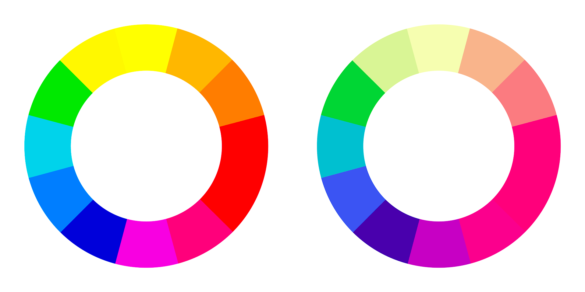
Notice how "Red" doesn't simply affect red and neighboring hues, but the entire color wheel. Every color changes because we are altering the percentage of red in each color. The same thing happens with the "Blue Primary" and "Green Primary" hue sliders as well.
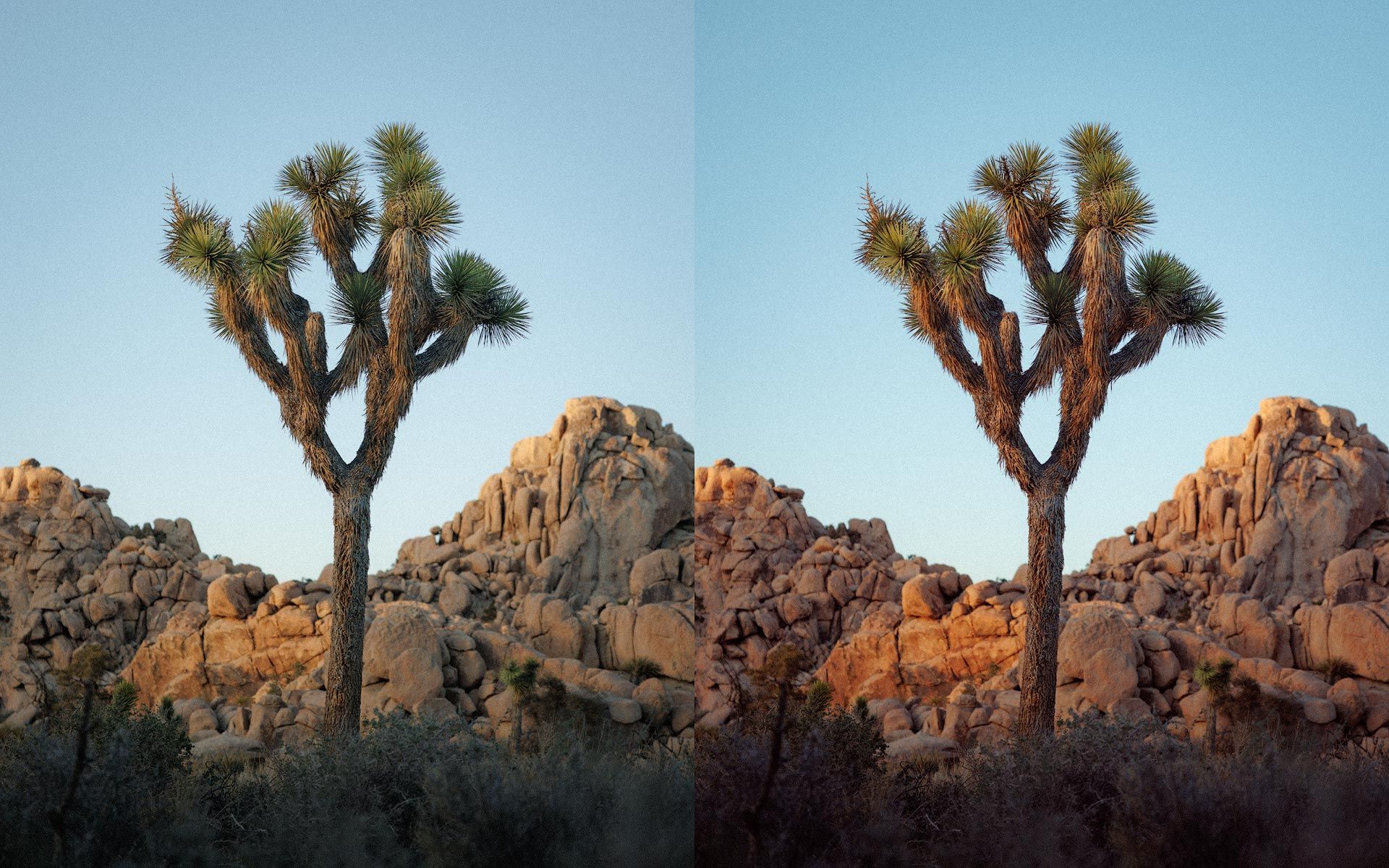
We can put this into practical use by skewing the hues of a specific image to achieve a particular look, or across an entire collection of images to add visual cohesion and consistency. I like using Calibration at the beginning of an edit to strengthen and add character to colors across an entire image.
For example, the image on the left is pretty much straight out of camera, as imported by Lightroom Classic. The image on the right has bolder, deeper reds and magentas, and a more pleasing hue of blue for the sky. No other adjustments to this image have been made using HSL, the Color Grading tool, or anything else. Only the Hue and Saturation sliders for Red Primary, Green Primary and Blue Primary in Calibration.
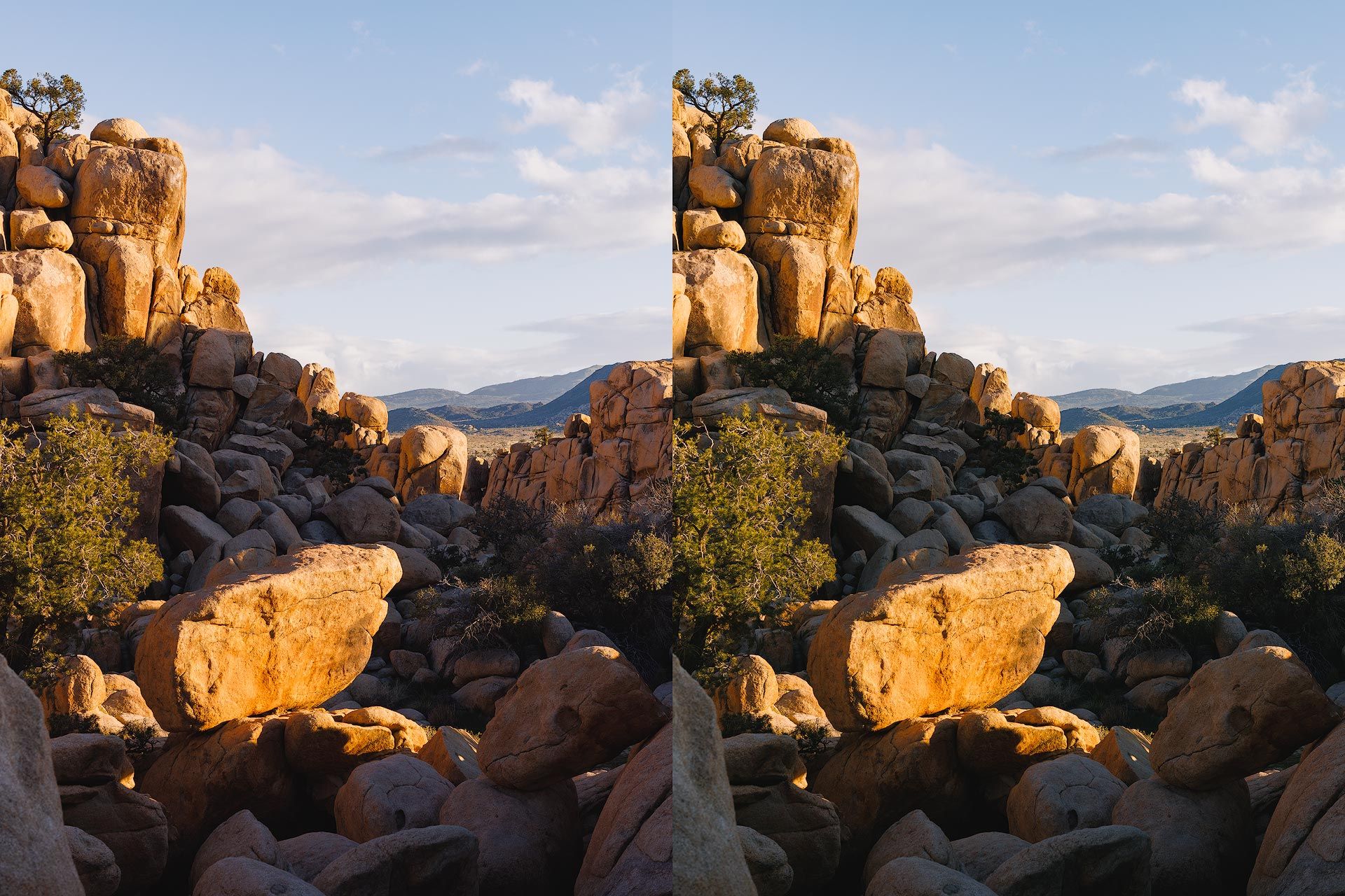
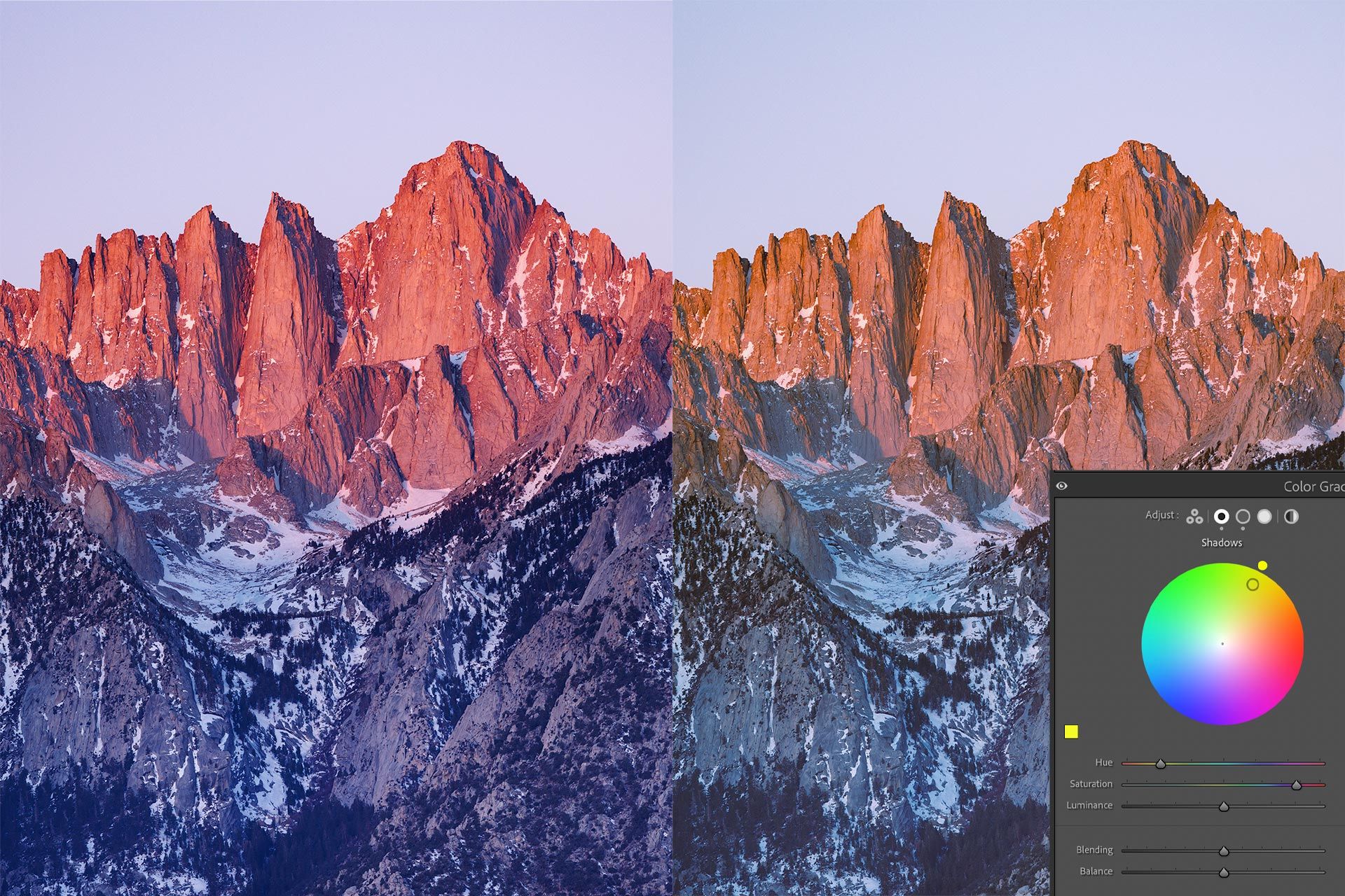
Another helpful tool in Calibration is the Shadows slider. This tool helps add or remove color from the darkest areas of an image. It can be used to add color to dull, neutral shadows, or remove color cast adding a color's complement (as described earlier).
For example, my Canon raw files always seem to exhibit elevated levels of red and magenta, especially in the shadows. It's not a look I care for, so I often use the Calibration panel's Shadows slider to inject green, which helps negate the magenta tint. The slider is very strong, so a little goes a long way. Here's a before and after example from Joshua Tree, California.
I actually moved the Calibration panel to the top of my Develop panel because I use it so often at the beginning of an edit. I have also created some presets (containing only Calibration panel adjustments) to get particular looks quickly and easily at the beginning of a color grade.
Avoid the global Saturation slider
Speaking of the global Saturation slider in Lightroom and Camera Raw, I rarely get pleasing results out of it. Colors can quickly become oversaturated and gross because Saturation injects saturation into every pixel in the image without regard for how saturated a pixel already is. This is why colors often turn out blotchy and weird when using this tool.
A better saturation tool (for global saturation) is Vibrance. This slider also adds global saturation, but is weighted towards less saturated pixels. It mostly ignores well saturated pixels, and focuses more on flat, dull areas that could use some lift. The tool also does a good job of balancing and equalizing saturation by bringing under saturated colors closer to well saturated.
For example, I boosted saturation in the following comparison image using +50 with the Saturation slider (left) and +50 with the Vibrance slider (right). The greens aren't too bad, but the yellows and reds are muddled and completely unnatural looking.
I almost always find myself using negative Saturation (around -5 to -10), plus a little Vibrance (+20 or so) to help balance global saturation and provide a good baseline for additional color edits.
Increase global saturation to audit color
When listening to music, we can turn up the volume to better hear and isolate the individual instruments and textures of a song. With color photography, we can do something similar by cranking the global Saturation slider all the way to 11.
The colors will be garish and awful, but clearly visible. How yellow are the greens? How orange are the reds? Are there any weird colors lurking in the shadows or midtones? For the image above, there answer is definitely yes, with hues of cyan and magenta in the shadows. The highlights also may be leaning a little far towards green.
Armed with this information, I can then decide whether to change a color's hue, saturation, or luminosity. I might also target all colors in a specific tonal range (eg, midtones) to remove color cast or make other stylistic adjustments.
Whatever the intent, cranking up Saturation is a good way to gut check color across an entire image.
Use negative luminosity to add saturation
Because digital photography is an "additive" color medium, colors become brighter and skew closer to white when saturation is increased. This is the opposite of analogue, "subtractive" mediums like paint and film, where colors become darker and skew closer to black.
If increasing saturation creates brighter, poppier colors (which don't appeal to you), try decreasing a hue's luminance in the HSL panel. This alone can "deepen" colors so they appear darker, denser and more saturated. Lowering color luminance is also an effective way of simulating how analogue film typically responds to increased saturation, if going for a filmic look.
For example, check out the comparison image below. The image on the left is the original (taken inside the Barbican Centre in London), while the right is the same image with a green saturation boost using Lightroom's HSL panel. Notice how the greens have not only intensified in color, but are also now brighter than they were before.
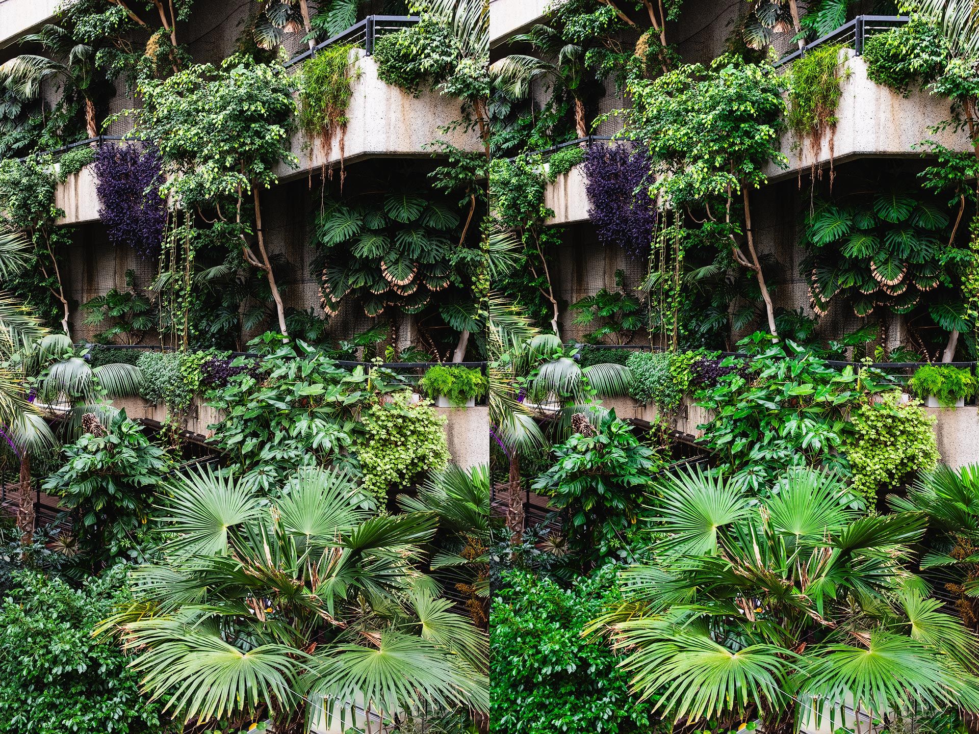
Some may like the brighter greens, but I find them to be a bit synthetic for my taste. For the next image, I added saturation by moving the Green "Luminance" slider to -90. The greens are richer and more densely saturated, but without increasing their brightness. They also (to my eyes at least) appear more organic and life-like.
Note that the Luminance slider doesn't always produce good results. Sometimes colors can turn muddy and weird, so it all depends on the image you're editing. I recommend trying negative luminosity, plus an accompanying saturation adjustment to the same hue to adjust color density.
Mix complementary colors to increase neutrality
Colors can also be desaturated and pushed closer to neutral by adding their compliment. This simply means blending-in whichever color sits directly across the color wheel from your target color.
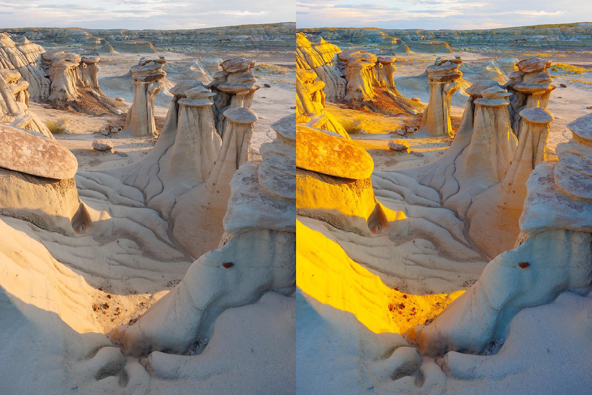
For example, the following image was taken at sunrise in Alabama Hills, California. The original (left) contains lots of blue in the shadows. If I wanted to create an image with a more muted look, I don't have to reduce blue saturation in the HSL panel. I also have the option of toning the shadows with blue's compliment (yellow). The closer the wheel gets to pure, fully saturated yellow, the closer the blue shadows get to neutral, for the colors are now effectively cancelling each other out.
Doesn't matter which hue or tonal region you're targeting (shadows, midtones, or highlights), you can use the Color Grading wheels to desaturate color and push their hue closer to neutral.
Reduce visual color complexity
The more colors an image contains, the greater its visual complexity. The more "things" a viewer's eye must digest. The more distracted they may be from the intended subject. Variety of color can sometimes be the underlying intent of an image (eg, a rainbow), but for me, most of the time less color truly is more.
A common technique in color landscape and portrait photography is bending neighboring hues closer together. This reduces color complexity, lowers the signal-to-noise ratio, and creates a more unified, purposeful image.
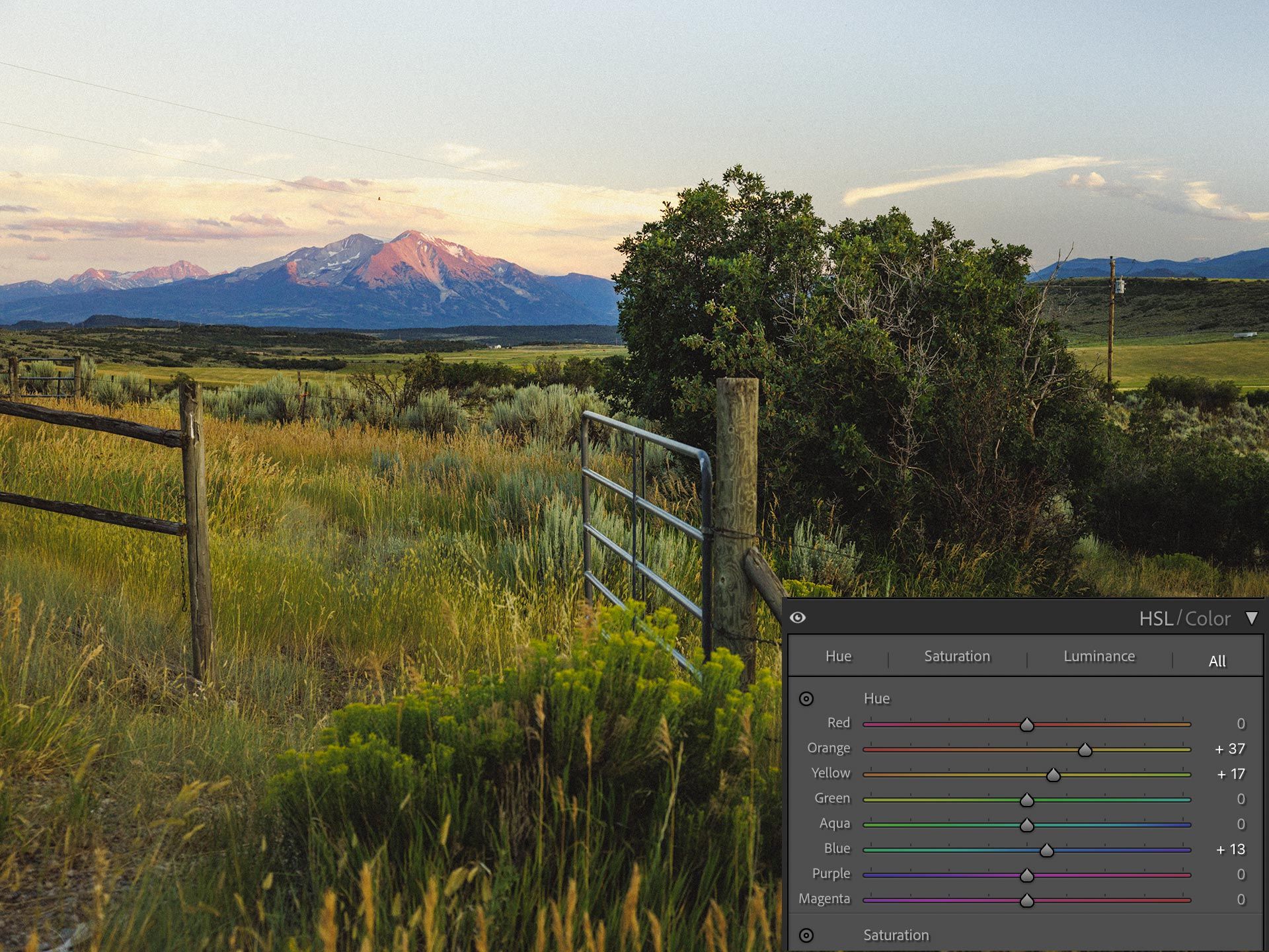
For example, the image below was captured at sunset near Glenwood Springs, Colorado. There are a multitude of colors in the grass, trees and shrubs, all competing for attention.
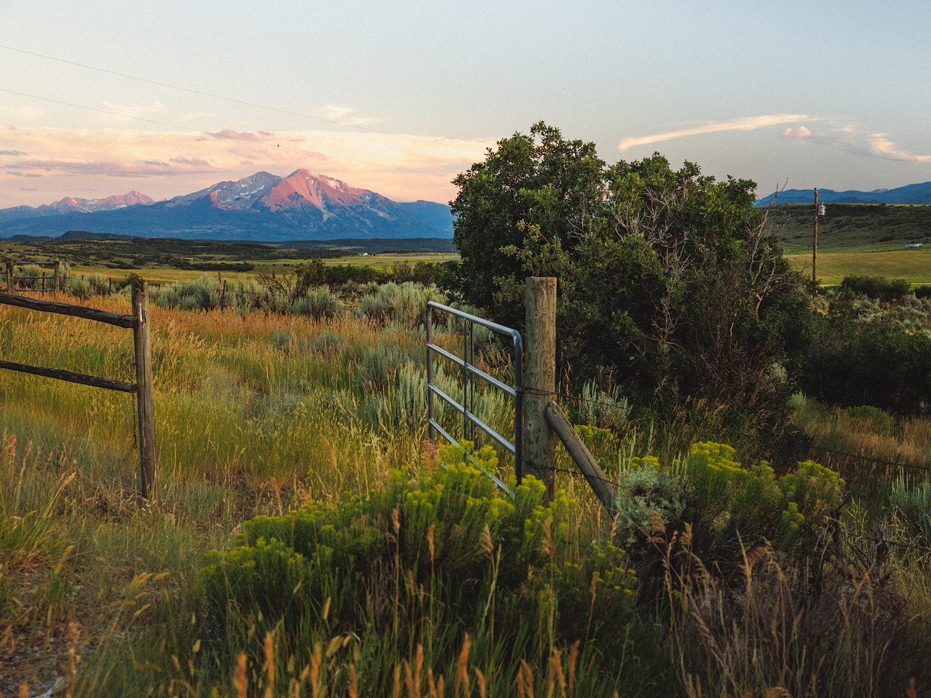
To reduce color complexity, I could push the yellows further towards green, and the oranges further towards yellow. Doing so collapses the neighboring hues into a more solidified, uniform green hue that ties the area together, reduces visual complexity, and does a better job of emphasizing the the gate and mountains in the background (see below). The image feels calmer and more subdued as well.
Another method for reducing color complexity is lowering saturation of "extra" colors that do not provide valuable context or information. You can find this by lowering the saturation of each hue to zero, and seeing what (if any) influence the color has. If the color isn't important or visually present, you can keep its saturation low.
Tangentially, I find that this technique also helps make digital images look less digital and more like film. Digital is objective and does a great job of accurately capturing a variety of color, but film is designed for subjective color. Colors that are pleasing to the eye, out of the box, by bending and desaturating hues.
Reduce saturation when increasing contrast
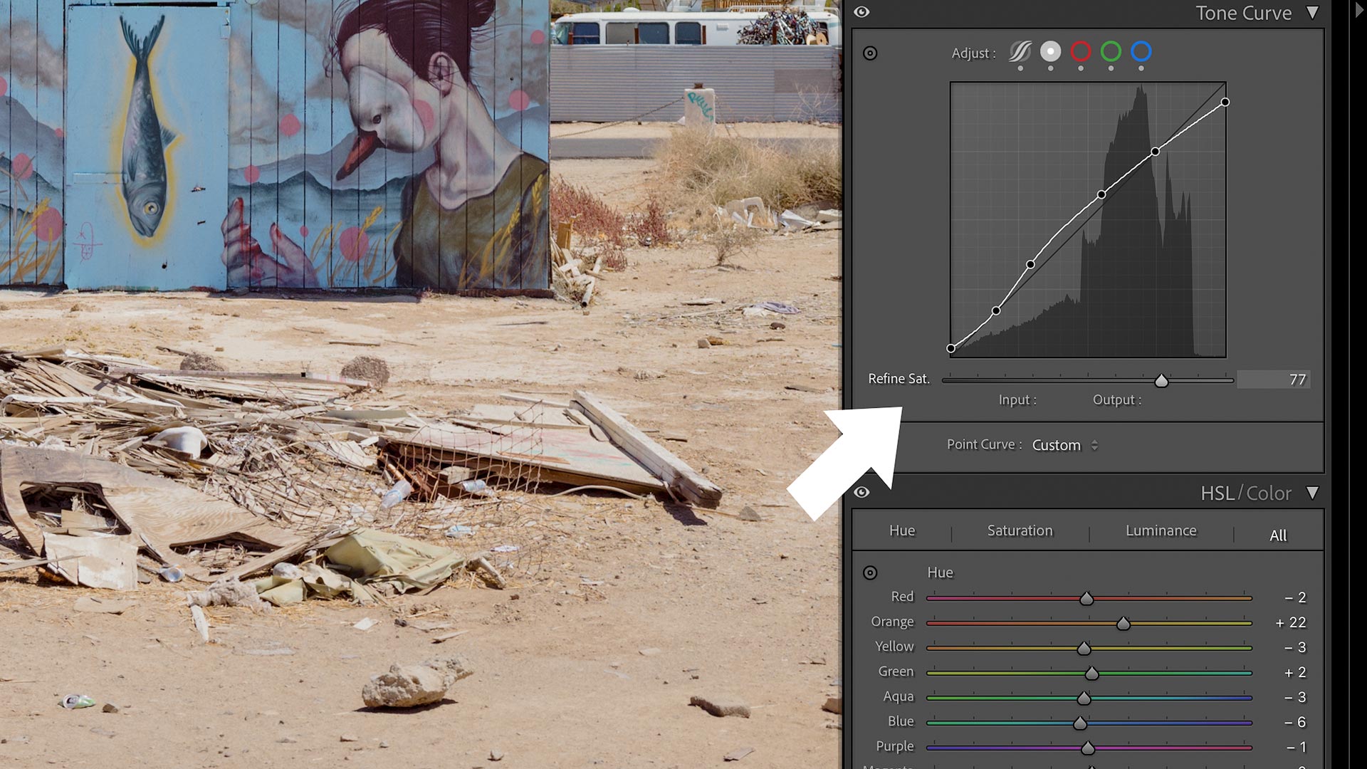
As mentioned earlier, color and tonality are inherently linked when editing raw. Increasing and decreasing contrast can cause colors to become more or less saturated. Colors would often require some degree of desaturation after increasing contrast.
To counteract this behavior, Adobe recently added a new "Refine Saturation" slider to the bottom of the Tone Curve panel in Lightroom Classic. This slider balances and counteracts saturation changes so only a color's luminance value is affected. And because it's a slider, you can dial-in however much or little you want.
Summary
As you can see, there are many unique ways to adjust color in Adobe Lightroom and Camera Raw. Hopefully at least one tip in this article gives you something new to experiment with when editing your own raw images. For more Lightroom editing tips, check out this related article on black and white photo editing:
 Todd Dominey