From screen to paper: preparing digital images for print in Photoshop
My step-by-step process when creating photography prints using Adobe Photoshop to ensure good results
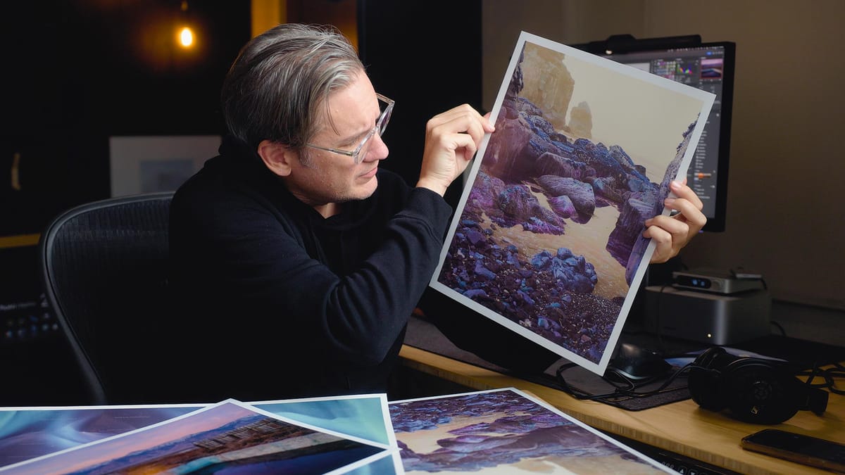
There’s nothing quite like seeing a large print of one of your favorite photographs displayed on a wall. However, preparing images for print can be stressful—it’s often an intricate and costly process, particularly if you’re new to it. In this article, I’ll share my step-by-step process for preparing images for printing using Adobe Photoshop, along with tips and recommendations to help you achieve better, more accurate results.
Calibrate your display
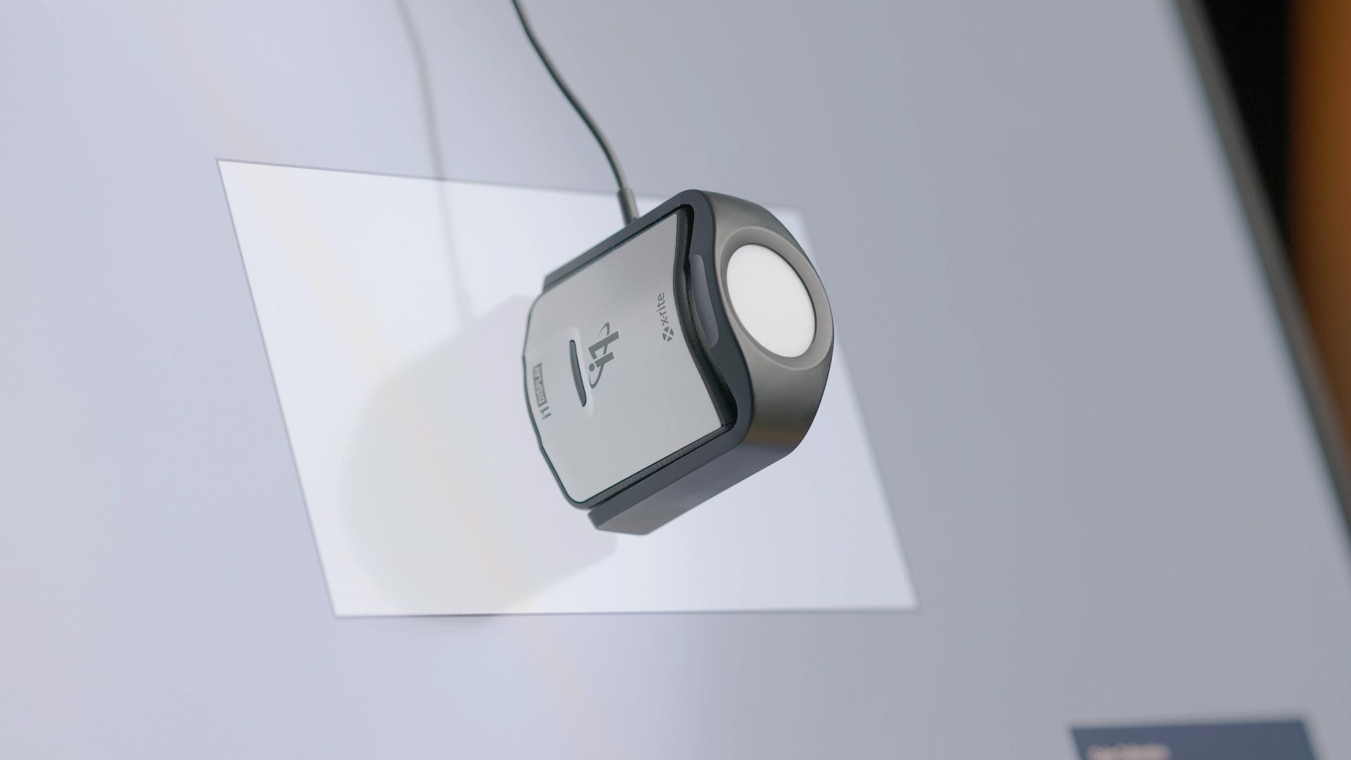
Calibration is like tuning a musical instrument: when the instrument is out of tune, every note and chord feels off. Similarly, if a display isn’t accurately calibrated, the colors on screen won’t reflect true-to-life hues, leading to incorrect image outputs. Even high-quality, color-accurate displays (like the one I use) require periodic recalibration to maintain their accuracy.
Calibration also ensures proper brightness levels for photo editing, addressing one of the most common issues in printing—unexpectedly dark prints. This issue often occurs because many displays are set too bright for accurate editing. Tools like the Calibrite Display Pro HL (what I use and recommend) not only correct color inaccuracies but also help you fine-tune brightness and contrast, enabling better emulation of how images will appear on paper.
Create test prints
After your screen has been properly calibrated, I recommend creating small, inexpensive test prints of your images. This is important because images on a screen can often look different when printed. Images can appear darker, muddier, or less saturated due to the fundamental differences between screens and paper.
Monitors are backlit, making images appear brighter and more vibrant as they emit light. In contrast, paper is a reflective medium, where brightness depends on the amount of light bouncing off its surface. This difference in how images are displayed makes test prints invaluable for ensuring your final results meet your expectations.
If you own or have access to a color inkjet photo printer (I use a Canon PRO-300), I recommend using basic photo paper from Canon or Epson. I like Canon's 8x10 Semi-Gloss paper because it's affordable and large enough to see an image, but without wasting loads of ink in the process.
If printing yourself isn't an option, you can get cheap prints through a variety of online providers. I've had good experiences with Mpix when doing this, but any affordable option will do.
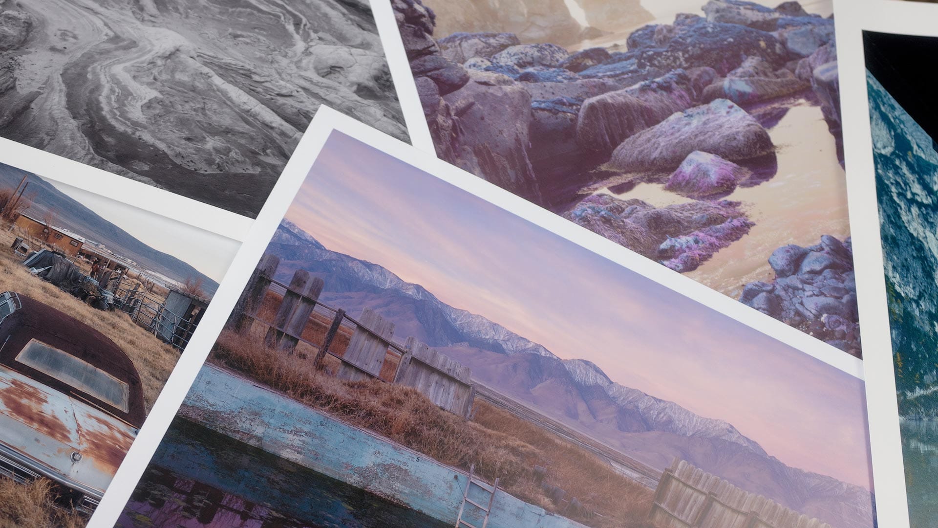
The point here is simply seeing your image on paper. A gut check, so to speak, to ensure the image is one you feel good about and want to move forward with before investing more time and money.
Preparing an image for printing
Next, I need to create a new version of my original image specifically for printing. This involves the following steps.
- Open the original, layered PSD (ProPhoto RGB)
- Duplicate, flatten, convert to Adobe RGB. Save as new PSD.
- Proof and adjust (if necessary) this image for editing
- Duplicate and flatten again, resize, sharpen, save as flattened TIFF.
Typically this looks like the following on my hard drive:
FileName123.psd
FileName123-PRINT.psd
FileName123-PRINT-18x24.tiff
This separates the "screen" version from the printed ones, and provides a smaller, intermediary file (#2) I can quickly open and resize without re-opening the much larger, original PSD. It also provides a convenient file for soft proofing and adding print related adjustments before sizing the image for a specific size (#3).
When creating the second PSD for printing, I convert its color space from ProPhoto RGB to Adobe RGB so the lab doesn't have to (which helps avoid surprises). Most reputable labs - including Whitewall (the lab I use) - accept files in sRGB or Adobe RGB. I choose the latter because it is a larger color gamut.
Soft proofing an image for printing
Every reputable printing lab provides downloadable ICC profiles for their papers (example page from Whitewall). Printers provide these profiles for soft proofing and previewing images only, not for embedding or converting the image's color profile. Meaning, keep your image as either sRGB or Adobe RGB and only use ICC profiles for proofing.
After duplicating and flattening my original PSD, I then soft proof the image for print by selecting the following:
Menu > View > Proof Setup > Custom
This opens the "Customize Proof Condition" window, where I then make the following edits:
- Select the paper's ICC profile from the "Device to simulate" dropdown
- Leave "Preserve RGB Numbers" unchecked
- Choose "Relative Colorimetric" from the "Rendering intent" dropdown
- Check "Black Point Compensation"
- Check "Simulate Paper Color"
- Click "OK" to close the window
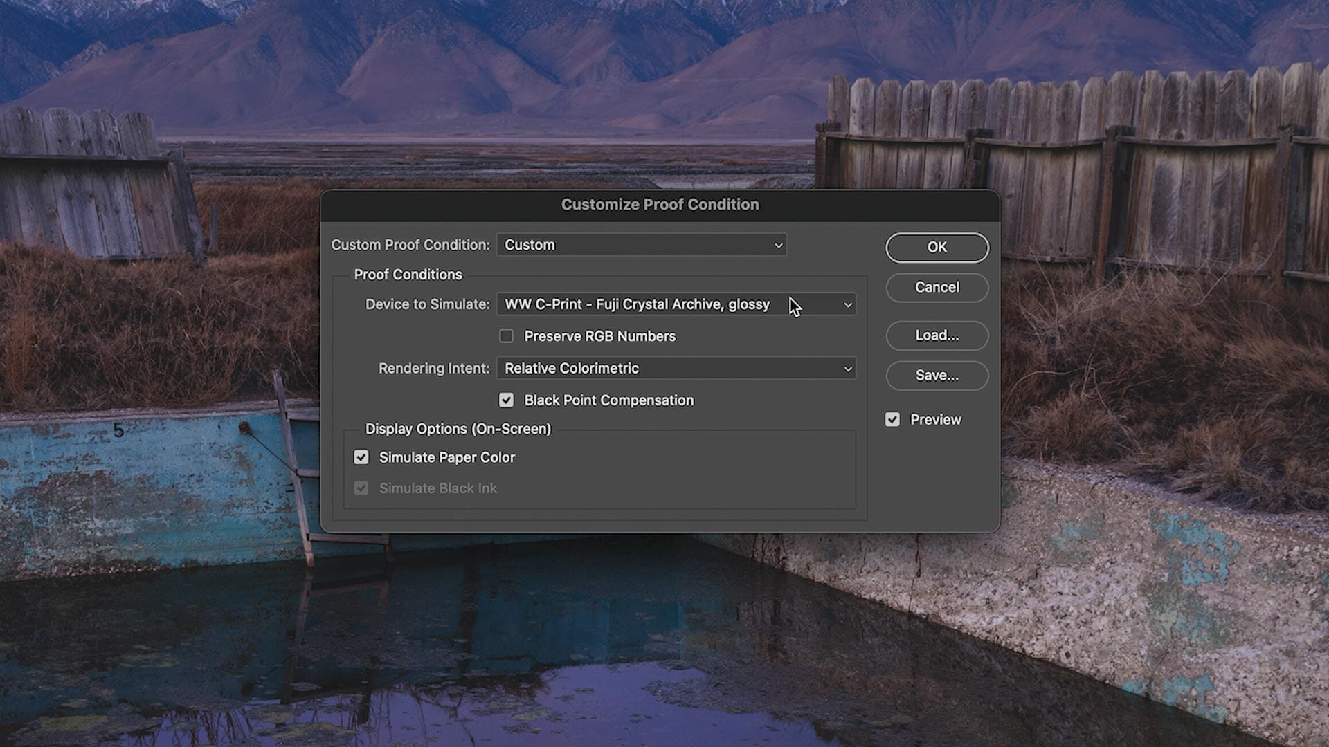
The image appears different because it is being “proofed” for paper, simulating how it will look when printed. This process often results in softer contrast, a higher black point, and reduced color saturation. Additionally, slight shifts in color temperature may occur due to the paper stock’s inherent cool or warm tone. You can easily toggle this proofing view on and off by selecting Menu > View > Proof Colors or by pressing Command/CTRL+Y on your keyboard.
Next, I switch the color mode of my BenQ display to a calibrated mode using Adobe RGB with a D50 white point. D50 is the standard of the printing and graphic arts industries, and is slightly warmer than the D65 white point standard used in desktop displays, phones, televisions, etc.
Switching the display’s white point to D50 makes Photoshop’s Soft Proofing mode (and proofing modes in other apps) more accurate when compared to prints. This is because paper ICC profiles are calibrated against D50, not D65. Calibration software and hardware can help you calibrate your screen for the D50 white point if you want more accurate proofs with "Simulate Paper Color" enabled. BenQ displays - and similar models from ASUS and Eizo - can also make switching from D65 to D50 (and back again) easy.
If switching to D50 is cumbersome for your setup, I recommend simply disabling the “Simulate Paper Color” option in Photoshop’s soft proof settings and enable “Simulate Black Ink” instead. The latter will preview perceived darkness when the image is printed, independent of paper color temperature.
Adding adjustments to the soft-proof
The next step is adding adjustment layers to counteract the changes seen in the proof. For example, if your proofed image appears a little dark or murky in the shadows, I recommend adding a Curves adjustment layer, locking the midpoint with a node, then lifting the black point slightly to brighten the darkest tones. You can also use the Levels adjustment layer to achieve the same effect, or get fancy with luminosity masks if you're so inclined.
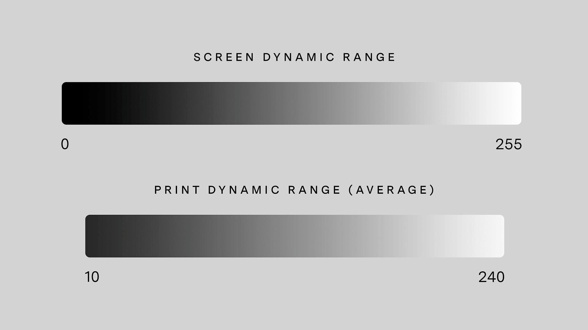
The point here is lifting the blacks and dark shadows a little higher than how the image was edited for screen to compensate for the reduced dynamic range of paper (illustration below). Paper cannot print pure white or black. Instead, it prints a compressed range of tonal values, depending on paper type (glossy has more range than matte). If the image now appears soft, try lifting the whites and/or adjust the midpoint to compensate.
When adding adjustments, it's also a good idea to enable gamut warnings by selecting Menu > View > Gamut Warning (or press Shift + Command/CTRL + Y on the keyboard). Any areas painted 50% gray indicates colors that are out of gamut, as illustrated below.
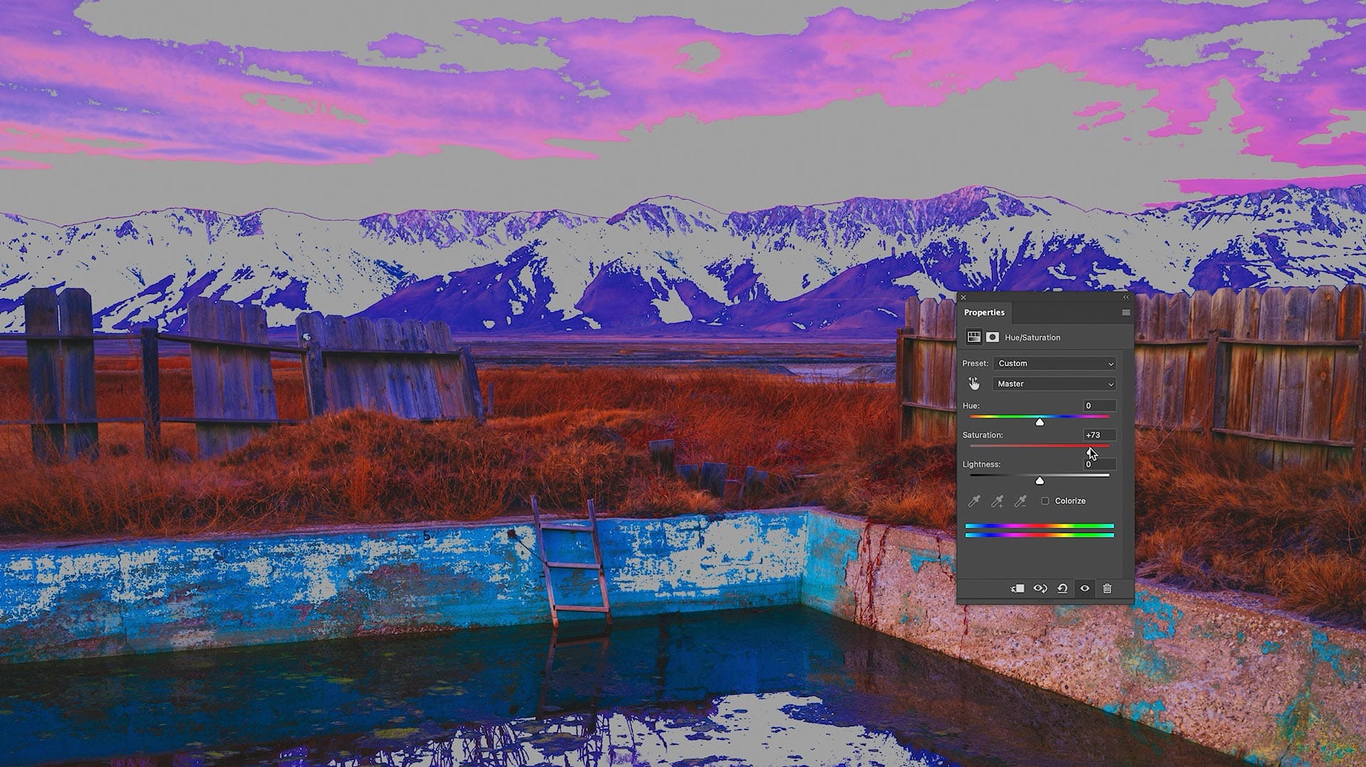
To fix these issues, add a Hue/Saturation adjustment layer from the Adjustment Layers panel, then either lower saturation across the entire image, or target specific hues in the panel properties until the gray disappears. Note that this will affect all hues across the entire image, so if you'd rather be more selective, mask the Hue/Saturation layer, fill the mask with black, set your brush color to white, then paint over the affected gray areas.
If no gray areas are visible, all colors are "in gamut" and are fine for printing.
When I'm happy with how the proofed version of my image looks, I save it as a new PSD and move on to resizing.
Resizing the image for printing
Next, I duplicate and flatten my “PRINT” PSD to create a third file. Now we're ready to resize the image to the exact dimensions it will be printed at. You could just let the printer scale the image for you, but it’s better to resize the image ahead of time to fine tune its output.
When resizing, keep in mind whether an image will be printed with borders, or without. For example, if you want a half-inch, white border around the corners and edges, resize the image to be one-inch smaller all the way around (eg, 12x18" for 13x19" paper).
If downscaling an image to a smaller size, I simply use Photoshop's built in resizing by selecting Menu > Image > Image Size and entering the new target dimensions.
When upscaling an image to a larger size, I could use Photoshop (it does a good enough job in most use cases), but prefer Topaz Gigapixel AI. I like Gigapixel because it typically does a better job handling artifacts and rebuilding details when upscaling pixels. Gigapixel can also denoise and sharpen when upscaling, if so desired. I also like that it works as plugin for Photoshop so I can upscale without leaving the app.
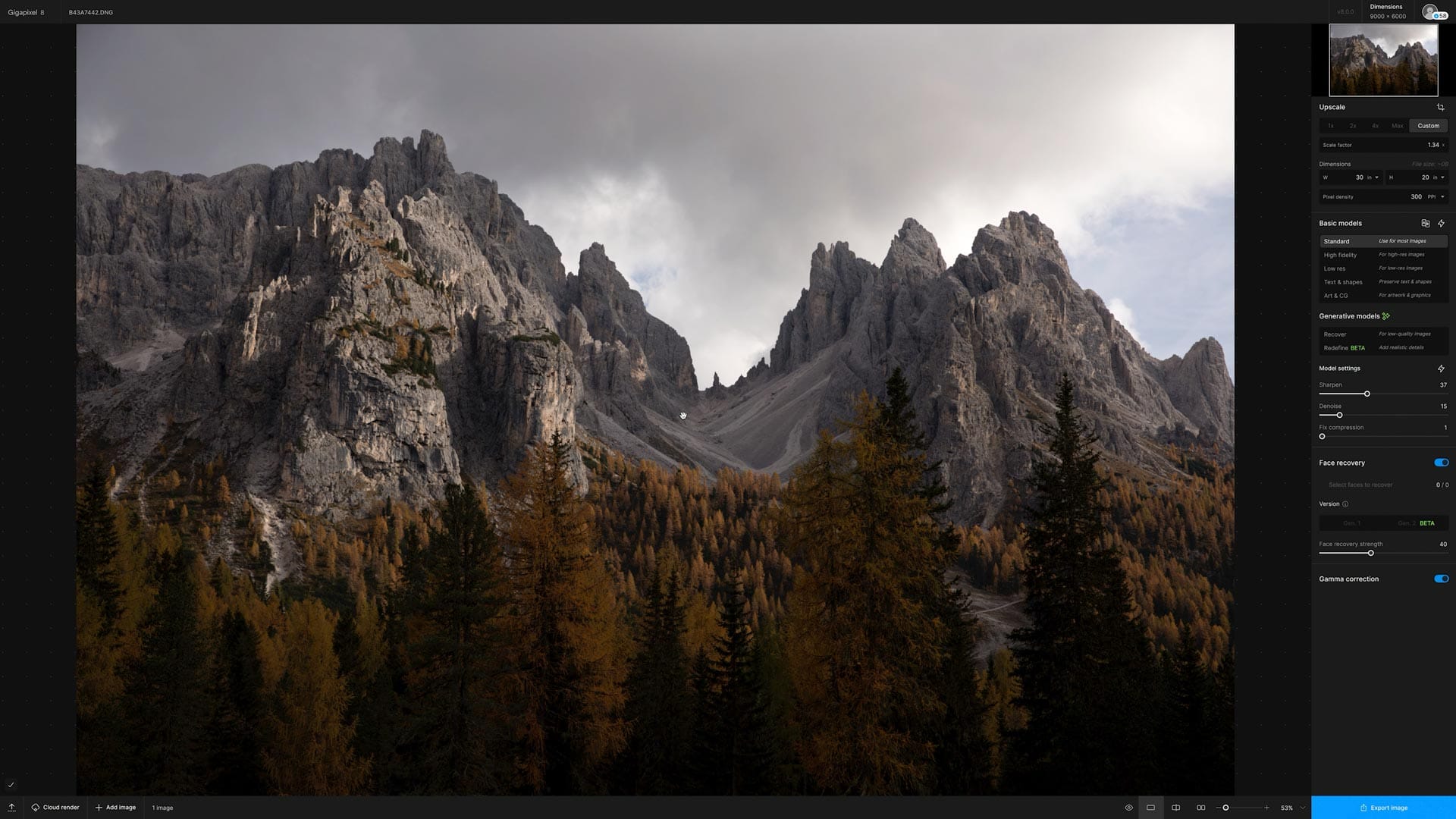
300 dpi is considered the norm when making prints, but can be dropped to around 150-200 dpi when making very large prints (because the prints will be viewed from a distance). Personally, I keep things simple by sticking to 300 dpi.
Sharpening the image for printing
It's better to sharpen at this final step of the image process so we're working with the actual pixels that will be printed. Images almost always require some additional sharpening when upscaling and downscaling, so it's best to wait until the end.
My first sharpening step is Photoshop's High Pass filter, selected through Menu > Filters > Other > High Pass. This will target and accentuate areas of division and contrast. I recommend zooming into the image, and increasing Radius (image below) until major areas of division are visible but super fine details are not. A little goes a long way, so just a little should do the trick.
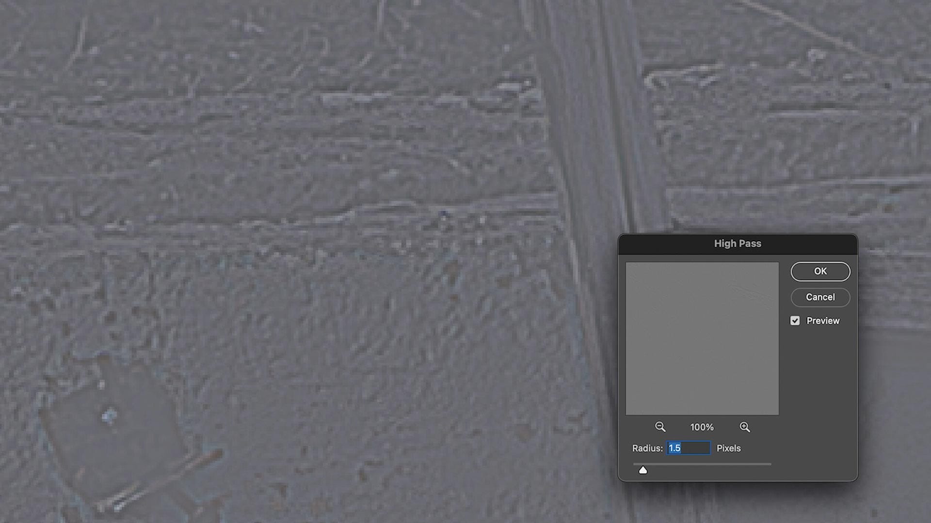
When finished, click OK, set the layer's blend mode to Overlay, and adjust Opacity if needed. Toggle the layer's visibility on and off to see the difference and decide whether the image needs more or less sharpening. If so, delete the layer, create a new duplicate layer, and try again.
Depending on the results from High Pass and how inherently sharp the image is, I sometimes add additional sharpening by selecting Menu > Filters > Sharpening > Unsharp Mask or Menu > Filters > Sharpening > Smart Sharpen. The former is simpler and more straightforward, while the latter provides more nuanced controls, plus the option to save presets for future use.
The overall goal here is lifting details and emphasizing areas of division to counteract the inherent softness that occurs when images are printed using inks on paper. Glossy and metallic papers typically require less sharpening (for they do a good job of "holding" texture), while matte and rag papers may need a little more. In my experience, sharpening can be pushed a little more aggressively with prints compared to editing for screen. Remember to check for undesirable white halos around areas of high contrast, a common problem when too much sharpening is applied.
Update (March 2025) — Check out my new calculators to help quantify the best print sharpening settings.
Outputting the image for printing
With an image resized and sharpened, I make at least one more test print before moving forward to bigger and/or higher quality paper stocks. A final gut check, so to speak. If everything looks good, I flatten the layers and save the image as a TIFF for printing.
Remember at this step that the finished, saved TIFF will reflect the adjustments made earlier when soft proofing the second image. When in doubt, re-enable soft proofing and check again before finishing.
When uploading to an online lab, pay close attention to any automatic image enhancements or adjustments. For instance, Whitewall includes an “Image Optimization” feature that typically increases brightness and contrast. While this can be helpful for casual users, it’s likely undesirable if you’ve meticulously prepared your image for print and want it to remain unaltered.
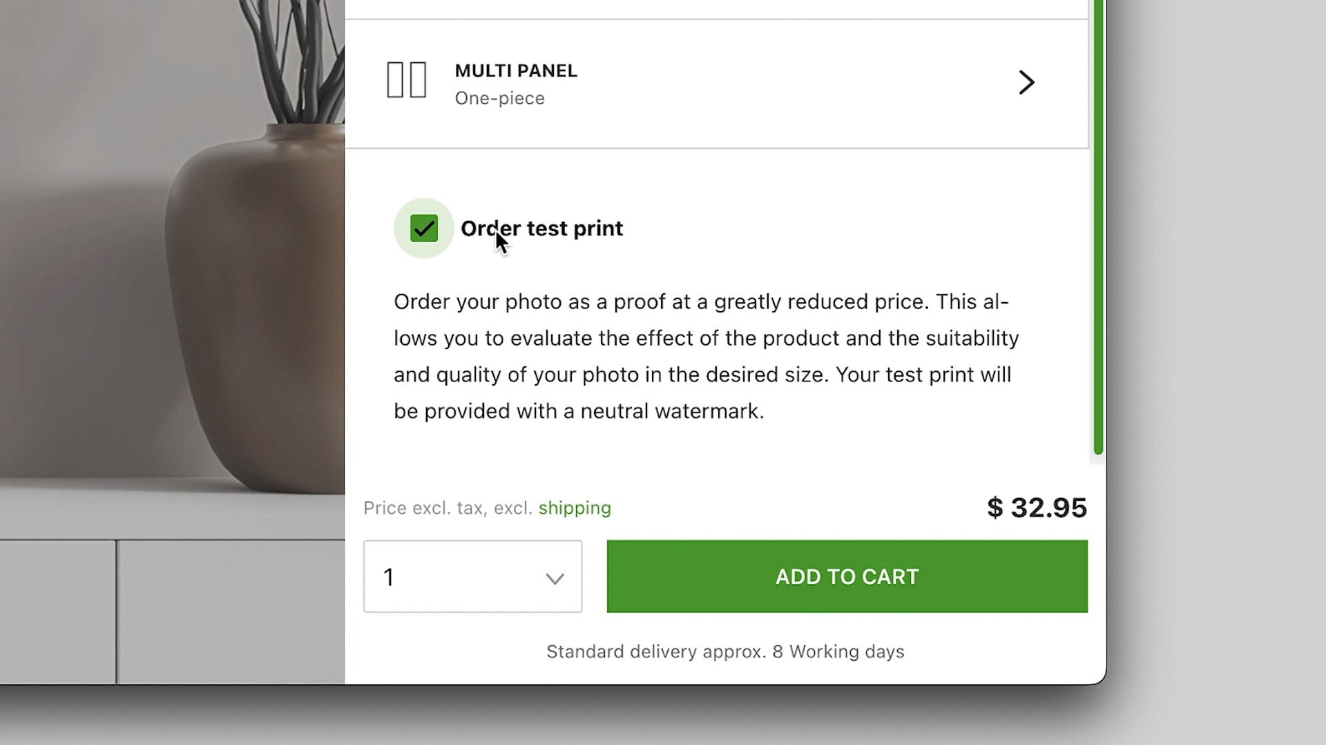
Whitewall also provides a cost-effective “test print” option for unmounted papers, which is ideal for evaluating your images. I’ve frequently used this service to print photographs at their intended size on my chosen paper stock before committing to a mounted or framed print. These test prints include small watermarks but are otherwise identical to the final product, making them a valuable tool for ensuring your print meets expectations.
Crossing the finish line
By now, you should have your finished print in hand! At this stage, it’s important to view the print under natural light and compare it to your on-screen image. If the print appears darker than expected, consider reducing your monitor’s brightness further to better match the print’s output. Also consider re-calibrating your screen to the D50 white point for more accurate comparisons.
Also, remember that printing just like photography itself - a process of continuous learning. Each print teaches you something new and helps refine your workflow. Moral of the story, keep printing and shooting.
