Want better colors? Learn to see the undertones
Learn to see color by training your eye to recognize subtle undertones—essential for better edits, cleaner matches, and more intentional hues.
Color is one of the most challenging aspects of photo editing: frustrating, unpredictable, and easy to get wrong. Even deciding what looks “right” can be slippery. Among all the skills involved in editing, developing the ability to see, interpret, and shape color with intention is one of the hardest to master.
Part of the solution, I believe, is learning how to see and break color down into components. Training our eyes to isolate and evaluate a color—not simply as a whole, but as a mix of underlying elements.
In practical terms, this means seeing inside colors and understanding their recipe. Something akin to a painter mixing dabs of paint on a palette to form the color they want.
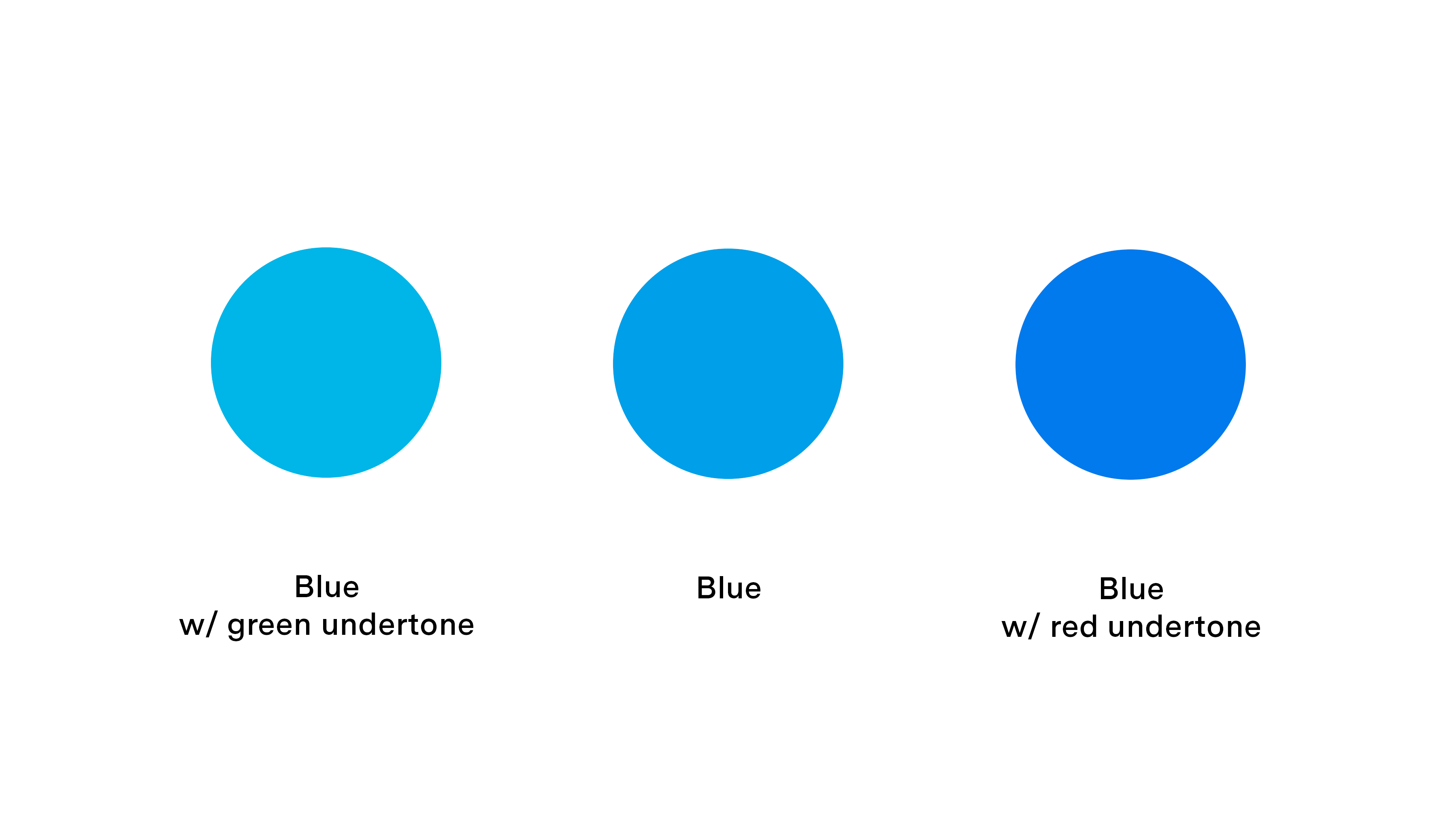
In photo editing, color adjustments are often less about dramatic transformations and more about subtle shifts in a hue’s secondary undertone—the faint color influences that alter the perceived temperature or character of a primary hue. Take the image below, for example. All three swatches are blue, yet each carries a different undertone: the left leans slightly toward green, while the right drifts subtly into red. These nuanced variations may seem minor, but they play a critical role in shaping and adjusting colors in color photography.
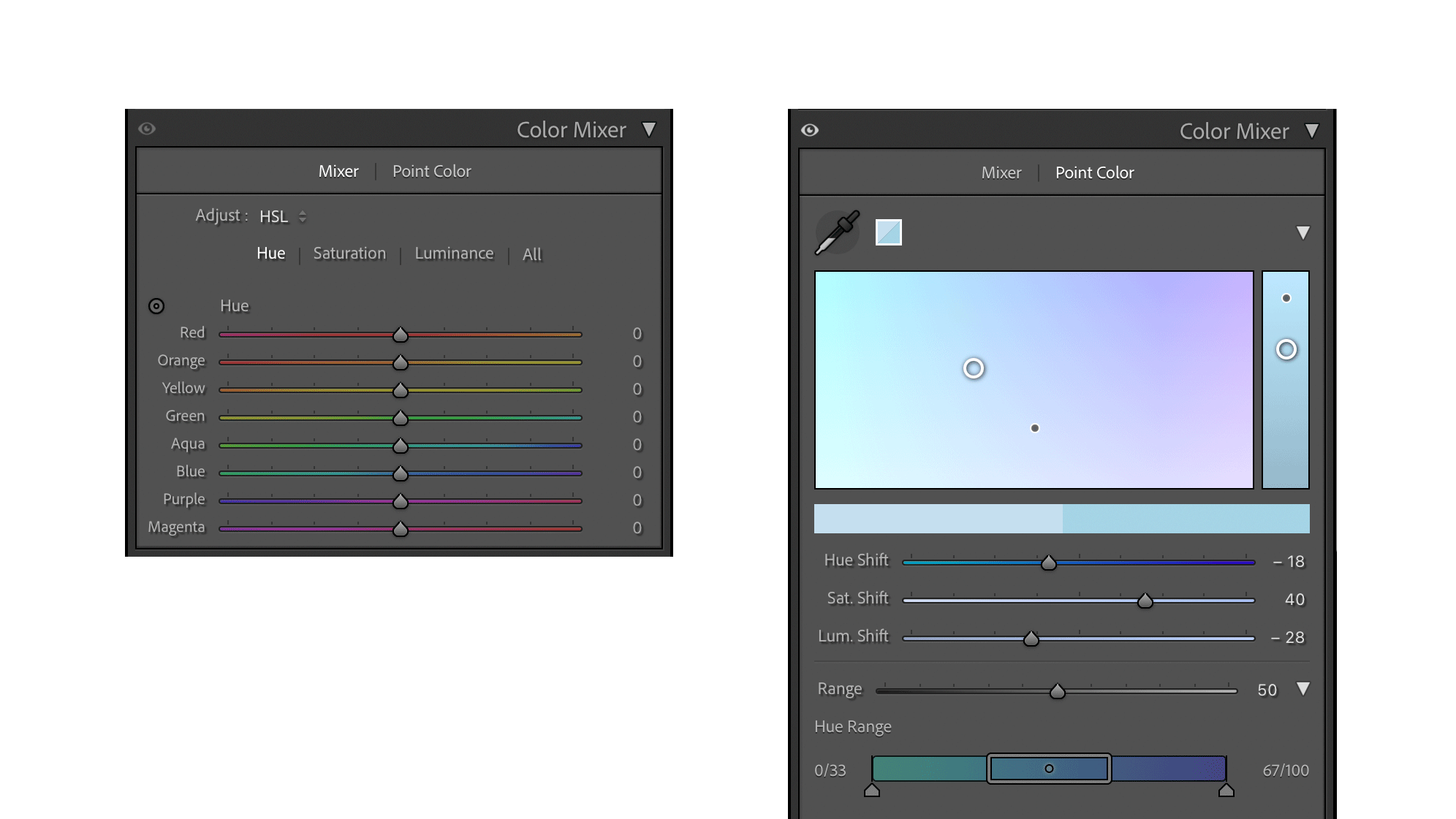
In Adobe Lightroom, Lightroom Classic, hues are typically adjusted using the Color Mixer, which includes HSL and Point Color tools for precise, swatch-based control. The Hue sliders shift colors along the color wheel, subtly changing their appearance by nudging them toward neighboring hues. These adjustments can affect a color’s perceived warmth or coolness by altering its undertone. When applied with care, they refine a hue’s character without pushing it into an entirely different color family.
In Adobe Photoshop, there are two primary adjustment layers for manipulating color: Selective Color and Hue/Saturation.
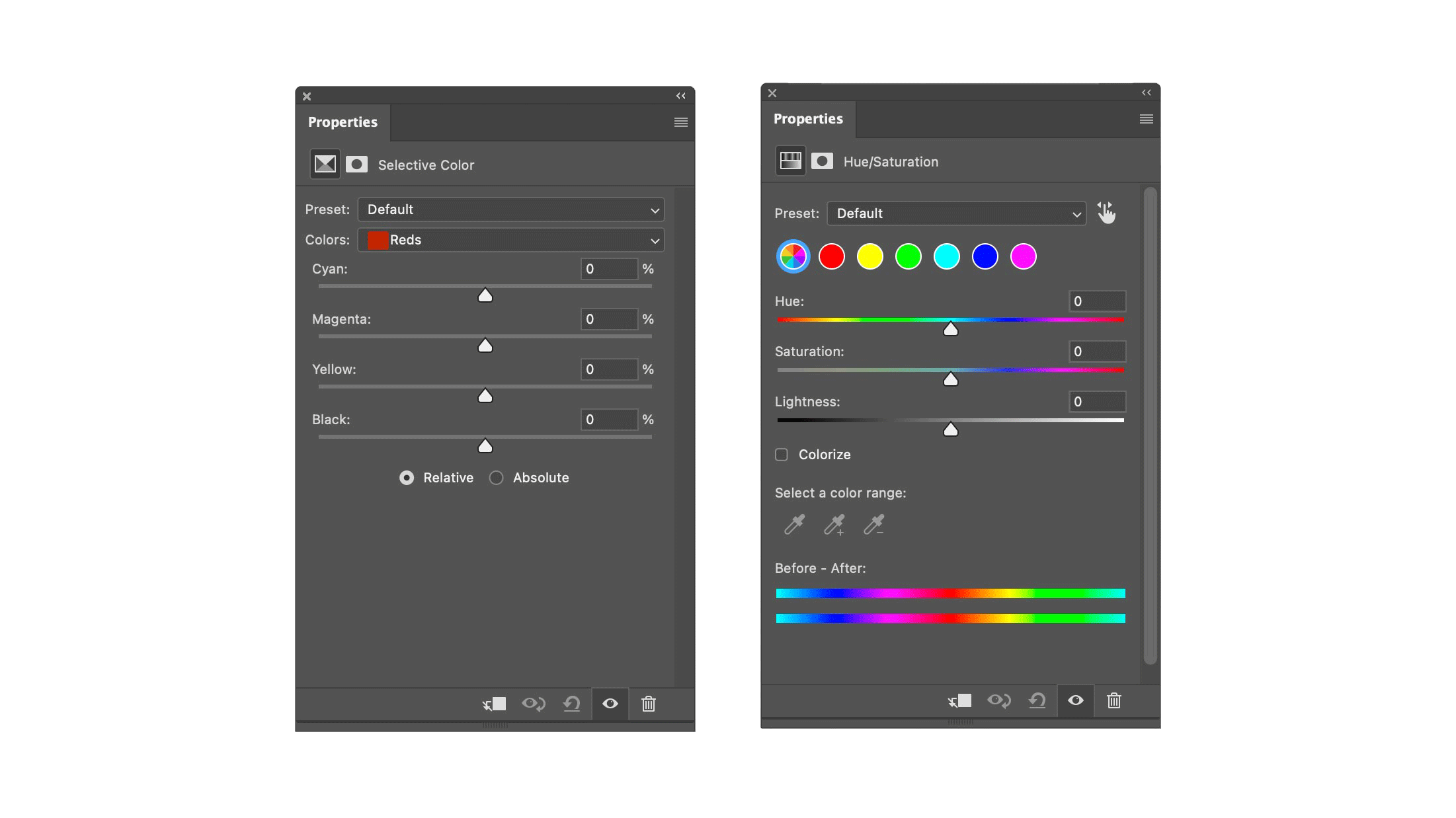
The Hue/Saturation adjustment operates using the HSL (Hue, Saturation, Lightness) model. It allows users to shift colors dramatically or subtly, including sweeping changes around the entire color wheel. Worth mentioning, Adobe recently updated this tool with a redesigned interface that includes visual color swatches and a new “Prominent Hues” feature, which analyzes the image, averages the dominant hues, and displays them as editable swatches.
Selective Color, by contrast, offers a more nuanced, component-based approach to color adjustment that feels closer to traditional subtractive processes used in painting and printing. Instead of shifting hues globally, it allows precise control over the individual CMYK components—Cyan, Magenta, Yellow, and Black—within specific color ranges like Reds, Blues, or Greens. This enables subtle correction of color casts, tonal refinement across Whites, Neutrals, and Blacks, and the ability to deepen and enrich colors.
This is why I prefer Selective Color—its controls offer greater nuance. For example, to warm up the reds in an image, I can shift its undertone by reducing cyan and blue. To cool the reds down, I shift its undertone by adding cyan and blue. Selective Color can handle just about any color editing task, from small, subtle shifts in a hue's undertone, to removing color cast in the Neutrals, to increasing the strength and presence of a hue without necessarily increasing its saturation.
Learning to see and decipher undertones
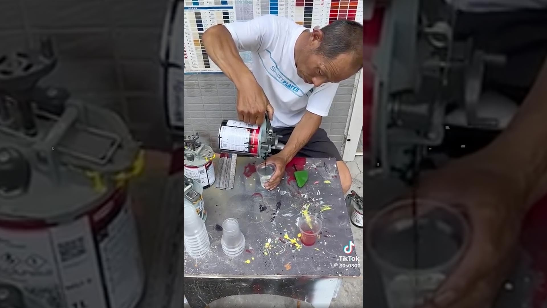
There's a great series of videos going around social media of a man mixing paints on the street, seemingly using only his eyes to break down a color provided by a customer. He then quickly mixes the exact measurements of paints and tints to create a practically perfect match. Some observers believe there's some clever sleight-of-hand here, but I prefer to believe it's entire real.
While most of us may never reach that level of mastery, we can train our eyes to become more attuned to color undertones. With practice, we learn to evaluate hues by sight alone—discerning the subtle shifts that give a color its character. Over time, this skill can become intuitive, allowing us to recognize when a hue’s undertone feels right or wrong for a given image, and to know instinctively how to adjust its “mixture” to meet our creative intent.
We can practice this every time we sit down to edit an image in Lightroom, Photoshop or other applications using the aforementioned tools.
Or, we can play a game.
As an experiment, I spent a few hours prompting ChatGPT to code a simple color matching game using an interface similar to Selective Color in Photoshop. The goal of the game is to match the hue of the right swatch to the left by adjusting the amount of Cyan, Magenta, Yellow and Black.
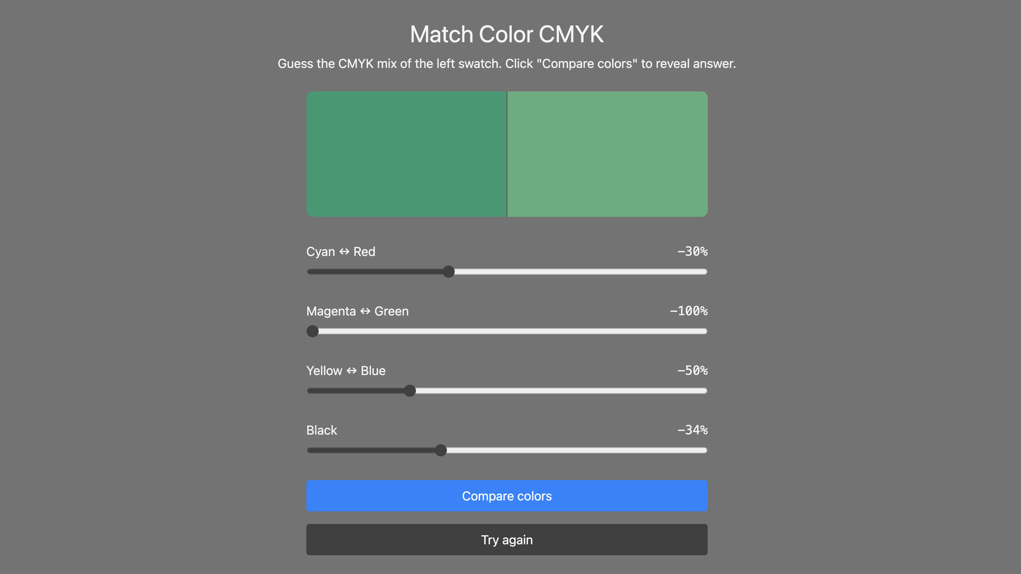
To begin a color match, start by closely analyzing the swatch on the right using only your eyes. Try to determine whether its undertone leans warm or cool, and whether there are hints of magenta, green, or other secondary influences in the mix. Also consider how light or dark the hue appears—how much black might be affecting its density. Once you’ve made those observations, adjust the sliders in the directions that neutralize the undertone and bring the hue closer in appearance to the reference swatch on the left.
Once you’ve reached your best guess, click the “Compare Colors” button. The app will show how closely the two swatches match, along with the correct slider values displayed in green. You can then move your sliders to those values to reveal the correct “100% Match” result. Click “Try Again” to test your eye on a new color.
It took some back-and-forth to get ChatGPT to understand exactly what I had in mind—but once it did, it built the app far faster than any of us could have done from scratch. I'll be experimenting with more app ideas like this in the future.
Summary
With practice, we can all improve the colors in our images by deepening our understanding of how they’re constructed—learning to recognize the underlying “DNA” of a hue and how its components interact. The more we train our eyes to see these subtle building blocks, the more confidently we can shape and adjust color to suit our creative intent.
Video
Check out the video version of this article.