Building a DIY print viewing booth
Building my own ISO 3664 compliant photo print viewing and proofing booth with off-the-shelf products
Since I started making my own photography prints, I've struggled to find balanced, accurate light to view and analyze them. Light which illuminates prints evenly from corner to corner and edge to edge, without introducing shadows or bias. I looked into professional print viewing hardware, but those products are extremely expensive. I’m sure their quality and convenience is great, but couldn’t justify their high price tag, especially when I might be able to build something of my own for far less money.
Following the standard
When I started researching this, I learned about ISO 3664 P2, a standard published by the International Standardization Organization. This standard defines lighting conditions for viewing prints in graphic arts and photography. Requirements for ISO 3664 include:
- Color Temperature: A standardized light source with a color temperature of 5000 kelvin (D50)
- Illuminance: Viewing surface should be lit to 500 lux
- Evenness: Light must be uniform across the viewing area, with no hotspots or shadows
- Color Rendering: Light source must have a Color Rendering Index (CRI) of 90 or higher
- Surround Conditions: Walls and surfaces near the viewing area should be neutral gray to avoid color cast
Buying hardware
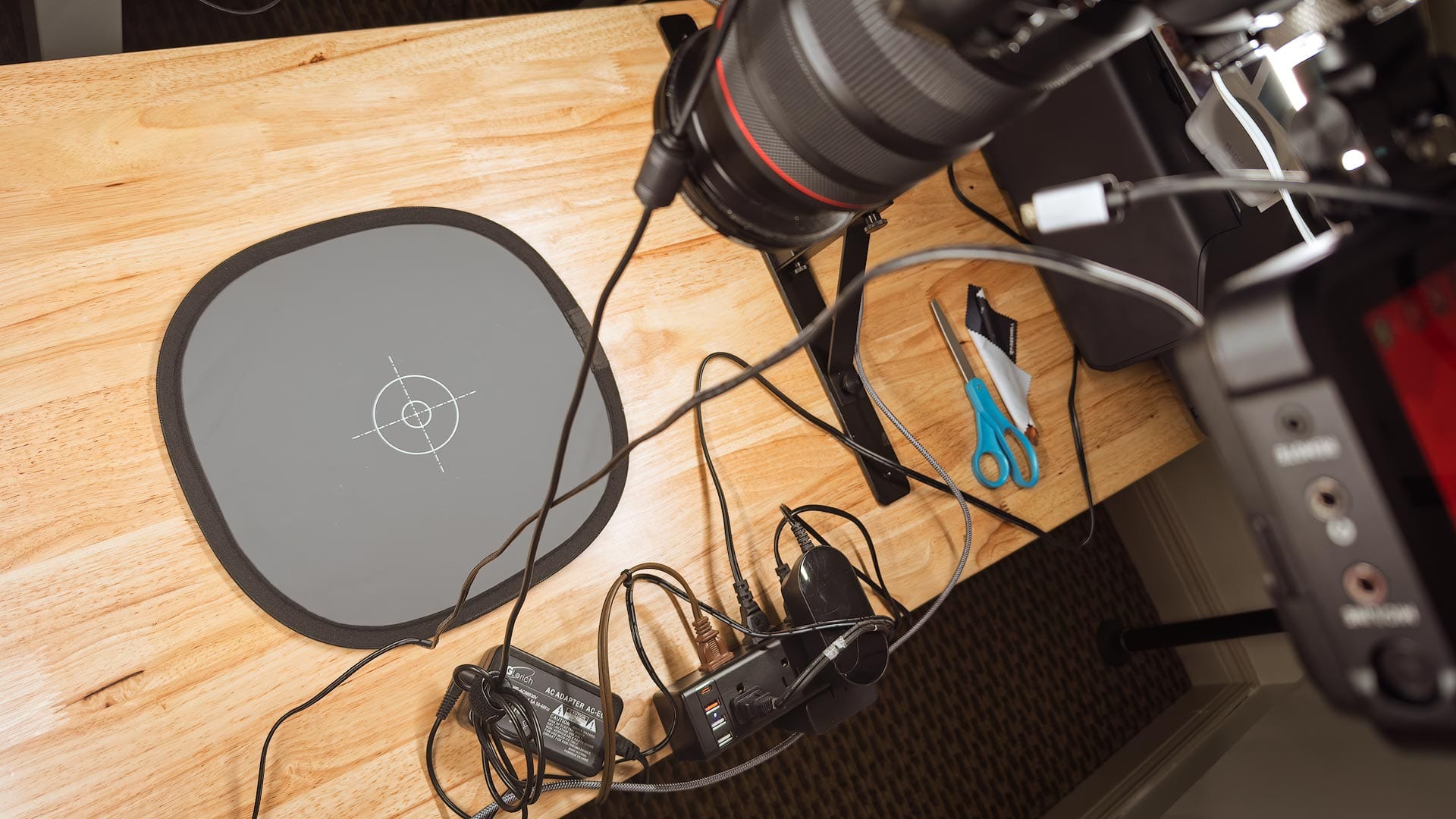
To begin building my own proofing booth, I bought a couple of LED linear fixtures from Waveform Lighting. These lights meet the requirements of ISO 3664 by emitting light at 5000 kelvin (D5o). This temperature is a little warmer than the D65 white point used by screens, and intentionally mimics the look of midday sunlight in the real world where a print would be viewed. These lights also have a high CRI value of 95 for optimum color accuracy, and can be cleverly daisy-chained together to extend their length and use only one power cord.
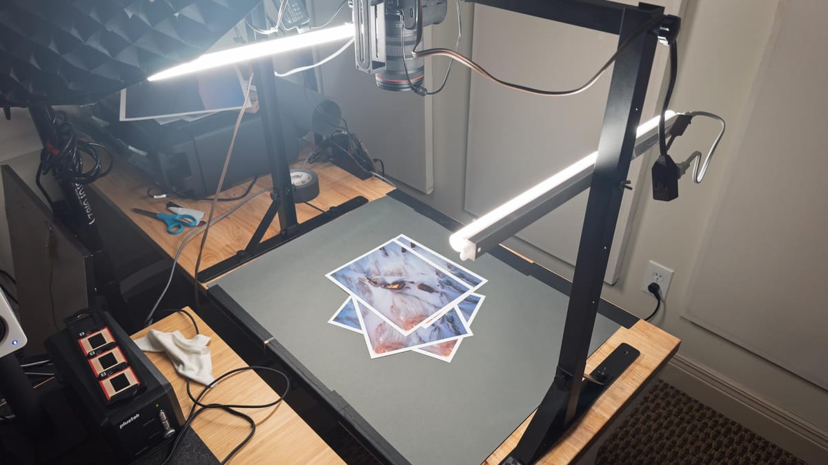
My first idea was to mount the lights inside a bookcase or underneath a shelf (the lights come with magnetized clips to do just that), but instead I bought a used Glide Gear OH100, a table-top metal frame designed for shooting top-down photos and videos.
This turned out to be perfect, for the Glide Gear provides more than enough room to view a 13x19" or A3+ print (the largest print I can make with my Canon PRO-300), and I can mount and adjust the position of my Waveform D50 lights using the 1/4-20 threads on its side columns. Best of all, I can also mount a camera and use the print booth for top-down photography and video content for my YouTube channel.
Something similar to the GlideGear could be built using spare lumber or PVC pipes from a hardware store.
But then I ran into a problem. As mentioned earlier, ISO 3664 stipulates a luminance of 500 lux. Each Waveform D50 light outputs light at a fixed brightness of 900 lux, without dimmer control. Together, they would output light approximately 3x brighter than the 500 lux standard. I could move the lights up and down the Glide Gear to make the surface brighter or dimmer, but couldn't calculate 500 lux without a fancy, expensive spectrometer.
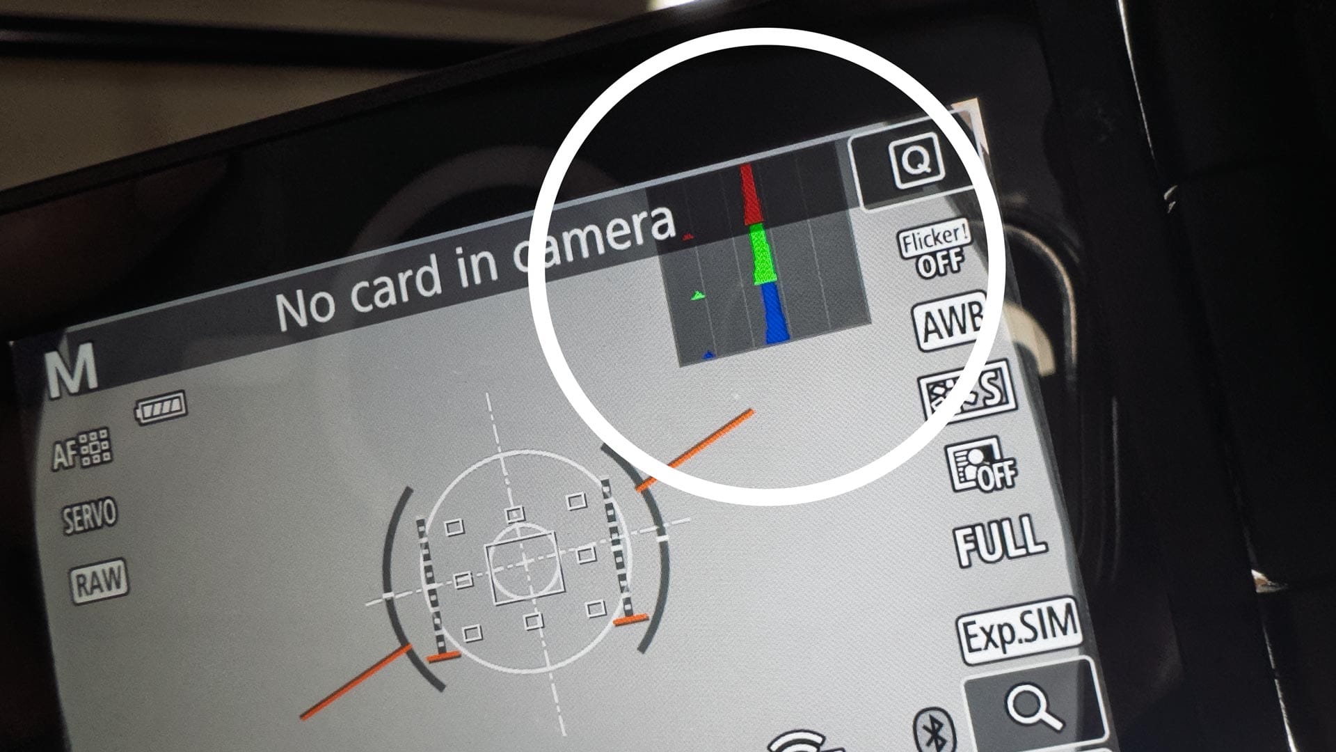
It was then I found a solution in the ISO 3664 specification: a method for setting light levels using a camera and an 18% gray card.
The concept is straightforward. If you photograph an 18% gray card and its value falls in the middle of the histogram, the lighting is around 500 lux—as long as the camera is set to one of these exposure settings, as defined by ISO 3664:
- ISO 100 with a shutter speed of 1/15 second at f/2.8
- ISO 100 with a shutter speed of 1/30 second at f/2.0
- ISO 200 with a shutter speed of 1/30 second at f/2.8
- ISO 400 with a shutter speed of 1/60 second at f/2.8
- ISO 800 with a shutter speed of 1/125 second at f/2.8
With this workaround, I was able to roughly achieve 500 lux by manually setting my camera exposure to ISO 400, 1/60 sec and f/2.8, then moving the lights up and down the side columns while keeping an eye on my histogram. When the gray card landed in the middle, I had found the sweet spot.
(Nerdy side note: 500 lux isn’t arbitrary — it’s roughly equivalent to the brightness of a display calibrated to 100 cd/m², which is a common recommendation for photo editing and viewing. This is why 500 lux is used as a reference level in ISO 3664.)
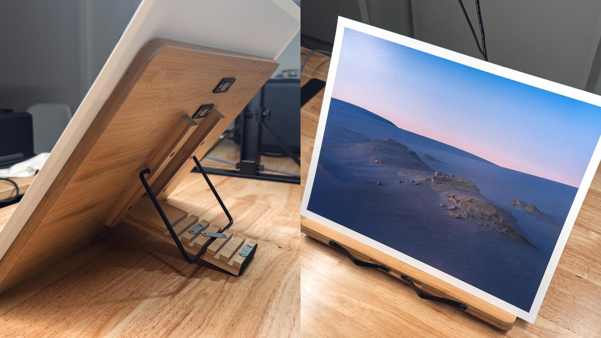
Another thing I noticed with some professional print viewing stations is that prints can viewed at an angle to mitigate reflections and provide a more comfortable viewing experience. For that, I added a simple book stand with adjustable angles. Perfect.
Finishing touches
I happened to have a roll of Savage Stone Grey backdrop paper, so I cut some out and taped it to the table underneath (see featured image at top of post). Not sure how neutral its grays are yet, but it's better than looking at warm wood.
Is this overkill for viewing prints? Probably, but I couldn't resist the urge to build something of my own for ~$1,000 less. In some ways you could argue this solution is better, for it can handle larger prints, and allows me to shoot photos and videos, which would be impossible with a smaller commercial viewer.
If interested in building something similar, I recommend checking other products offered by Waveform Lighting. In addition to the lights I bought, they also sell high CRI light bulbs, strips, and tubes which could be used creatively a variety of ways. If I had a room with a long table and unfinished ceilings, I'd totally get these shop lights. Someday.
For now, I'm pleasantly surprised by how well this turned out!