Comparing all four Canson Arches fine art matte papers
A hands-on look at Arches fine art photo paper. How they differ, what they’re best for, and which one might be right for your photography.
After trying some great fine art photo papers made by Hahnemühle (including these cool photo cards), I decided to test matte fine art photo paper made by another centuries-old European paper company: Canson. Specifically, papers in their Infinity Arches fine art collection, including:
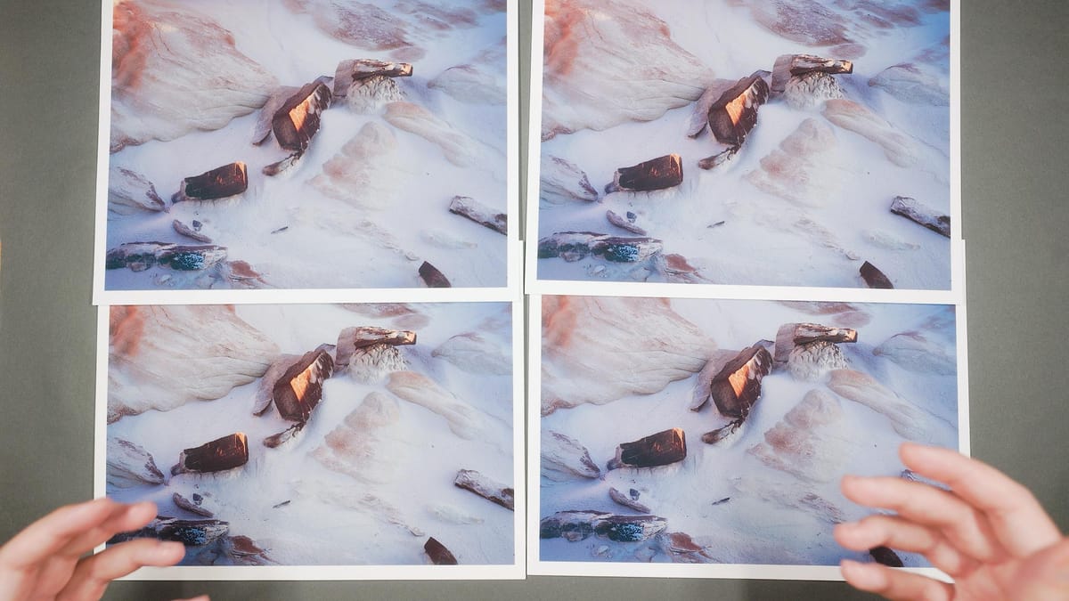
To test all four, I ordered a cost effective Arches Discovery Pack, which includes two sheets of each paper. Each sheet has a helpful sticker on the back for easy identification. I picked a recent landscape image of mine with cool, neutral and warm hues, plus notable detail and texture, then printed it on all four paper types using Canson's official ICC profiles for the Canon PRO-300.
All four papers are very similar. Each is made from 100% cotton, acid-free, free of optical brightening agents (OBAs), and finished with a subtle matte texture that gives a soft, painterly look. As you’d expect from a fine art paper by a company with over 50 years of experience, they all look and feel excellent.
But there are some subtle but important differences between these papers.
Arches 88: An ultra-smooth paper with no surface texture. It has a neutral color temperature and bright whites, with a CIE whiteness of 96—indicating both high brightness and excellent color neutrality.
Arches BFK Rives Pure White: Slightly textured and nearly identical in neutral tone to Arches 88. With a CIE whiteness of 97, it offers extremely bright and balanced whites without optical brightening agents (OBAs). In fact, Canson claims it’s the brightest fine art paper on the market that contains zero OBAs.
Arches BFK Rives White: Has the same subtle texture as BFK Rives Pure White but with a warmer color temperature and a slightly dimmer, less neutral white point. Its CIE whiteness of 85 reflects both reduced brightness and a warmer (less neutral) tone.
Arches Aquarelle Rag: Features a more pronounced texture than BFK Rives, with a similarly warm color temperature. Still, its whites remain impressively bright and neutral for a warm-toned paper, with a CIE whiteness of 97—matching the cooler-toned BFK Rives Pure White.
Best options for different scenarios
No one type of paper is better than another—just different. Each has its own qualities, strengths, and weaknesses that make it suitable for different image types and creative goals. Here are my thoughts after printing on all four sheets.
Arches 88 is best for fine detail: Arches 88 has an extra-smooth finish that creates stronger contrast between detailed and non-detailed areas. Smooth areas of an image are printed smooth, which makes details easier to see compared to the other Arches papers where texture in the paper grain can obscure subtle elements.
Arches 88 and BFK Rives Pure White are closest to screen color: Most fine art photography papers have a warm, yellowish tone due to their natural fibers. However, Arches 88 and BFK Rives Pure White are more neutral in color, resulting in minimal shift from the D65 white point of a standard desktop display. This makes image colors appear more accurate when printed.
Arches BFK Rives White has its place: It’s the warmest of the three, with a softer white point and lower contrast that give it a classic, traditional feel. It’s a beautiful paper that could enhance the right kind of image, especially work with a vintage or painterly aesthetic. I tend to prefer more neutral papers with brighter whites, so this one doesn’t quite fit my style.
Arches Aquarelle Rag is ideal for painterly reproductions: With its pronounced texture that closely resembles watercolor paper or canvas, Aquarelle Rag stands out as the best choice in the Arches lineup for fine art prints aiming to replicate the feel of an original painting. The textured surface adds depth and character, helping brushstrokes appear more natural and dimensional. This avoids the flatness of photographic paper for photographers who like pronounced texture.
My personal favorite Arches paper
For my photography style, it’s a close call between Arches 88 and BFK Rives Pure White. I appreciate their neutral white tone, which better matches how my images appear on screen. I'd be perfectly happy printing on either paper. If I had to choose though, I’d go with Arches 88, for I prefer how its textureless, ultra-smooth surface preserves fine detail without interference from paper texture.
Of course, that’s just my personal preference. The best way to find what works for you is to print your own images on each paper. I highly recommend the Canson Arches Discovery Pack—it’s the most affordable way to test all the paper types and see which one suits your style best.