How to avoid over-saturated landscape images in Lightroom
Exploring the many tools and methods for controlling saturation in an image, from basic to advanced.
Every photographer, regardless of experience, is susceptible to over-saturating their landscape images. I've lost count how many times I've seen it mentioned in "top editing mistakes" videos and blog posts. The reason? Pushing saturation helps increase color depth and richness in raw images, but it can often lead to over-baked, unnatural looking results.
There are a few reasons why this happens.
One, the wide gamut displays most of us edit with today have more color latitude than sRGB. They allow us to push colors to extreme levels that go well beyond realism, and for that matter, what most printers can handle when making prints.
Two, it's easy to apply saturation across an entire image, to every pixel, without noticing how saturated a color already may already be. We might improve color in one area, while also blowing it out in another.
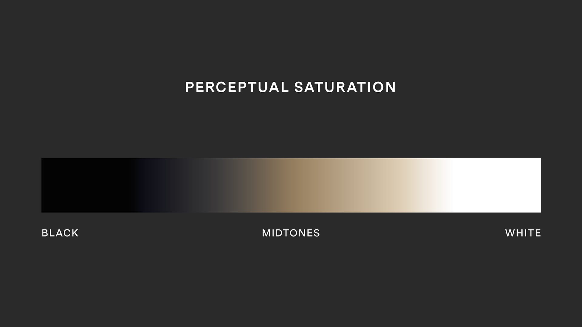
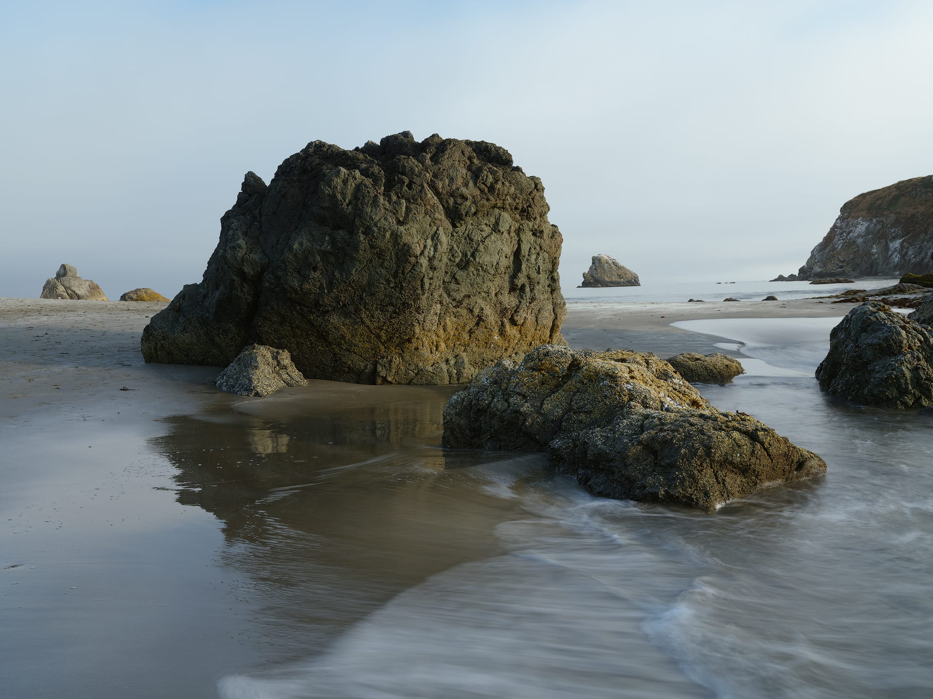
Three, we forget how we, as human beings, see and perceive colors in the natural world. Richly saturated colors typically land in and around the midtones. As light gets brighter or darker, color saturation naturally falls off. Not completely desaturated and neutral, but less colorful and saturated in comparison, as illustrated below.
Four, we overlook (or forget) that RGB is an additive color mode, where white is created when multiple colors are combined. This is the opposite of the subtractive analogue world, where colors get darker.
Because every pixel we see on screen is comprised of Red, Green and Blue, more of each channel is used when saturation is increased. This causes RGB colors to not only get more saturated, but brighter as well. At a certain point, their luminance can turn practically fluorescent and unnatural compared to the real world.
This happens because the RGB channels are tightly interdependent. Change one thing, and something else changes. If you've ever applied contrast to an image and then had to desaturate it because the colors became too bold and bright, that's how RGB channels (unfortunately) work.
Adding saturation in Lightroom and Camera Raw
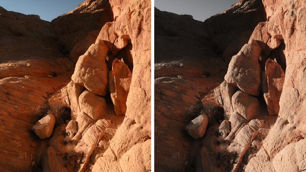
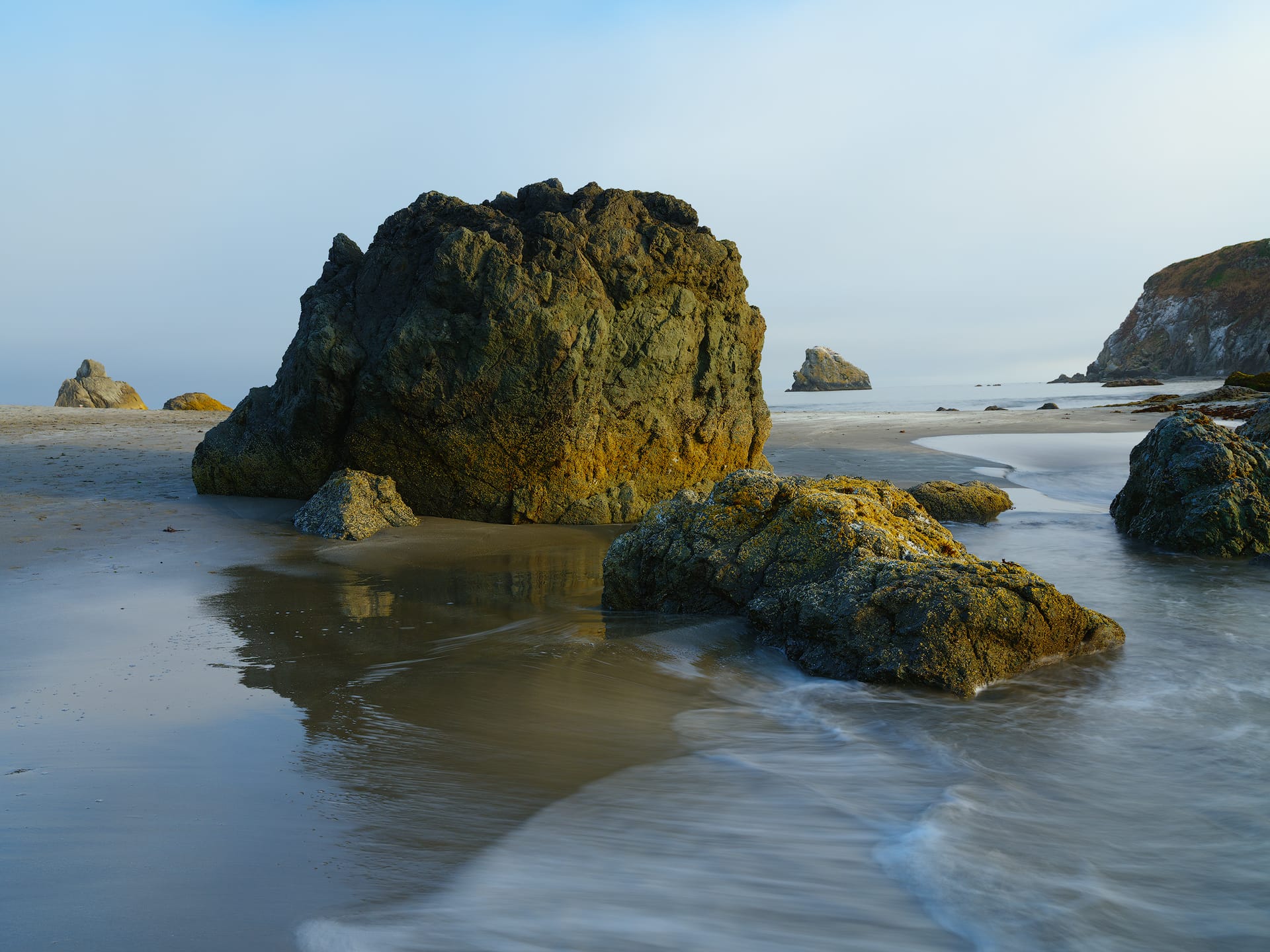
Lightroom, Camera Raw, and every other raw editor provides a dedicated "Saturation" slider. Generally speaking, these sliders are best avoided when adding saturation, for not only do they add saturation to every pixel in an image (without caring how saturated a pixel already is), but they also produce colors that appear unnaturally bright.
For example, look at the second image below. Notice how synthetic and strange the blues appear? The warmer hues in the rocks also feel a little off, but blue is most noticeable.
Adding saturation with Vibrance
Vibrance intelligently increases saturation by targeting pixels with low-to-medium saturation. Meaning, it has little-to-no effect on pixels that are already well saturated. This allows saturation to increase in areas which could use extra color, and ignore areas which are fine as-is.
However, it's worth noting that Vibrance can also increase the luminance of color, similar to the Saturation slider. It's more nuanced and less obvious, but colors can still get brighter when using Vibrance.
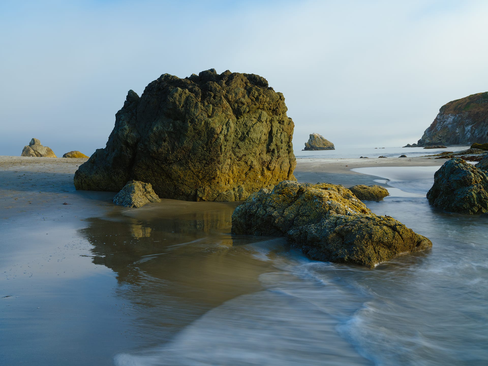
Here's the same image again with an equivalent amount of Vibrance. The image feels richer and more uniform, but the colors are (again) too bright and unnatural looking. The shadows are also getting thick and gummy looking with too much saturation.
Adding saturation with the Color Mixer panel
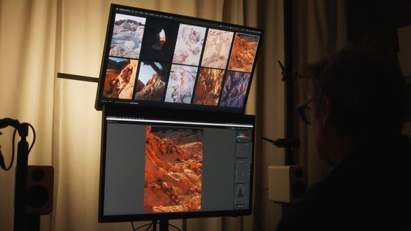
For more nuanced saturation control, the HSL panel (inside Color Mixer) allows you to control saturation within specific hues. For example, you can boost the saturation of your blues while simultaneously decreasing the saturation of your reds. This provides far better control over global saturation compared to the aforementioned Saturation slider. Options include "HSL" and "Point Color" for more fine-tuned adjustments.
[img - color mixer panel HSL and Point Color views]
Saturation adjustments in HSL don't increase luminance as much as the global Saturation and Vibrance tools. And if they do, luminance can be easily dialed back using the Luminance sliders in the same panel to create more natural looking results.
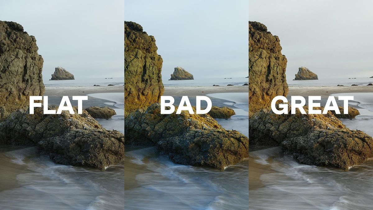
Looking again at the original image, I see two possibilities. One, keep the atmospheric blues and use them to complement the yellows and oranges in the rocks. Two, desaturate and diminish Aqua and Blue for a lighter, less heavy appearance.
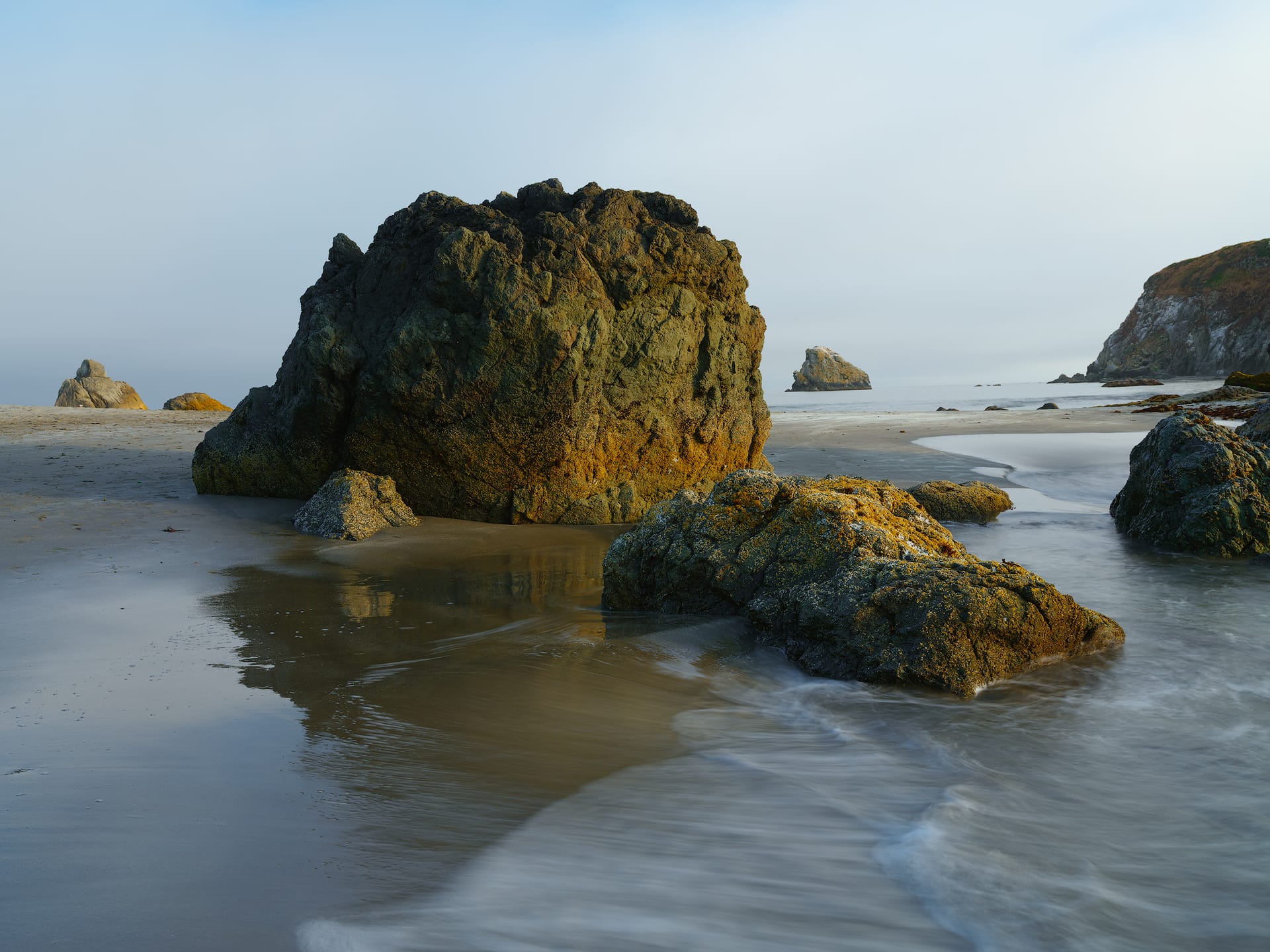
Here's an example of the first approach. With this, I desaturated Aqua and Blue, while also decreasing their Luminance. I also pushed their respective hues a little warmer (towards yellow) to make the cool tones softer and neutral. Finally, some slight adjustments to Yellow and Orange to make the rocks richer and more noticeable.
Here's the second approach. With this, I desaturated Blues and Aquas while also increasing their luminance in the HSL mixer. I also lightly shifted the tint of Yellow and Orange toward Magenta to help remove their green color cast. Some selective tonal adjustments in Basic Adjustments were also made to better balance the highlights, midtones, and shadows (especially shadows which were feeling a bit heavy).
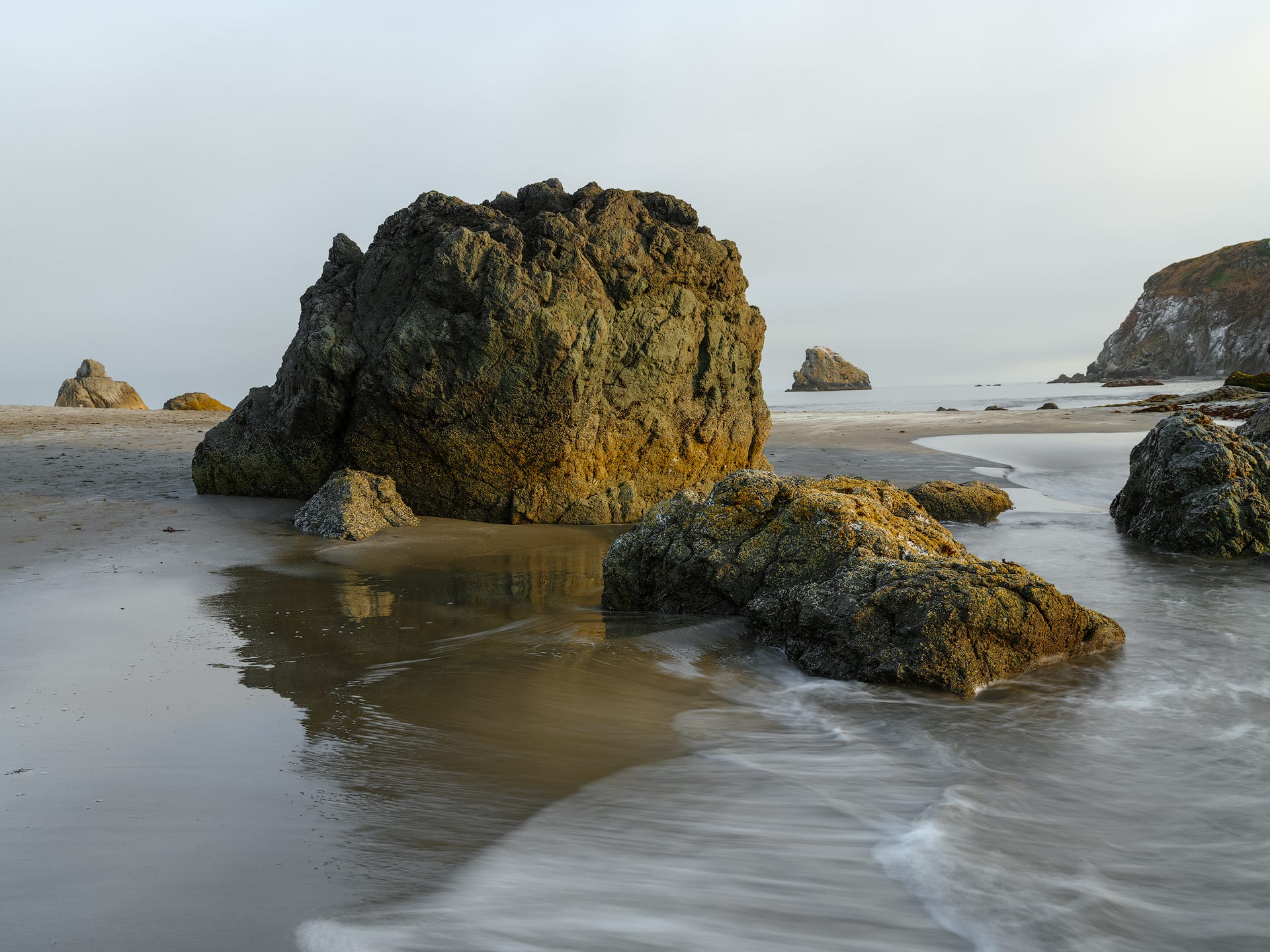
Subjectively speaking, either approach works. Maintaining blue (first version) gives the image more energy and a pleasing color contrast, while the second feels calmer and more atmospheric. I would personally pick the second, for I like my images to be less busy, but it can go either way.
Summary
As you can see, there are many methods for increasing color saturation in an image using either Lightroom or Photoshop. How little or much saturation an image needs is entirely dependent on your creative style and goals, so there are no right or wrong answers. What's more important is understanding the difference between each option, and using them with intention. Hopefully this walkthrough gave you some new ideas and approaches to experiment with!
Video
Here's the video version of this article, if interested.
Many thanks to Squarespace for sponsoring this video! Sign-up for a free 30-day trial, no credit card required, then use promo code DOMINEY to save 10% off a new website or domain.