BenQ SW272U long term review: still a good photography monitor?
My experience editing photos and videos using the BenQ SW272U 27" 4K PhotoVue display, and comparing it against newer options.

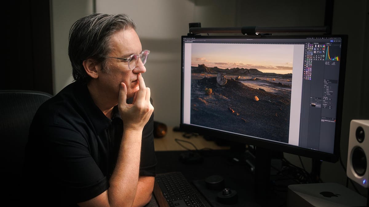
For the past couple of years, I've been using a BenQ SW272U for all my photo and video editing work. Since that time, I've received multiple emails and messages from others, asking about the display. Specifically...
- Do I still recommend the display?
- Have I experienced any issues?
- Do I need a 4K display?
- Do I need Adobe RGB?
- Are there better monitors on the market today?
How I setup my SW272U
Like other PhotoVue and DesignVue displays from BenQ, the SW272U comes factory calibrated with a printed report in the box. I would not, however, recommend using the default color mode options for very long. For optimum performance, the display should be calibrated using a third party calibrator (BenQ does not provide one). I use and recommend the Calibrite Display Pro HL, though there are numerous alternatives which can also work.
Calibrations are handled by BenQ's proprietary Palette Master Ultimate software, a free download for macOS and Windows. BenQ's software must be used to calibrate the display because the display is hardware color calibrated. Meaning, the software changes the mechanical output of the display, which can only be accessed through BenQ's software.
I've customized my SW272U with three modes, which are easily switchable using the SW272U's wireless desktop puck.
- Adobe RGB, D65 white point, 100 cd/m²
- Black and white
- Rec.709, D65 white point, 100 cd/m²
The first mode is my daily driver for editing images, using the Adobe RGB color gamut (more on that in a minute), D65 white point (the standard for digital displays), and 100 cd/m² for brightness. This brightness level is notably dimmer than what most displays use by default out of the box, and is better for photo editing because it more closely emulates the reflected luminance of light on paper. Meaning, it's more similar to a photography print viewed in the real world. 100 cd/m² is an option when calibrating the screen using Palette Master Ultimate, so it's easy to configure.
The second mode is a shortcut for browsing my entire image catalog in black and white (without converting color images). I find this mode extremely helpful when looking for color images that might work well as black and white. Not something you need a BenQ display for (both macOS and Windows offer black and white accessibility display modes), but having black and white available at the touch of a button is fast and convenient.
The third mode is for editing video using the Rec.709 HD broadcast television standard. Rec.709 has practically the same color gamut as sRGB, and is not required for editing video (apps like DaVinci and Premiere use color management to emulate Rec.709 within larger color spaces like DCI-P3), but I like the idea of working in the native color space without color management getting in the middle of things.
Why I use Adobe RGB, and whether you should too
Adobe RGB was introduced in the late 90s as an alternative to the smaller sRGB color gamut introduced by Microsoft a few years prior. Adobe created this larger color space to fully encompass the range of possible colors used in four color, CMYK printing. With screens supporting Adobe RGB, print designers could see more accurate colors when proofing their work.
And yet, despite its superiority to sRGB, Adobe RGB never really caught on outside of the niche printing world. Similar to the old Betamax versus VHS battle of the 80s, the inferior technology won, and sRGB became the standard for pretty much everything. This still holds true today when viewing images online, but the tide is slowly turning towards a newer color gamut named P3.
P3 is nearly the same as Adobe RGB, but slightly smaller, and with greater emphasis on richly saturated oranges and reds. In comparison, Adobe RGB encompasses a broader range of richly saturated cyans and greens. Meaning, there are some deeply saturated colors which can only be viewed in Adobe RGB, and others in P3. Otherwise, both color spaces support a nearly identical range of hues.
Put simply, P3 was designed for screens, while Adobe RGB was designed for print.
Practically speaking however, the only time a photographer would see a difference between Adobe RGB and P3 is when editing images containing bright, richly saturated cyans, blues and greens (think seascape photography). If editing and printing an image with "normal" saturation levels, a P3 edited print would look the same as an Adobe RGB edited print.
I could definitely use P3 if Adobe RGB wasn't an option, but because it is with the SW272U, I choose to use it instead.
Hardware performance
For daily photo and video editing, the SW272U hardware has been a solid performer. No dead pixels, glitches, malfunctions, or problems of any kind. The LCD panel does have some slight darkening around the inner edge of the screen (similar to a vignette). Not something I honestly noticed until testing a desktop OLED display with perfectly illuminated pixels from corner-to-corner.
Overall though, no white, glowing light leaks from the large, white panel illuminating the screen from behind. The backlight is well encased and blocked when displaying deep, dark shadows and blacks.
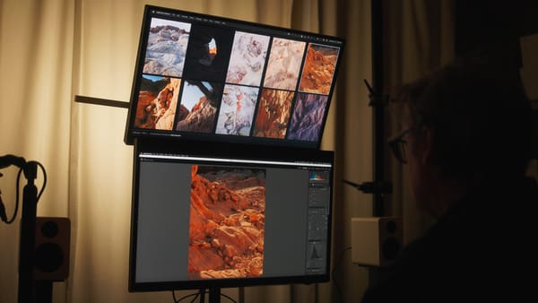
I very much like panel's matte finish. While some users favor glossy screens for their richer contrast and deeper blacks, I prefer matte because it provides a more neutral edit ing environment. Less bias that could influence my editing decisions, and its paper-like appearance does a better job of emulating how images appear when printed, making it better for soft proofing.
Software is unpredictable
The one issue I've encountered with the SW272U is the Palette Master Ultimate software. As mentioned in my initial review, BenQ's software quietly runs in the background, and is supposed to automatically switch ICC profiles in the macOS and Windows operating systems when switching display modes on the monitor. Switching ICC profiles is necessary so the operating system's color management system is communicating properly with the display (and thus, displays correct color and contrast).
I was excited by this feature, for it meant I no longer needed to manually switch ICC profiles when (for example) switching from Adobe RGB to Rec.709 to edit video (or vice versa). Palette Master Ultimate would seamlessly handle the ICC profile switch for me.
Since my review, this feature has been hit and miss. ICC switching worked at first, then mysteriously stopped for many months. Today though, it's mostly working again, but only when Palette Master Ultimate is running in the background. If not, ICC profile switching doesn't work, which can lead to a mismatch between the display and operating system.
Does any of this matter if you only use one calibrated mode? No. This would only affect you if you have two or three calibrated modes you switch between in your workflow.
Overall, I recommend keeping an eye on Palette Master Ultimate to ensure it's running at all times. If you use macOS like me, you may need to quit and relaunch System Settings to see which ICC profile is currently in use to ensure it's working properly.
Are there better display options today?
Since my review, BenQ introduced two new displays: the PhotoVue SW272Q and DesignVue PD2730S. I'm drawing attention to the latter because it is BenQ's first 5K display. Which means, it directly competes with the 5K, 27" Apple Studio Display, but costs less overall when factoring-in its matte display and adjustable height stand (which cost extra with Apple). This is a display intended for designers, so it does not support the Adobe RGB color space, nor does it come with a hood to block ambient light, but could be a solid option for some users. Now that BenQ has 5K hardware, I'm betting it's only a matter of time before a 5K PhotoVue display is introduced.
(5K displays are generally preferred by macOS users over 4K because they support Apple’s 2× Retina scaling. When the display is set to 2560×1440 (2.5K) in macOS, the system renders text and icons at twice the resolution — a clean 2:1 scale — which results in sharper visuals and places less strain on the graphics system. I don't think it matters that much, but is worth noting.)
The SW272Q is a more budget-friendly option with a maximum 2K resolution of 2560x1440. This is same effective resolution as the 5K PD2730S, but not quite as sharp because of the aforementioned Retina upscaling in macOS. It's also nearly half the price of the SW272U ($900), with all the same features and specifications, but with 109 pixels-per-inch (PPI) compared to 163 in the SW272U. I think this display could be a solid option for photographers who don't necessarily need or want a sharp display. I'd spend a little more and get the SW272U to see more detail and texture in my images, but that's just me.
Until BenQ introduces a 5K PhotoVue display, I still think the SW272U is the better BenQ PhotoVue option currently available.
What about OLED?
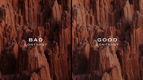
Some people consider OLED to be superior to backlit LCD panels (like the SW272U) because every pixel is a single, individual light. When pure black is needed, the pixels simply turn off. This is what makes OLED displays appear deeper and darker compared to LCD. OLED displays also don't exhibit any light roll-off around a panel's edge, as mentioned earlier.
I had a good experience recently using an ASUS OLED display, but from a photo editing perspective, wasn't convinced OLED was inherently better. OLED has its own tradeoffs, including some difficultly displaying accurate shadows just above black. OLED is also more susceptible to burn-in long term, and viewing angles aren't typically as good.
Don't get me wrong, for certain things like gaming and watching movies, OLED is definitely better. But for the work I do, I'm perfectly happy with the older technology used in LCD panels.
Summary
Until something better comes along, I'm still a big fan of the SW272U. Its color accuracy is outstanding, and prints consistently match what I see on screen. Switching between color spaces is quick and seamless. What I value most is the confidence it gives me. I trust that the hues and tonal values are being displayed accurately. That peace of mind matters more to me than any technical specification.


