Better color grading using Photoshop blend modes
Using the Color/Linear Burn and Dodge blend modes in Photoshop for stronger, richer color grades
Color grading is typically applied near the end of an edit, after exposure, contrast, and other foundational adjustments have been made. It’s an opportunity to give an image additional character, mood, and style. A common approach is to use complementary color schemes, such as adding blue, teal, or purple to the shadows and yellow, orange, or red to the highlights. This combination adds richness and energy to an otherwise flat, neutral image while also creating greater visual separation and definition.
Lightroom, Lightroom Classic, and Adobe Camera Raw provide a Color Grading interface designed for this purpose. But for those willing to explore additional techniques in Photoshop, there are powerful tools available that can yield even better results.
First, let me show you what I don't like about color grading in Lightroom.
Color Grading in Lightroom and ACR
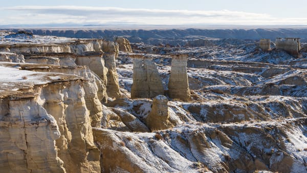
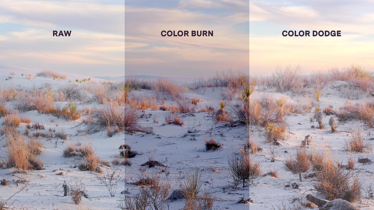
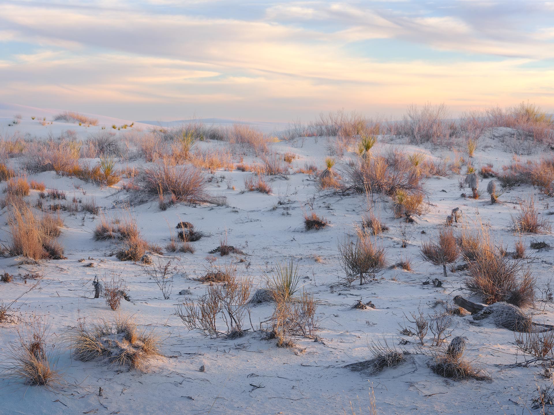
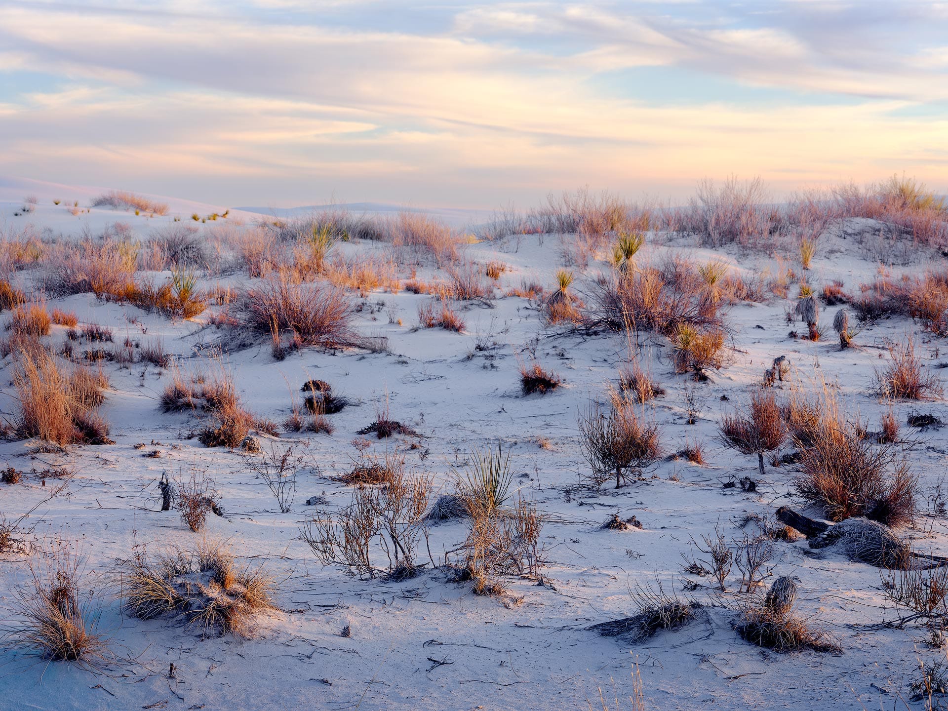
Here’s an unfinished landscape image of mine that could use a little more color. To do so, I'll use the Color Grading color wheels in Lightroom Classic to add a dark blue hue to the Shadows. This should emphasize the areas of indirect light reflecting blue from the sky above, and create more visual separation between the sand and the warm, yellow grass and highlights in the clouds.
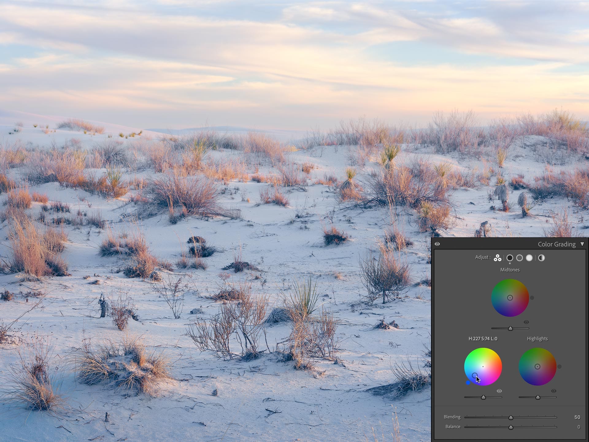
Notice what’s happening here. I’m adding a dark, rich blue to the shadows, but the shadows aren’t getting darker. Instead, they’re getting brighter. Additionally, the blue looks weak and chalky.
Some of this added brightness can be offset by lowering the exposure slider underneath the Shadows color wheel (as well as lowering blue’s luminance in HSL), but even with those modifications, the colors aren’t as strong and dense as I’d like. I want the shadows to feel like blue ink soaking into paper, not illuminated with a flashlight. Something closer to the depth and color of positive slide film.
Let's see what we can do using Photoshop.
Color Burn and Linear Burn blend modes
Open an image in Photoshop, then do the following:
- Add a Solid Color adjustment layer
- Select a dark blue hue (eg, #0712a7)
- Select "Color Burn" as the layer's blend mode
- Set "Fill" to 20%
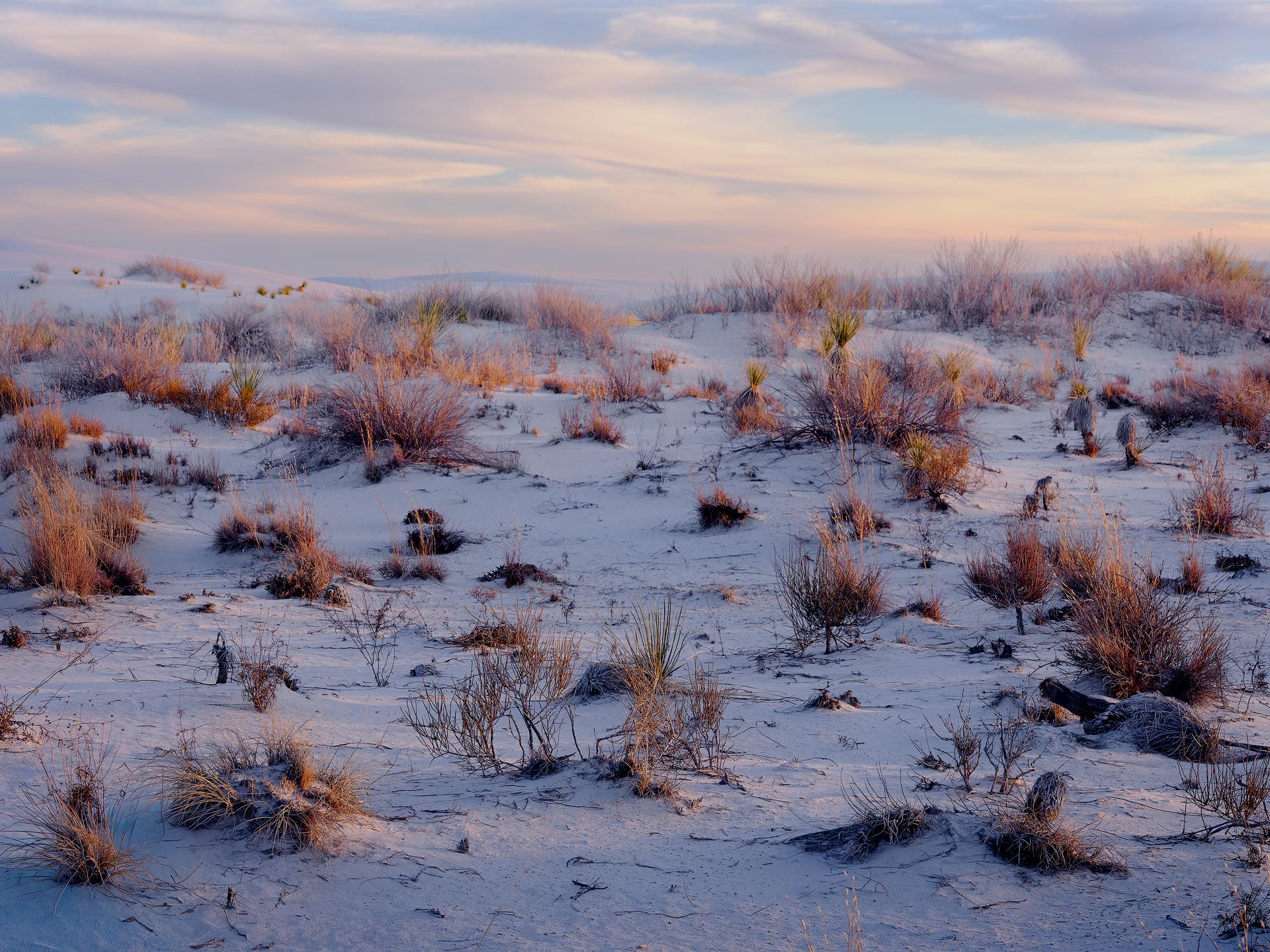
Here's the same image with this adjustment:
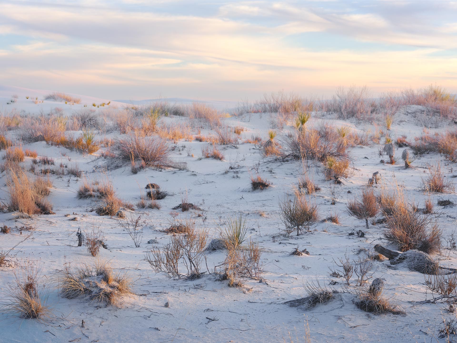
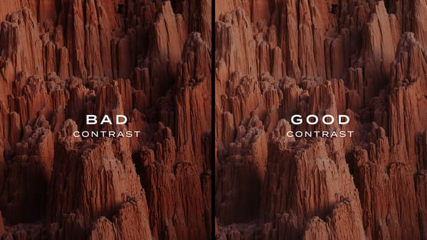
Woah! That's a completely different look. The shadows are not only darker and bluer, but the entire image has more contrast, depth and shape compared to the flat, ghostly image in Lightroom. Granted this effect is a bit strong (Fill is set to 20%), but I dialed it up to make the effect easier to see.
So, what's going on here? Well, the Color Burn blend mode darkens and intensifies colors using mathematical division. In simple terms, Color Burn makes the underlying image darker and more intense by emphasizing the difference between the base and blend colors. The effect pushes midtones toward deeper shadows and rich, saturated hues. As its name implies, Color Burn burns color into the image.
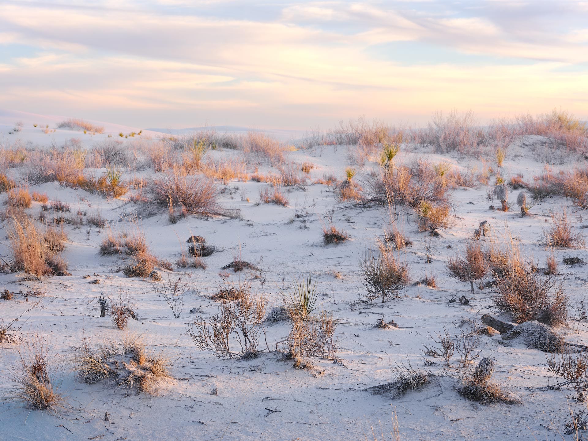
Now let's try these same settings with Linear Burn, a similar yet different darkening blend mode:
Like Color Burn, Linear Burn darkens all pixels in the image, but does so by adding the base and blend values together, then subtracting one unit of light. When blending a solid, uniform color as we are here, the result is uniform darkening that deepens color in equal measure across all tonal regions. Linear Burn doesn’t emphasize one region over another. Instead, it simply darkens every pixel by the same amount and infuses those pixels with our chosen hue of blue.
The difference between Color Burn and Linear Burn lies in how each blend mode removes light. Color Burn behaves like subtractive pigment mixing, similar to adding black paint to deepen color and increase saturation. Linear Burn subtracts light evenly across all channels, more like lowering exposure. Both operate similarly to subtractive color mixing (where colors get darker when their saturation increases), but Color Burn produces richer, more vibrant colors and contrast.
For this image, I prefer the sculpted look of Color Burn, but there could be instances where Linear Burn would be helpful as a baseline, blanket color cast (while also darkening light).
Before we move on to the Dodge blend modes, an important note about Fill. First, I used 20% in these examples to better visualize the effect of each blend mode, but in practice a much lower value typically works best (e.g., between 1 and 8%). Second, I'm using Fill to adjust strength because both Color and Linear Burn are part of Photoshop's "Special 8 blend modes" which perform best using Fill adjustments, not Opacity.
Color and Linear Dodge (Add) blend modes
Now let's experiment with brightening the image using Dodge blend modes.
- Add a Solid Color adjustment layer
- Select a vibrant orange hue (eg, #eaa770).
- Select "Color Dodge" as the layer's blend mode
- Set "Fill" to 5%
Because my image is already fairly high-key (bright), I'm going to use a lower Fill value of 5% to avoid blowing out my whites. Here's my image with the settings above:
Couple of interesting things happening here.
First, the blue hues in the original image are being neutralized by the infusion of orange. Anytime you mix a color with its complement, that color is pushed further towards the neutral center of the color wheel.
Second, the image feels brighter and more atmospheric. Colors are also becoming more richly saturated and pastel. The highlights in the grass are especially nice. I could see the final image going in this direction just as much as the burned blue versions from earlier.
Under the hood, Color Dodge brightens an image by dividing the base layer by the inverse of the blend color, then inverting the result. Similar to Color Burn, the math creates a nonlinear curve that mostly focuses on midtones and highlights while preserving shadow depth. Exposure blooms upward, contrast increases, and saturation rises as colors push toward white.
Alright, now let's try the “Linear Dodge (Add)” blend mode:

Similar neutralization of blue compared to Color Dodge, but Linear Dodge (Add) injects less contrast and bias. Effectively, the same behavior we saw earlier with Linear Burn, where its brightening effect is uniform and equal across all tonal regions (plus a little infusion of orange to give it character).
The difference between Color Dodge and Linear Dodge (Add) lies in their curves. Color Dodge behaves perceptually, mimicking how light exposure blooms and compresses in film or the human eye using a smooth, rolling curve. Linear Dodge (Add) behaves mathematically, stacking light with no perceptual adjustment.
To my eyes, Color Dodge feels more energetic and dimensional, while Linear Dodge (Add) feels more atmospheric and calm. I could go either way, but I think I like the more natural look of Linear Dodge (Add).
Selectively applying blend modes
In all of the aforementioned examples, the solid color adjustment layers are affecting the entire image. This is fine when color grading an entire image, but odds are you will want to limit the adjustment to a specific tonal region.
For example, we can limit the Color Burn adjustment to the shadows by adjusting the "Blend If" settings for the solid color layer. Here's how:
- Double-click on the Color Burn solid color layer
- Look at the "Blend If" interface at the bottom of the window
- In the "Underlying Layer" slider, hold down Option (macOS) or Alt (Windows), click the left half of the white arrow. Drag the left half to the left.
The Blend If interface should then resemble this:
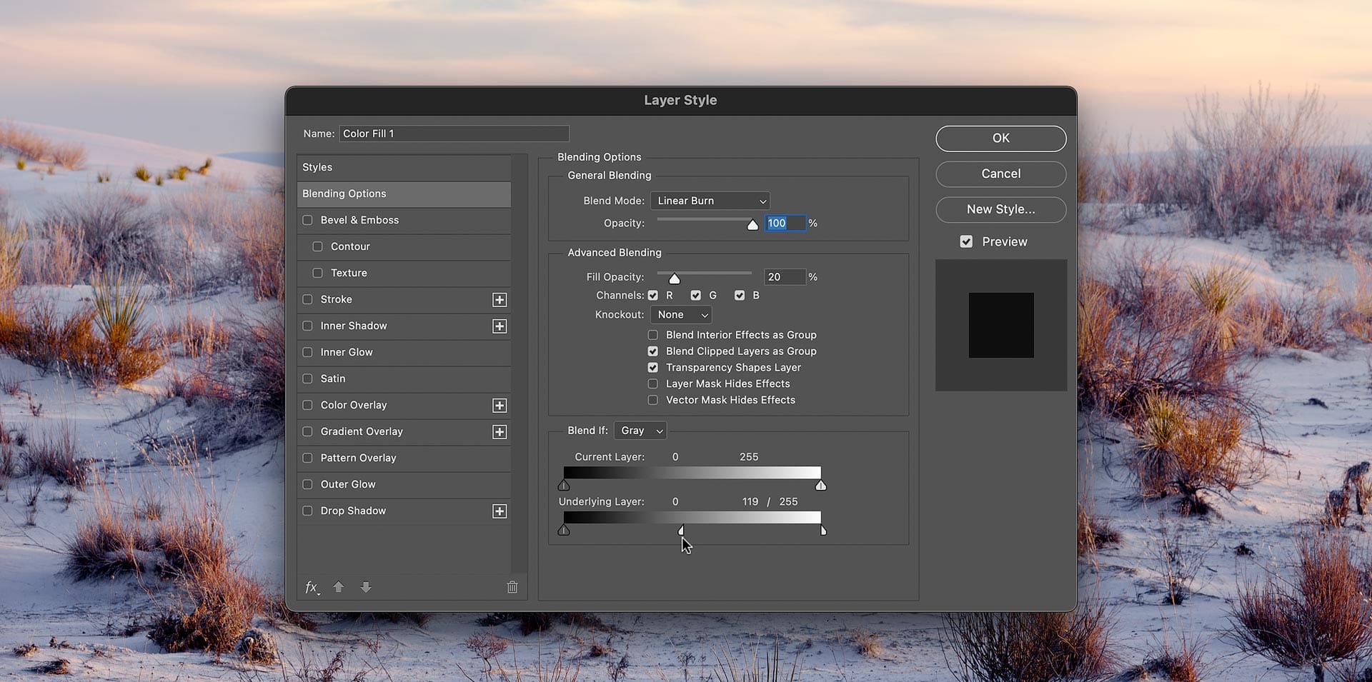
What we’ve done here is remove the brightest highlights from the blend and feather the effect by splitting the arrow. Move the left half of the arrow to expand or collapse the selection. You can also drag the right half of the white arrow to the left for a more aggressive selection. Also try temporarily raising the “Fill” percentage to better visualize the Blend If adjustment, then lower it back to the desired strength when finished.
This same technique can be used with the Dodge blend mode layers by splitting the black arrow (again in “Underlying Layer”) and removing the shadows and blacks from the selection.
If you know how to create luminosity masks, these are also very effective for masking the solid color layers.
Closing thoughts
Keep an eye on the histogram when using Color/Linear Burn and Color/Linear Dodge (Add), as both blend modes can clip blacks and whites. This is because of how their underlying math works, which can produce values that extend beyond the tonal range of an image (which Photoshop then clips to 0 and 255, respectively). If applying color grading toward the end of an edit, use very low Fill values for these blend modes, or experiment with others like Multiply (to darken) and Screen (to lighten), blend modes which do not cause clipping.
Another thing to experiment with is using the Burn blend modes with highlights and the Dodge blend modes with shadows. For example, apply a dark color with a Burn blend mode to darken and increase the color density of highlights, then apply a Dodge blend to lift, brighten, and tone the shadows. This approach can be especially helpful with overly bright and flat highlights and dark, deep shadows.