The wrong way to add contrast (and what to do instead)
How to improve contrast adjustments by finding an image's true midpoint
Contrast is the distance between dark and light. The greater the distance, the higher the contrast. Increase contrast using the "Contrast" slider in any photo editor, and the app will push brighter values to the right and darker values to the left, with dampening at both ends to prevent pixels from turning pure black or white. For general images containing a broad, even range of tonal values between black and white (meaning, plenty of shadows, midtones, and highlights to work with), the Contrast tool works as intended.
Where things get weird, however, is when adding contrast to low key, high key, or any image containing tonal values that primarily occupy one region. An uneven "massing" of values that are predominantly dark or light. For example, in the comparison image below, the daytime photo on the left contains a full range of values, while the low key photo on the right contains a smaller subset.
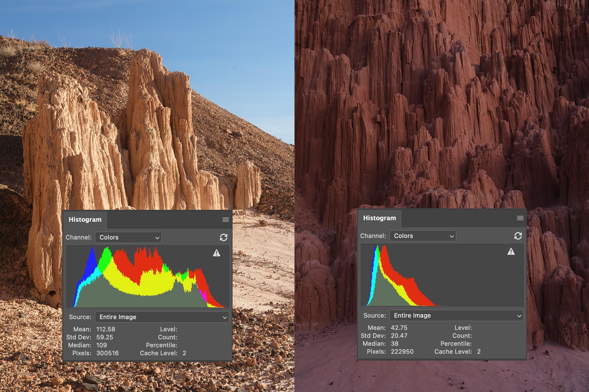
If we add contrast to both images using a Contrast slider, notice how their histogram shapes change.
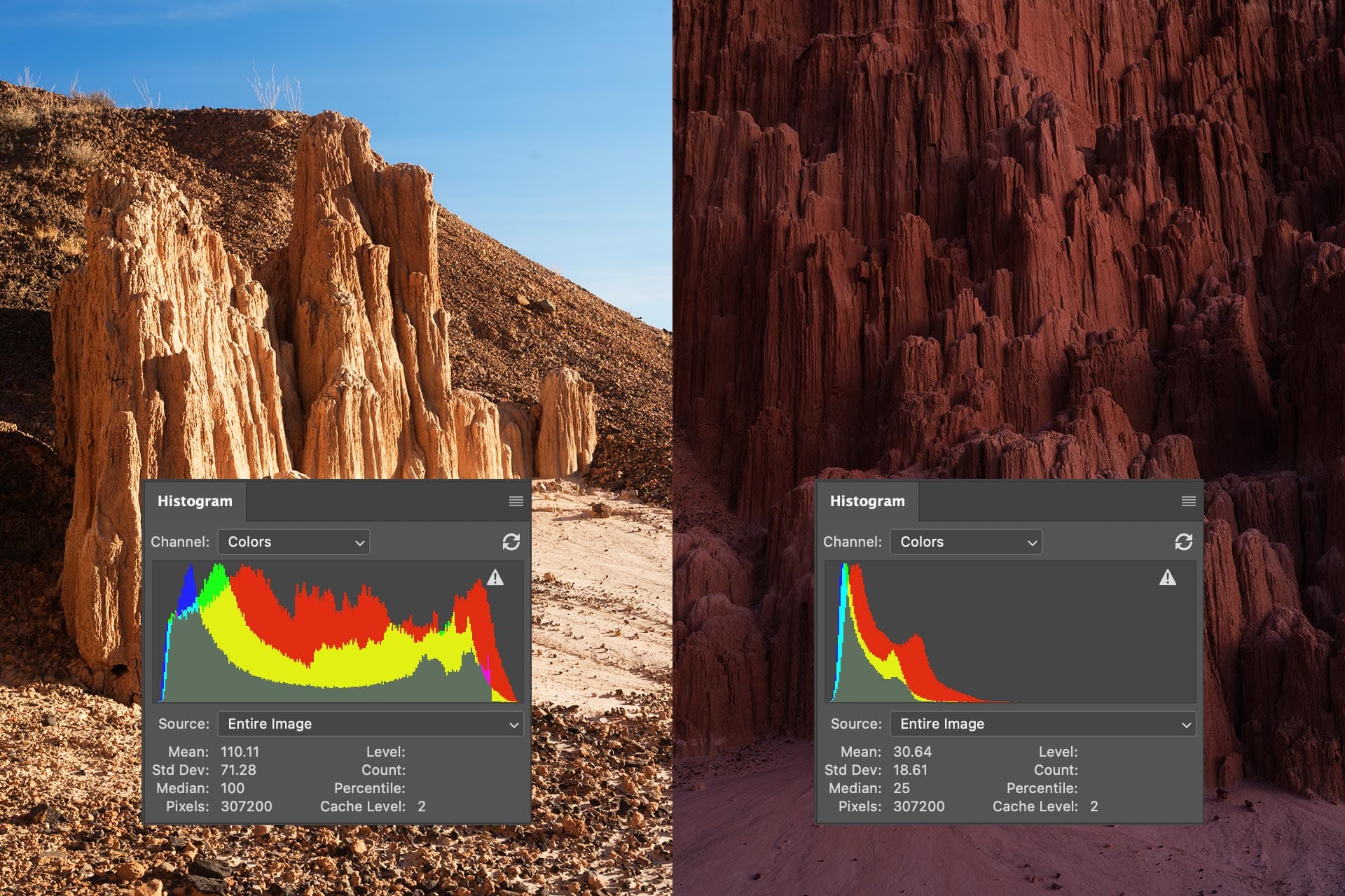
The histogram on the left has been pushed outward, with taller peaks at the ends and a wider "dip" in the middle. This is exactly what the Contrast slider is supposed to do. The histogram on the right, however, has pushed left. The whole image is now darker.
Why does this happen? Because Contrast sliders place the contrast midpoint (aka "pivot") at 50%. Or put another way, 128 on a scale of 0-255 in the histogram.
When global contrast is added to a low-key image, only half the adjustment is applied. Shadows are pushed downward, while non-existent midtones and highlights are pushed upward. There's literally nothing in the upper regions of the histogram, so the image simply gets dark.
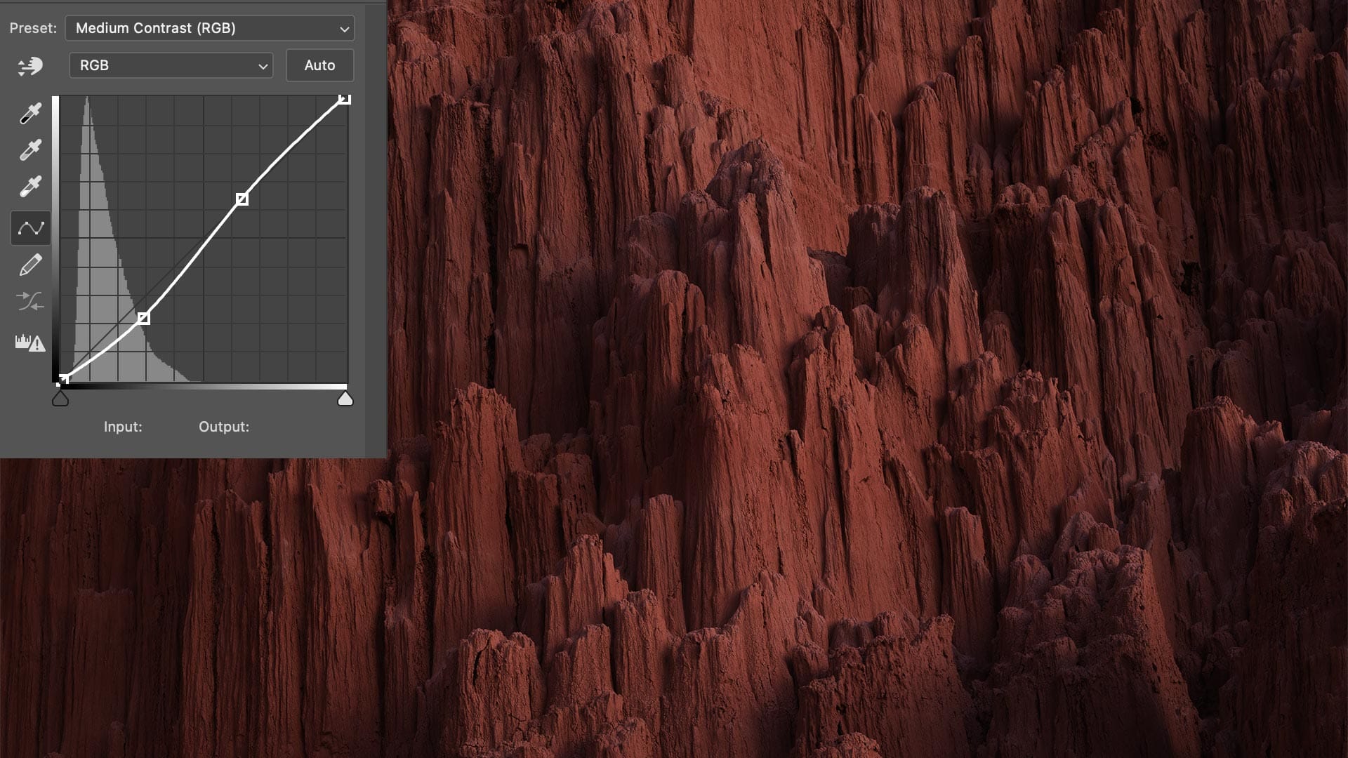
This can also occur with the tone curve. For example, in the image below, I've applied Photoshop's "Medium Contrast" preset, resulting in an s-curve that applies the same darkening effect as the Contrast slider. The image is now darker and muddier, as if it were underexposed.
How do we improve this? How do we create actual contrast in an image, and without affecting its exposure?
The solution is "adaptive" contrast.
Look at the "Median" number in Photoshop's Histogram panel (if you don't seen one, click the menu in the top right and select "Extended"). That number quantifies the true midpoint of all tonal values in the image.
We can use this information to apply adaptive contrast using the Tone Curve. Simply click anywhere on the curve to create a point, then change its Input/Output values to the Histogram's Median.
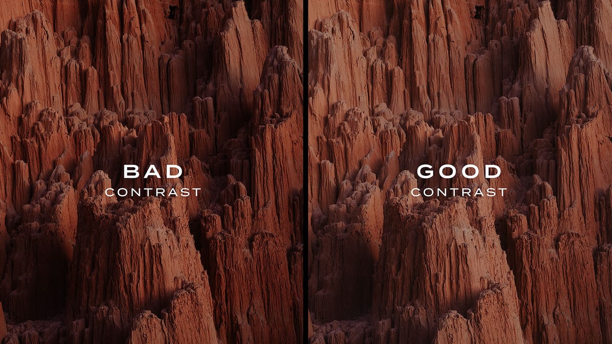
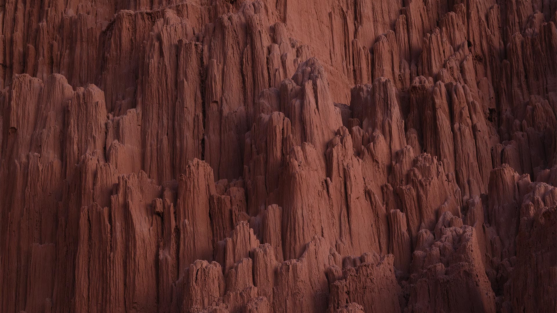
For example, my low key image has a median tonal value of 38. I added a midpoint with that input/output value to my Tone Curve, then lifted the right to bend the curve slightly upwards and downwards, as seen in the comparison image below (left: original, right: adaptive contrast).
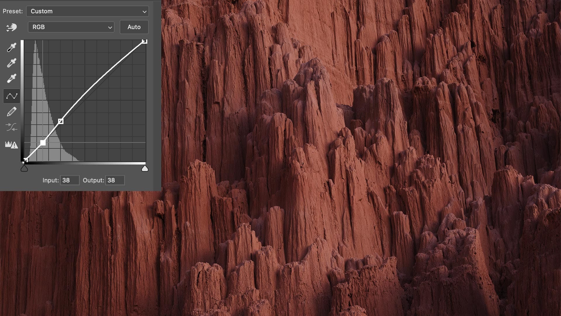
This looks much better. By placing the contrast midpoint at the median (38) we have added balanced, proportional contrast to the image without affecting its exposure.
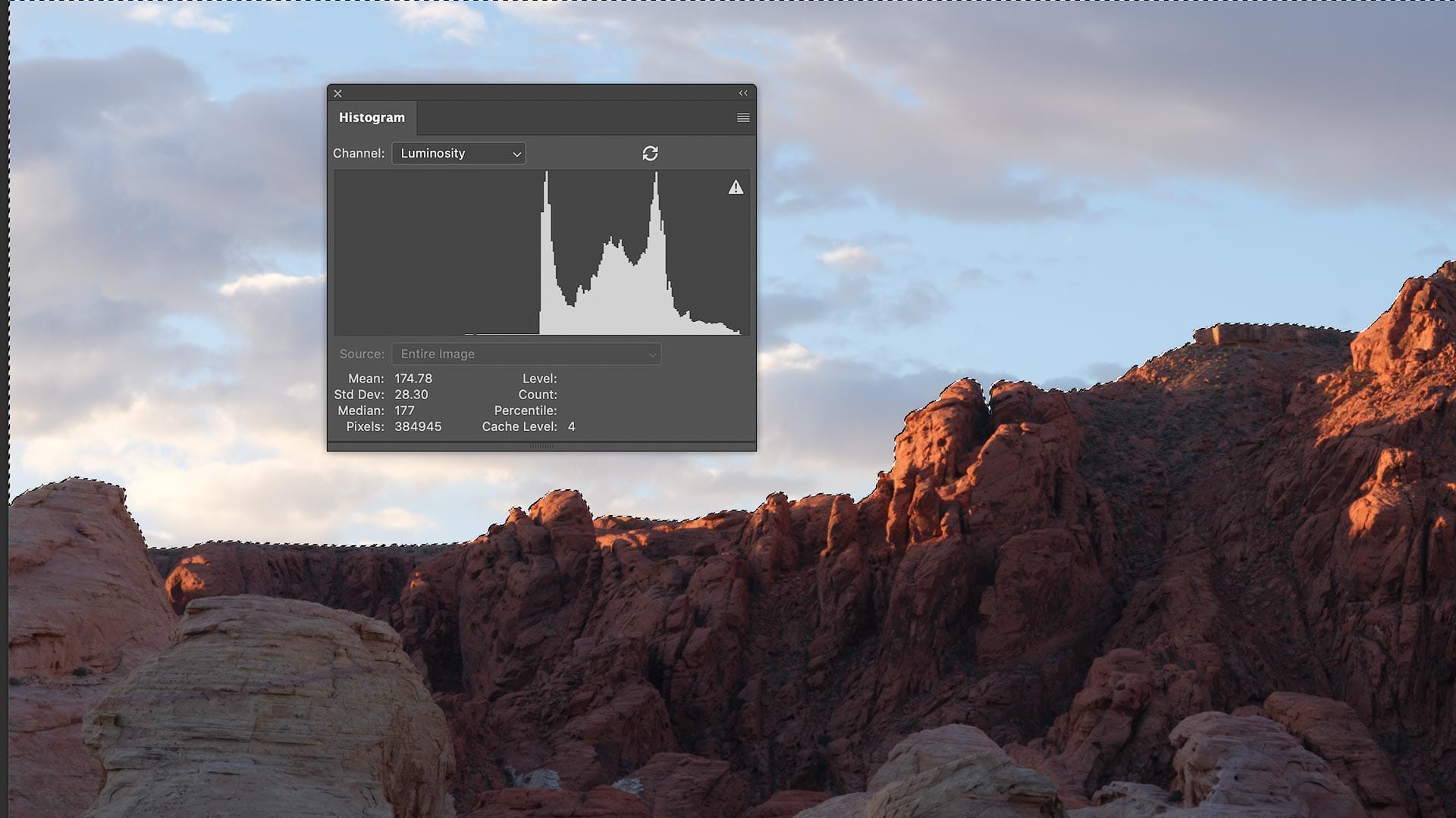
We can also use this technique with local adjustments. For example, in the image below, I used Photoshop's Sky selection function to select the sky. The Histogram then shows the tonal range of my selection, not the entire image. Here, I can see that the sky has a median value of 177. I can then add a masked curves adjustment layer, create an adaptive midpoint at 177, then adjust contrast from there, just like we did before with our global image adjustment.
Cool, but what about Lightroom or other apps?
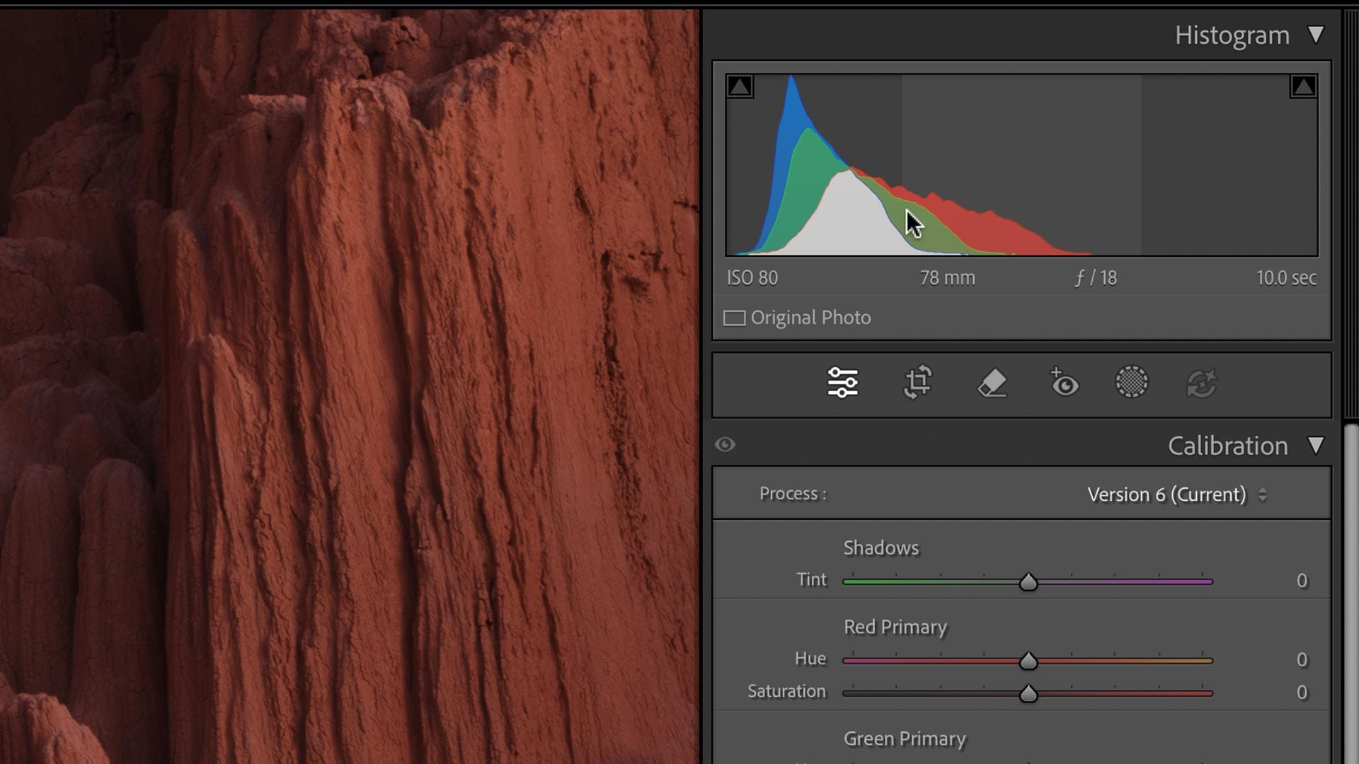
Unfortunately, Lightroom does display a Median value in its Histogram panel. To work around this, you may open an image in Photoshop, retrieve the median number, then return to Lightroom and edit the Tone Curve. Or, you can approximate the median using your eyes.
Look at the histogram of any image and visualize a vertical line that neatly divides the mass of values into equal weights. If this were a see-saw, where would you place the fulcrum underneath to balance the shape? For example, in the image below, I'm eyeballing (with the mouse pointer) where the true contrast midpoint of this image sits. I can then add a point at this approximate location in the Tone Curve panel.
Once you understand the basic principle of applying an adaptive contrast midpoint to the Tone Curve panel, it should become second nature to you, so you don't necessarily need the true median number from Photoshop. Close enough should be fine.
Video
Here's the video version of this article.