Why your shadows may look fake (and what to do about it)
Many photographers push blue into shadows out of habit. It feels right. But there's a reason those edits can sometimes look off, and it has nothing to do with the sliders you're using.
Photography is fundamentally about light and dark. In landscape and outdoor work, that relationship is especially important because the photographer controls almost none of it. You can time a shot around the sun, anticipate good light and color, and position yourself accordingly, but the rest is out of our hands.
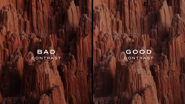
Of the two, I find shadows to be especially sensitive. The raw format gives you enormous latitude, and it's tempting to lift their values and pull up hidden texture and detail. Push it too far though, and the shadows grow unnaturally bright relative to the highlights, and the image starts to look over-processed and unnatural.
Color adds another layer of complexity. Blue and cyan can be beautiful against warm highlights, and it's easy to inject that using the Color Grading wheels, without questioning whether it actually fits the light and environment.
The better approach, I've found, is to start with naturalism. What does light actually do to shadows in the real world? Understanding that gives you something to edit toward, and something to depart from when an image calls for it.
Why are shadows blue?
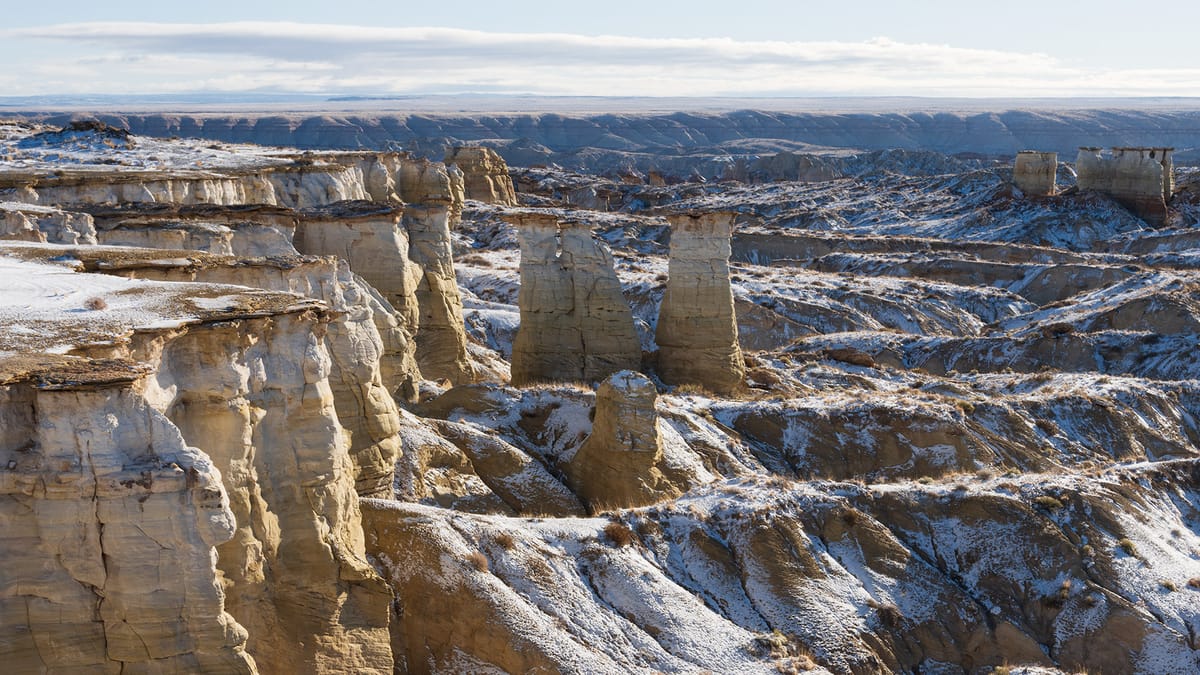
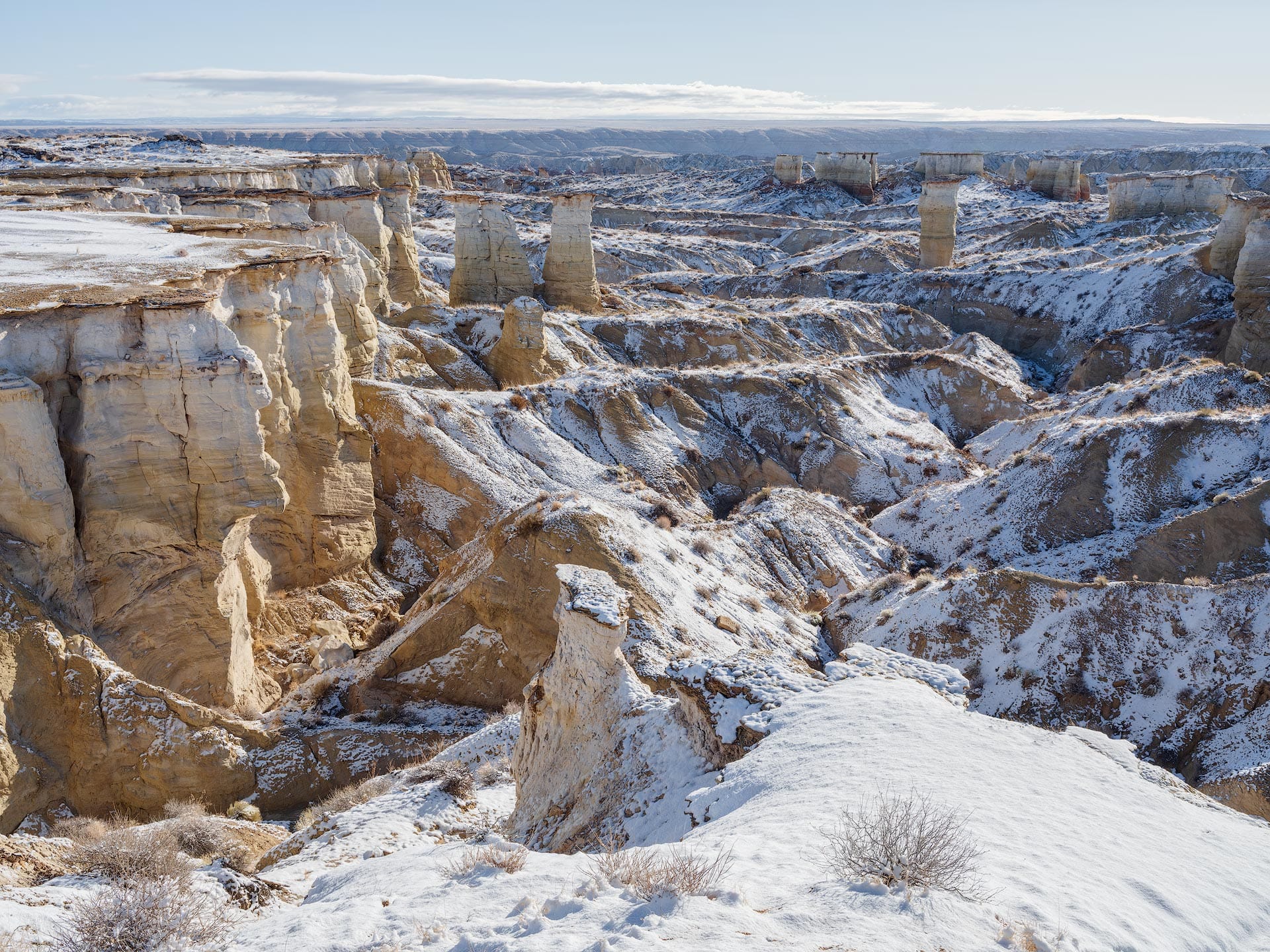
Below is a straight-out-of-camera landscape image of mine from northern Arizona, captured in a remote area the morning after a night of snowfall. The sky was clear, the temperature was freezing cold, and the shadows were vibrant blue. Not one of my better images, but a great example to use for this discussion.
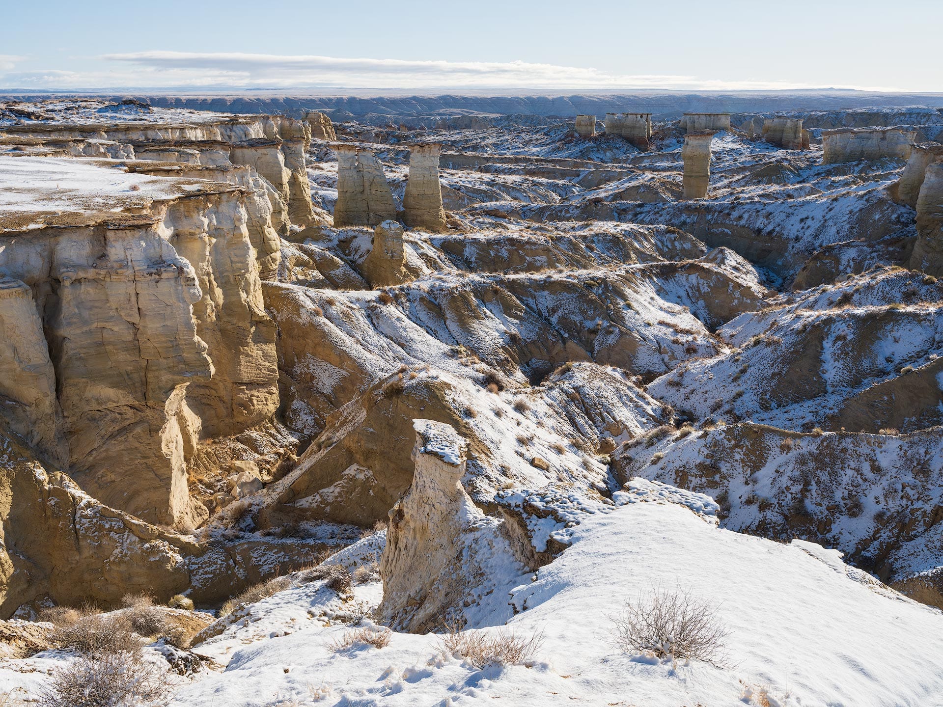
The shadows are bright blue because they are being filled with the ambient, omnidirectional blue light from the clear sky above. Think of the sky as a giant diffused softbox with a blue gel mounted in front. The highlights, on the other hand, are orange and yellow because they are being illuminated by the bright sun, overpowering the blue atmospheric light.
But wait a second, why aren't all shadows blue?
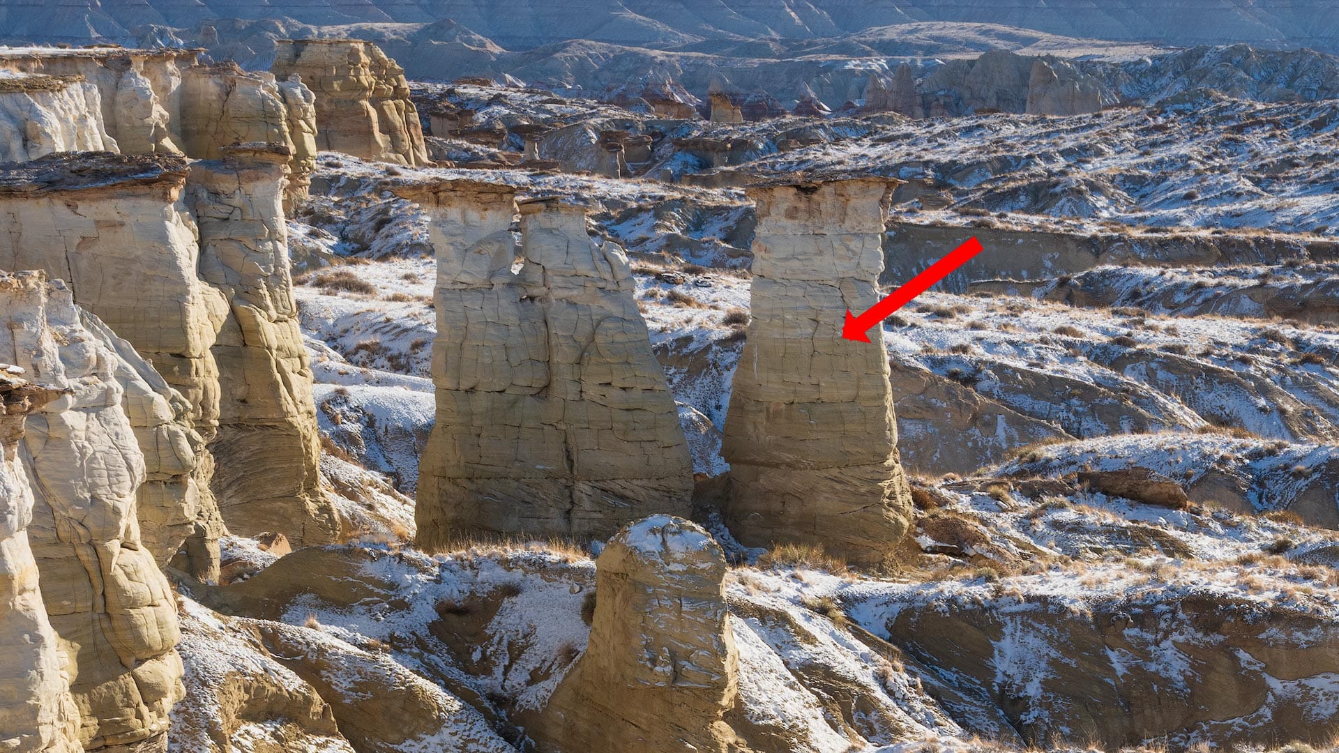
If we take a closer look at the same image, you'll notice a curious phenomenon. The backside of the tall pillars on the left side of the frame are not illuminated with direct sunlight. They are in shadow, but aren't blue. Rather, they are gray and neutral.
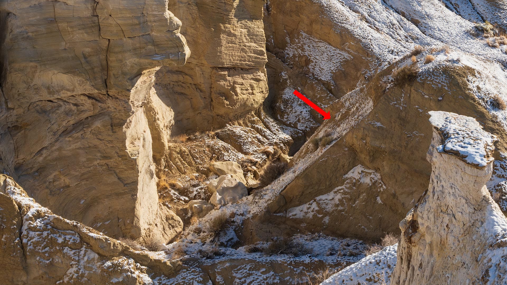
Again if we move around the image, we can spot another unusual shadow towards the foreground. This patch of shadow has a warm color cast, neither blue nor neutral.
What's going on here? Why does this image have three colors of shadow?
The backside of the pillars are neutral because they are not facing the sky. They are lateral. Imagine flying high above this landscape and looking straight down. Would you see the pillar walls? No. You'd see the top of the pillars and the landscape around them (with blue shadows).
The patch of warm shadow in the foreground also has a lateral angle, so it's baseline hue is neutral, similar to the pillars. However, they appear warm because warm sunlight is reflecting off the canyon walls, filling the shadows both with light and color.
We may imagine shadows as being gray and lifeless, but in landscape and outdoor photography, they usually exhibit some type of color cast. And that color comes from reflected, ambient light, wherever it may come from.
Handling shadow color when editing
Once you understand the basic rules of shadows, you can make better decisions when editing them in post. And just like any creative art form, there are no right or wrong answers.
One approach is to lean into the blue tones already present in the shadows, deepening them to create a stronger complement to the warm yellows and oranges in the highlights. This pushes the highlights and shadows further apart in both brightness and color, which increases the sense of depth in the image.
If you shift blue's hue using HSL, keep the relationship between foreground and sky in mind. If you mask one and shift its hues independently, the two can fall out of sync and the result can look unnatural. A global blue Hue adjustment usually works best, or leave Hue alone and focus on Saturation and Luminance.
The opposite approach is to pull the blue cast back rather than push it further. Reduce the Blue and Aqua Saturation sliders in HSL, lift the shadows, and use negative Dehaze to add atmospheric light so the image breathes and doesn't feel as heavy and dark.
Personally, I prefer the latter, not simply for stylistic reasons, but because of how human eyesight works.
First, humans naturally see blue as a darker hue compared to others. Line up a strip of colors, each with identical numerical luminance, and our eyes will perceive blue as being darker (scientifically known as the Helmholtz-Kohlrausch effect).
Second, our eyes also perceive dark regions as cool and bright regions as warm. Even without any color present, we still perceive them that way based on memory colors and our physical experience standing in sunlight and shadow.
Together, this means the shadows don't have to contain as much blue as they currently do because the viewer's eye will naturally interpret them as darker and cooler than they actually are. This explains why blue shadows can feel heavier and stronger than they actually are compared to other areas of an image, as evidenced in the heavier blue example image above.
When editing warm shadows, I recommend maintaining their beautiful warm hue and possibly injecting them with a little extra red or magenta to strengthen them. Neutral shadows can go either way (cool or warm). If you want more color separation and depth in the image, inject some blue with the color wheel and shift the Balance so the highlights aren't affected.
When in doubt, leave them alone for a natural appearance. Nothing wrong with that!