The saturation check you should be doing (but probably aren't)
Most editors add saturation by feel. Here's a quick Lightroom trick that shows you exactly where color is too hot, too flat, or just right, before it becomes a problem in your final edit.
When adding saturation in Lightroom, Lightroom Classic, or Camera Raw, it can be difficult to see which areas of an image are already well-saturated. These are the areas that, if pushed further, could clip an RGB channel, introduce banding, or produce unnaturally bright colors.
There's a simple trick to identify them before that happens.
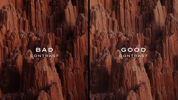
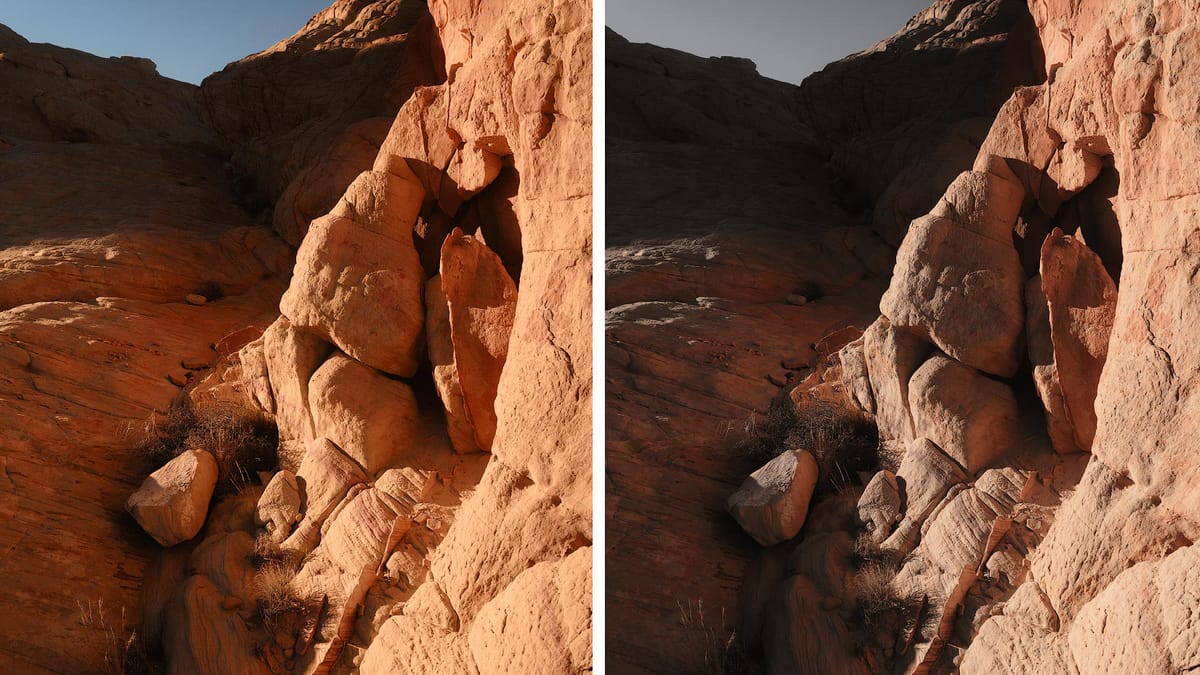
In Lightroom, go to the Vibrance slider. In Photoshop, open Adobe Camera Raw or add a Vibrance adjustment layer. Drag the slider nearly all the way to the left. The image should go mostly colorless, as seen in the right image below.
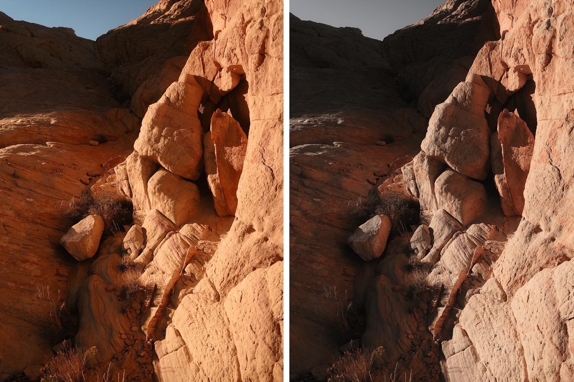
What you're seeing is color stripped away from pixels with low-to-medium saturation. Any color that remains has elevated saturation. In the before/after example above, the bright red rocks in the foreground hold their color while everything else goes gray. That tells me that saturation in those areas is high relative to the rest of the scene.
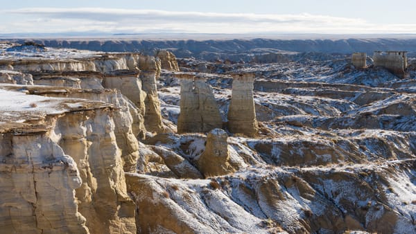
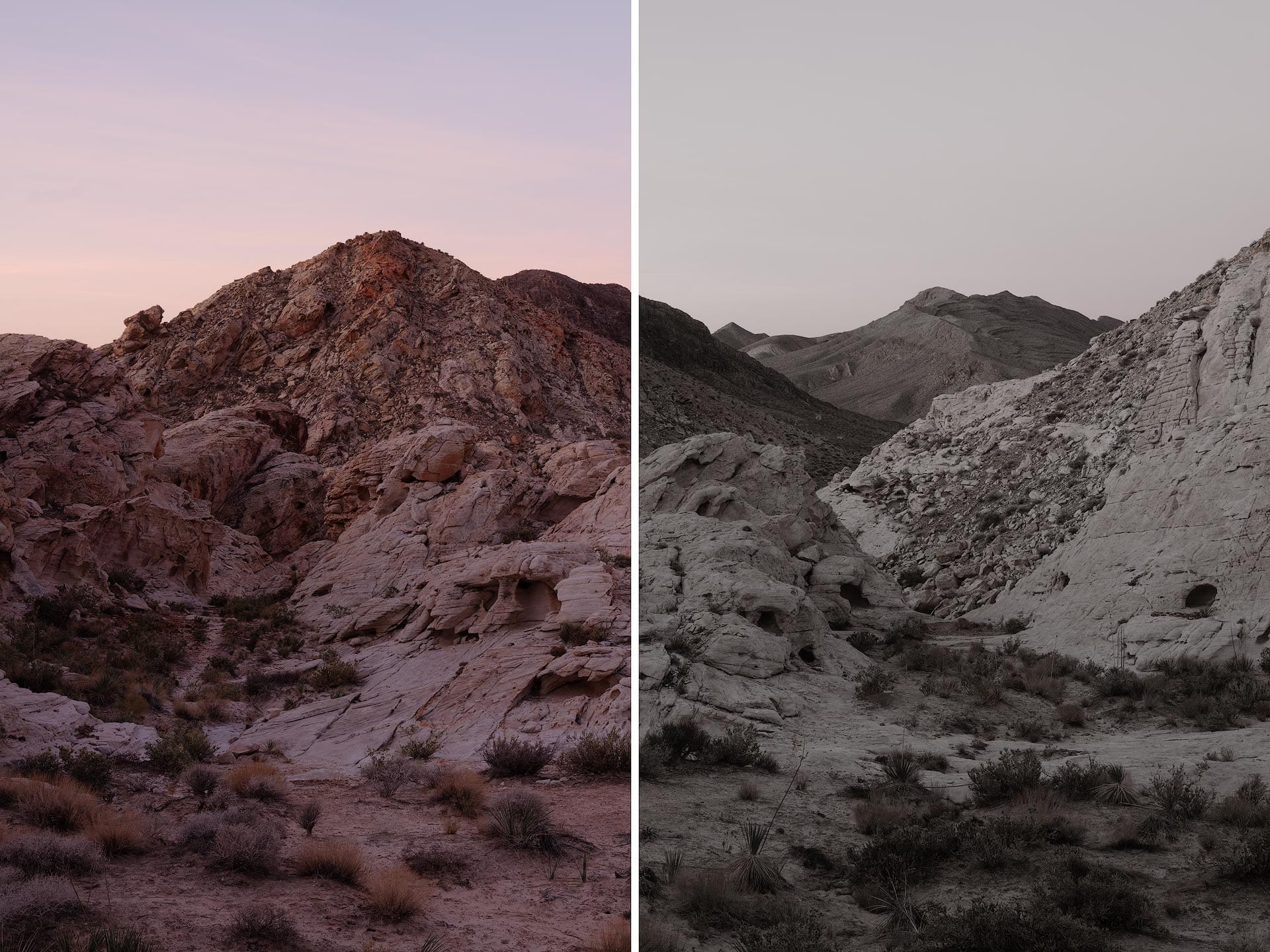
Here's a second example with a different outcome. With this image, negative Vibrance completely drains the colors, which suggests saturation across the image is low and evenly distributed, and might benefit from a boost.
This technique is useful because Lightroom and Photoshop offer only a basic Histogram for visualizing color information. There's no built-in way to see where saturation is concentrated. A negative Vibrance slider adjustment, used temporarily as a diagnostic tool, helps fill that gap.
So what do you do once you know? A few things to keep in mind.
Saturation imbalances are not automatically a problem. We're drawn to color, and if elevated saturation is guiding the viewer's eye or reinforcing the mood of an image, it may not need to change at all.
If the saturation does feel too strong, Lightroom offers several targeted ways to pull it back: the HSL Mixer, Point Color, or a Color Range mask. In Photoshop, a Hue/Saturation adjustment layer can do the job, or use the Sponge tool (set to "Desaturate") to target specific areas.
I recommend performing this negative Vibrance trick near the end of an edit, not the beginning. General tonal and contrast work in the RGB color space will shift saturation as you go, so you can't effectively judge color until other adjustments have been made.
Here's the video version of this article: