What is Adobe RGB, and does it matter when buying a display?
Why is Adobe RGB included in desktop monitors marketed to designers and photographers? Should you buy a display that supports it?

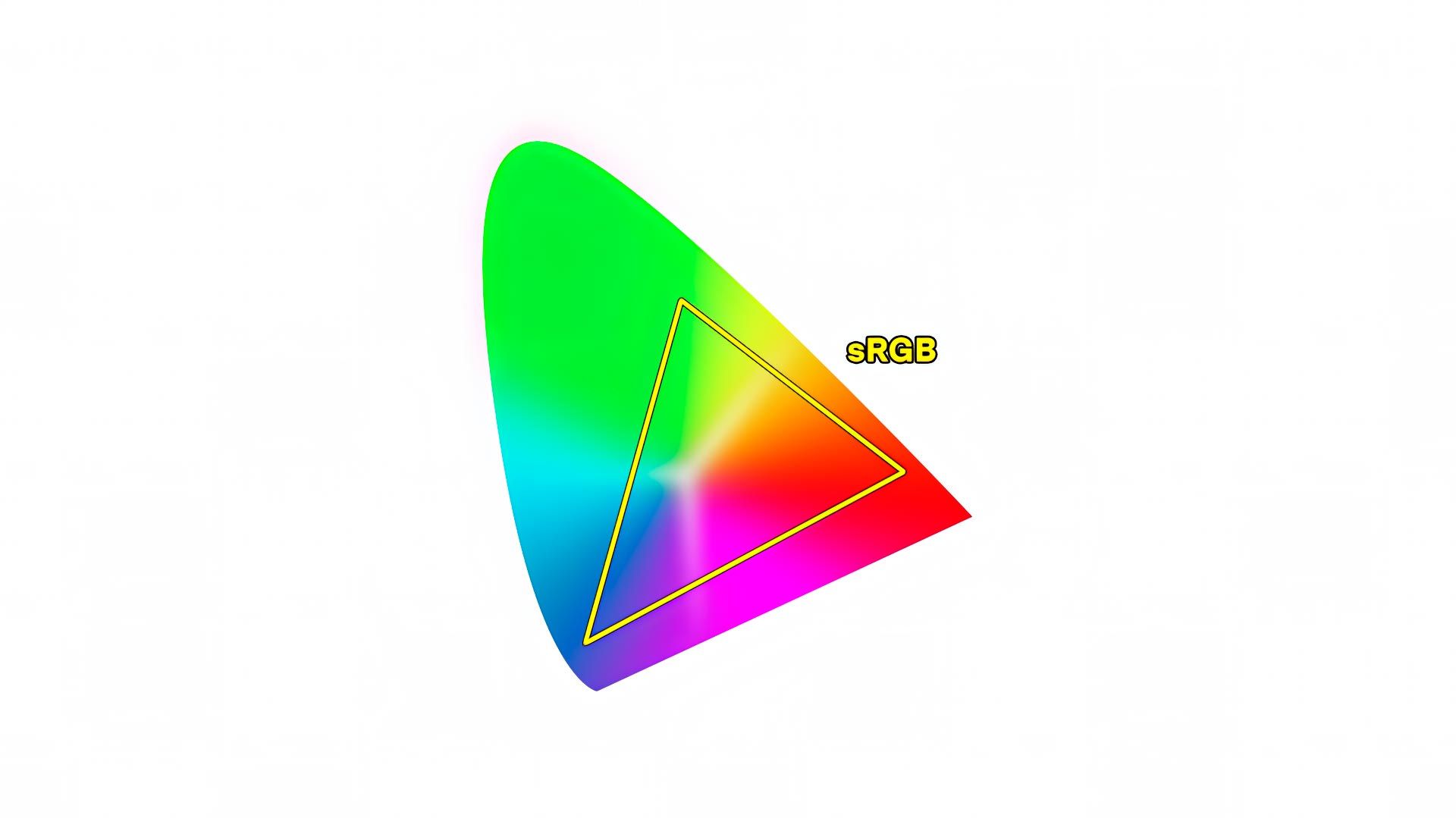
When shopping for desktop displays, you will most often encounter two color spaces: sRGB and P3. sRGB is the older standard and was designed around the limitations of early consumer displays and the web. It supports a relatively limited range of colors and remains the default for most websites, social platforms, and online images.
P3 is a newer, wide-gamut color space capable of representing a much broader range of colors. Over the past decade, P3 has become increasingly common, driven largely by its adoption in smartphones, tablets, most modern laptops, and many newer desktop displays. While the web still largely assumes sRGB, P3 is steadily becoming the default color space for consumer devices.
There is, however, a third wide-gamut color space option you may encounter: Adobe RGB.
What is Adobe RGB? What does it offer that sRGB and P3 do not? And, most importantly, does it matter enough to justify choosing a display that supports it?
Origins of Adobe RGB
Back in the 1990s when desktop computing and the world wide web were just getting off the ground, Microsoft and display hardware manufacturers decided that a standardized color space was needed to create a more consistent user experience across PCs. The result was sRGB, a color space modeled on Rec.709 (the standard color space of HD broadcast video), but modified to use a brighter gamma value of 2.2 instead of 2.4 because computer displays were viewed mostly in offices, not dark living rooms.
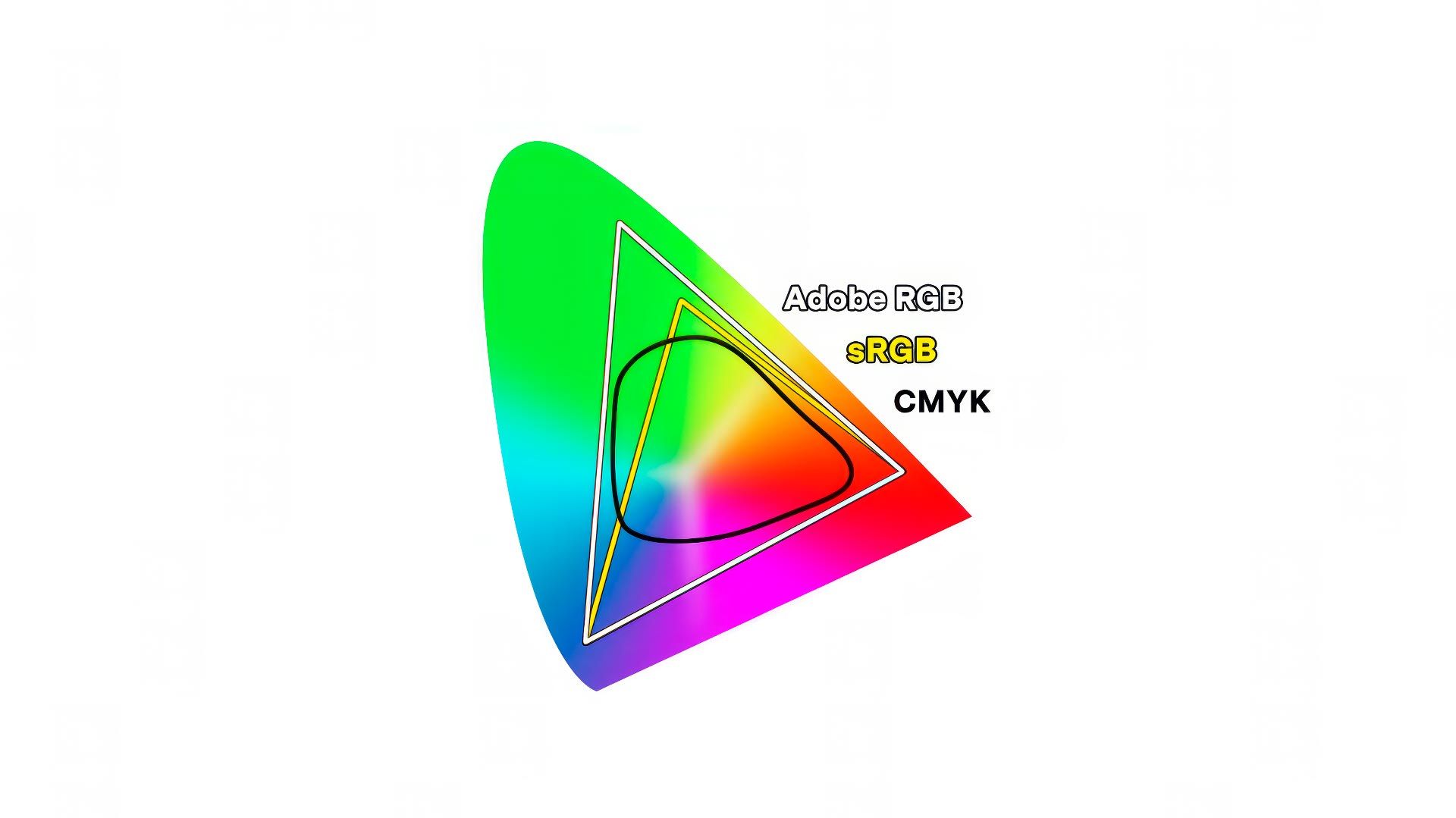
Everyone benefited from a consistent color standard, but problems emerged in the design and print industry. The sRGB color gamut was smaller than the range of hues supported by four color, CMYK printers (example illustrated below). This meant that a designer or photographer couldn't see on screen all the colors their printers and papers were capable of printing.
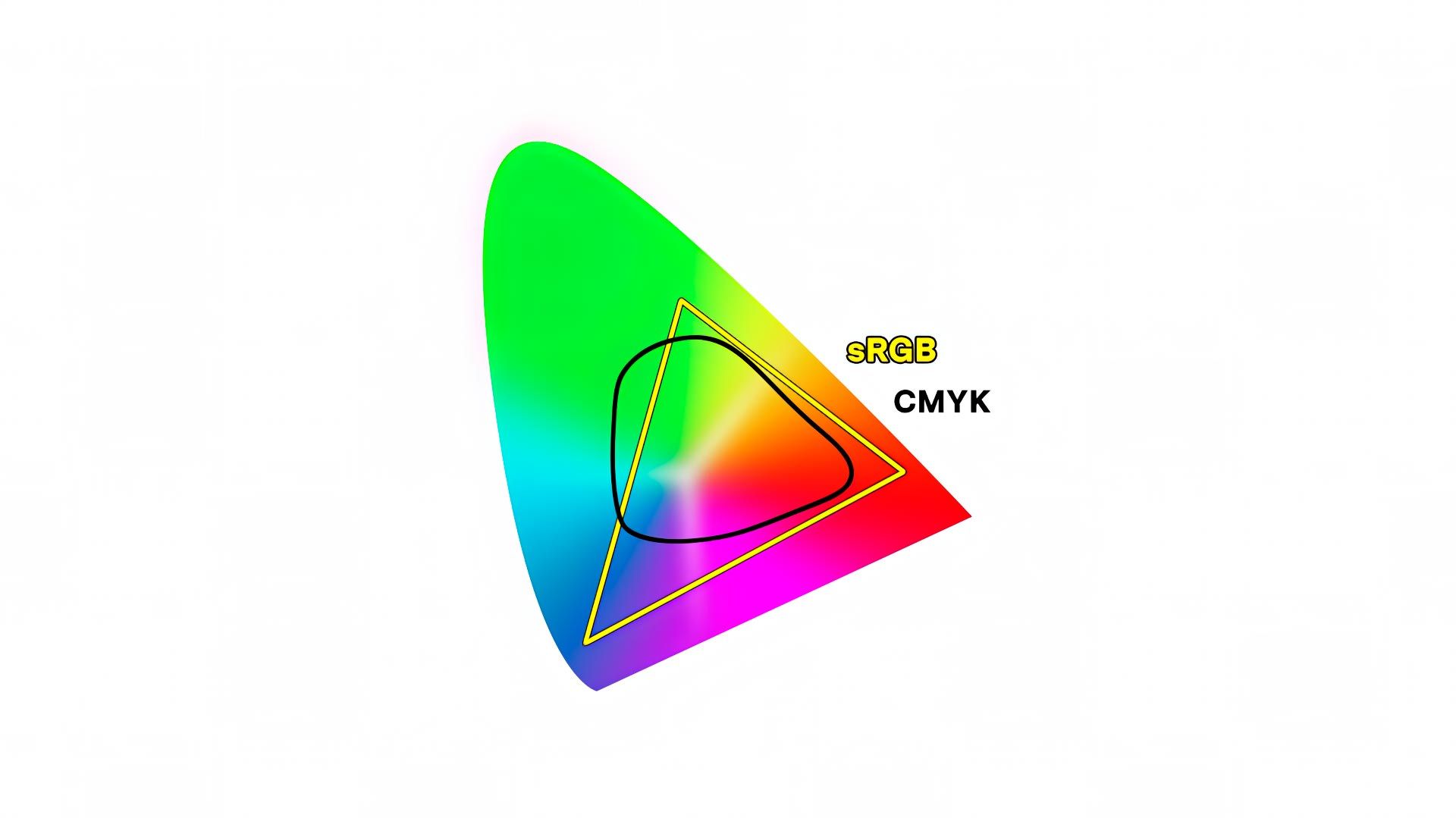
This is why, in 1998, Adobe stepped in an created their own color space: Adobe RGB. Adobe RGB was purposely designed to include nearly all the same hues supported by most CMYK printers and papers, resulting in a color space 35% larger than sRGB.
Unfortunately, Adobe RGB never caught on outside the design and print world. PC manufacturers (and Apple) stuck with sRGB. For years thereafter, sRGB was the dominant color space used everywhere and by everyone, while Adobe RGB was a relegated to niche status in design and print circles.
New kid on the block: P3
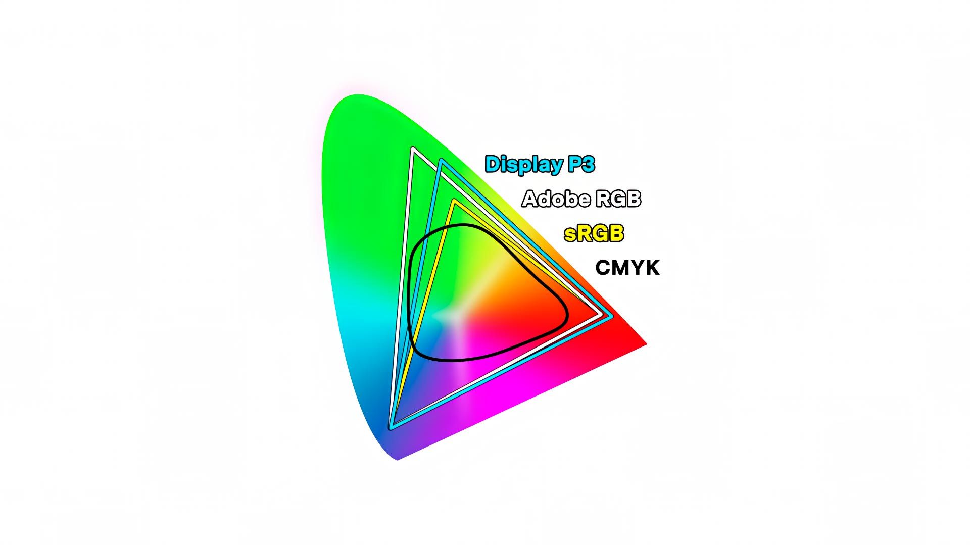
In 2015, Apple introduced an iMac with a "wide-gamut" display using a new color space: "P3" (or "Display P3" as they called it). This color space was modeled on the color gamut of DCI-P3, created by the Digital Cinema Initiative as a new standard for digital motion pictures in 2005, but with a 2.2 gamma and 6500K white point. P3 was a definite improvement for the average user compared to sRGB, for it provided richer, more vibrant colors. This was especially evident in mobile games and applications, where P3 quickly became the norm.
P3 should have been the death-knell for Adobe RGB because it was a new wide-gamut color space created nearly two decades later for more modern devices. But obviously, that didn't happen. Here's why.
Comparing P3 to Adobe RGB
P3 and Adobe RGB are ~35% larger than sRGB, and cover more or less the same range of hues (just over 1 billion). But their gamut volume is slightly different. Take another look at the chromaticity spectrum above. Adobe RGB extends more into richly saturated greens and blues, while P3 extends slightly more into richly saturated oranges and reds. Mathematically speaking, P3 is a smaller gamut than Adobe RGB, covering 45% of the CIE chromaticity diagram, while Adobe RGB covers 52%.
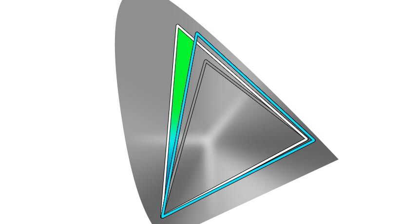
Net result? Adobe RGB displays a broader range of hues than sRGB and P3. Not a huge difference, but a difference nonetheless. The illustration below highlights the range of richly saturated cool hues Adobe RGB can display on screen, but sRGB and P3 cannot.
But what about color photography prints? Does display color space matter when making them?
Making color photography prints
The first thing to know about printing is that color gamut — the volume of reproducible hues — is dependent on the printer and paper being used. Some papers and printers support a wide range of richly saturated colors, while others cannot. Every printer and paper combination supports different volumes of color.
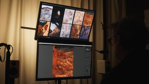
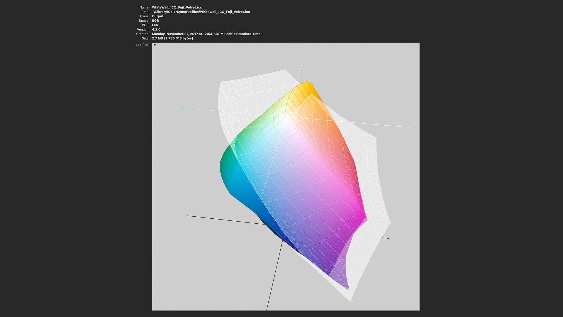
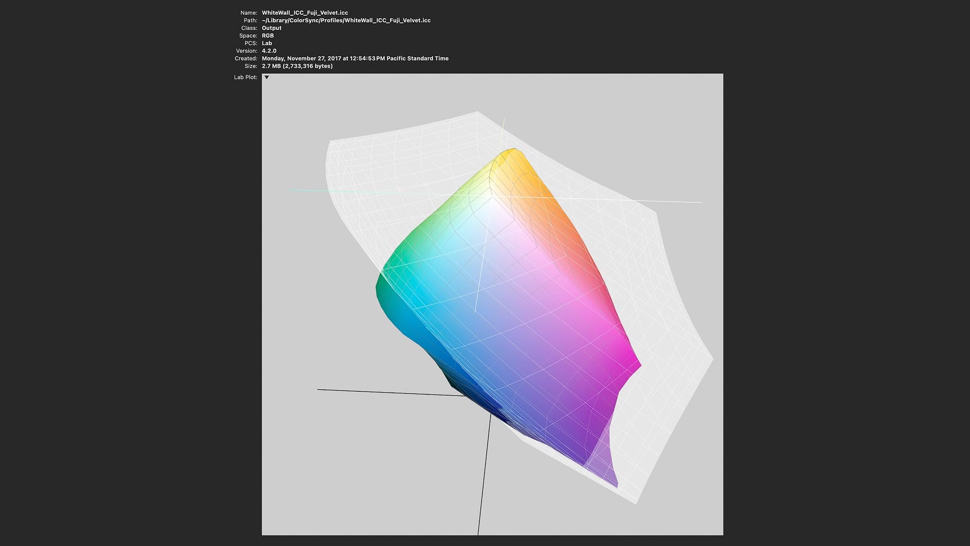
To see the difference between screen and print, I'll use ColorSync Utility in macOS. This app is fantastic for visualizing ICC profiles, which are the communication layer between software and displays/printers. I'll compare display ICC profiles for sRGB, Adobe RGB and P3 against printer ICC profiles downloaded from Whitewall for their professional grade, glossy Fuji Eterna color paper, which is capable of displaying a large volume of saturated colors.
Let's start with sRGB compared to Fuji Eterna.
In the screenshot above, the rainbow blob displays the range of hues supported by Fuji Eterna paper. The light gray blob displays the range of hues supported by sRGB. (The latter is gray and colorless so it can be seen around the first).
Pay attention to the shapes. Where the respective color spaces overlap, those hues are supported by both. Where they don't, there's a mismatch. For example, the Fuji Eterna paper extends beyond sRGB into vibrant greens and blues, plus a little orange and red at the top. sRGB covers most colors supported by Eterna, but not all. These "out of gamut" colors cannot be viewed on an sRGB display.
Now let's compare P3 to Fuji Eterna.
Similar, yet different. The P3 color gamut is larger than sRGB, fully covering the richly saturated oranges and reds outside the scope of sRGB, while also extending further into the blues and greens at the bottom. This means that more of Fuji Eterna's supported colors can be viewed on a P3 display.
Now let's compare Adobe RGB to Fuji Eterna.
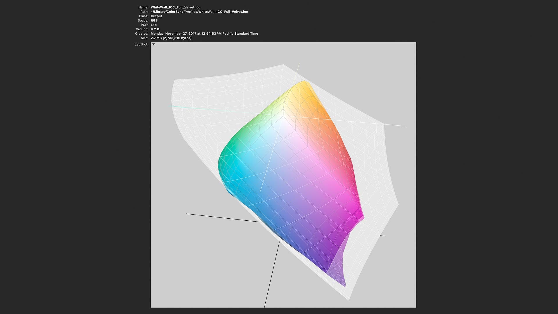
Here again, the wider color gamut of Adobe RGB covers the richly saturated oranges and reds beyond the scope of sRGB, but look at those blues and greens! Adobe RGB nearly covers the complete range of those hues.
Net result? Adobe RGB displays on screen the fullest range of hues when making a color photography print. A display supporting Adobe RGB will provide a truer visual representation of how a richly saturated color photograph will appear when printed on Fuji Eterna and other color glossy papers. Working with an Adobe RGB display also helps ensure colors are not clipped prematurely during editing, and avoids unwelcome surprises and mismatches when comparing color prints to screen.
What about black and white?
So far I've only talked about color, but in photography, black and white is also relevant. Does color space matter when editing in black and white?
Mathematically speaking, no. The color differences between sRGB, P3 and Adobe RGB only matter when evaluating saturation and vibrance. In black and white, it doesn't matter how many hues a color space supports, or how richly saturated they are, for black and white contains no color information.
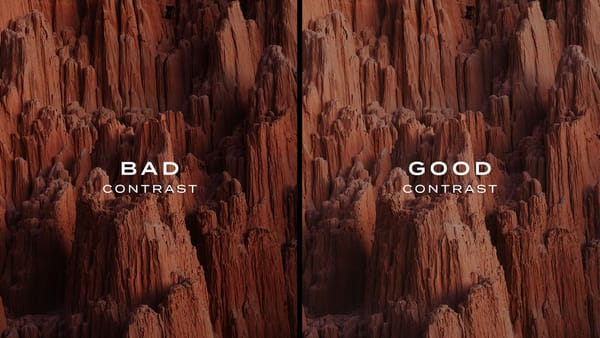
Practically speaking however, color space can matter, but for a different reason than you may expect. Wide-gamut displays are typically manufactured using higher quality hardware components with stricter quality controls. Quality displays are not simply more color accurate, but do a better job of displaying truer neutrals (without tints) and smoother gradations across tonal ranges than cheap, consumer sRGB displays.
So even though black and white isn't completely relevant to this conversation, monitor quality can and will matter when buying a display for both color and black and white photo editing.
Okay, but do I really need an Adobe RGB display?
Now that we've covered the technical side of color spaces, displays and printing, let's revisit the most important question: Does any of this truly matter? Do I really need to buy an Adobe RGB display to edit my images, or will P3 do the job?
The answer is...it depends.
If you are a photographer working with richly saturated color, deep blues in sky or water, vivid greens in foliage, or strong oranges and reds in products, clothing, etc, Adobe RGB provides the broadest usable range of hues. It does the best job of encompassing the colors that professional printers and high-end paper stocks are capable of reproducing.
That said, some photographers choose not to invest in wide-gamut Adobe RGB or P3 displays because their images rarely (if ever) contain colors that fall outside the boundaries of sRGB. Their images look consistent across different displays and print outputs, regardless of which color space a monitor supports. For them, sRGB feels sufficient, even if it is technically more limited, because their color photography doesn't contain richly saturated colors.
Even so, I believe that wide-gamut displays are still the better choice. Lightroom and other raw editors work internally in wide-gamut color spaces (ProPhoto RGB) because raw files contain far more color information than sRGB. A wide-gamut monitor allows you to see more of that information as you work, rather than compressing colors down prematurely for the sake of the display. It's better to view and edit images in a wide-gamut space, then export those images to sRGB when creating images for the web or other use cases.
Additionally, as already mentioned, wide-gamut displays are typically built with higher-quality panels and more sophisticated internal processing, which translates to better tonal smoothness, more stable neutrals, and greater consistency across the screen. Even when saturation levels remain modest, a wide-gamut display provides a more reliable and future-proof editing environment than sRGB.
Display buying advice
So at the end of the day, is an Adobe RGB display the best option currently available for editing photos? Yes.
Is a P3 display just as good as Adobe RGB? Nearly, but not quite. P3 is certainly better than sRGB, but more limited than Adobe RGB.
Should you buy an sRGB display? No. I see no reason to buy one outside of saving money. Otherwise, there's little practical benefit.
Outside of color space, are there any other specifications to consider when buying a new display for photo editing? Most definitely.
In display specifications, you will likely see color spaces preceded by a percentage. For example, "99% Adobe RGB" or "95% P3". These percentages represent how many colors a display can faithfully reproduce in a color space. The higher the number, the better. 95-99% is common. 100% is ideal, but not completely necessary. You simply want to make sure the display doesn't simply support a color space, but is technically capable of reproducing as much of it as possible.
Final thoughts
Hopefully this article helped clarify the difference between sRGB, Adobe RGB and P3, and helped you make a better, more informed purchasing decision for your own display. If you'd lie to check out which display I'm currently using (and recommend) to edit my own landscape images, check out my Gear page for more info.