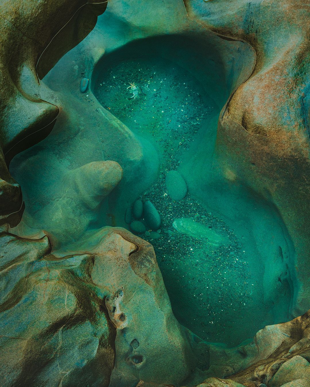
Photo: Washington tidepool
Fine art paper is supposed to look better. So why do prints sometimes come out duller and less colorful than cheap photo paper? It comes down to how the paper is made, and what you're actually printing for.
A little over a decade ago, two developers and I built a photography CMS called Koken. The story of how we built it, lost it, and recently got it back.
Is Fujifilm's $999 GF 1.4x teleconverter worth it for landscape photography, or can you just crop a 102 megapixel file instead? Here's my take after using it in the field with the GF 100-200mm.
Wind is one of the toughest conditions a landscape photographer can face. Here are practical, field-tested tips for getting sharp images when the wind won't cooperate.